Textures
Definition:
Textures makes surfaces the subject—rendering material detail (brick, rust, stone, peeling paint, concrete, wood) with tactile presence and compositional intent.
Usage:
Use Textures when you want the city to read as material instead of scene. A strong texture frame can:
turn an ordinary wall into an intimate “portrait,”
add rhythm and structure to a body of work (texture shots as connective tissue between larger scenes),
translate place through touch: grit, polish, weathering, repair, age, and craft.
Textures work especially well when you treat surface as design: seams become dividers, cracks become leading lines, patterns become tempo, and small imperfections become the story.
In Depth:
I use Textures as a Lexicon term because it names a very specific kind of attention: the city as surface memory. This isn’t just “sharp detail.” It’s the moment when brick, plaster, iron, paint, and stone stop behaving like background and start behaving like subject—carrying weather, labor, maintenance, neglect, repair, and time.
Textures are useful because they can make the ordinary feel intimate. They also help a larger photographic project breathe: between big vistas and obvious landmarks, texture images slow the pace, deepen the sense of place, and remind the viewer that a city is made of stuff—and that stuff records history.
They’re also wonderfully portable. Every neighborhood has surfaces; every surface has a life. Once named, texture becomes something I seek intentionally rather than something I notice only when it’s shouting.
A few quick ways to spot them in the field:
Look for layered surfaces: paint over paint, patched repairs, poster residue, stains, scuffs, and seams.
Use side light to reveal relief and micro-shadows; use diffuse light when you want subtle layering without harsh contrast.
Frame for structure: edges, cracks, mortar lines, rails, grids, and repeating modules should guide the eye.
Simplify ruthlessly. If the surface is the subject, remove distractions until the texture reads clearly.
Ask: does this feel like a portrait of a surface… or just a sample?
Below are ten launch examples that show Textures in different forms: brick as canvas, weathered exposures, crafted ornament, and industrial skins where material becomes the organizing force. Each image includes a brief note on what the texture is doing in the frame, and why I consider it a strong example of the concept.
Brick as Canvas (Walls with Rhythm, Grids, and Memory)
These examples show brick not as “background,” but as a full compositional engine—pattern, age, and structure doing the storytelling.

Garment / Fashion District - Manhattan - Espo - Fresh Flavor!
A ghost sign turns the wall into layered history: painted typography over weathered brick, with grime and tonal variation doing as much work as the letters. The texture isn’t decoration here—it’s the proof that time has passed.
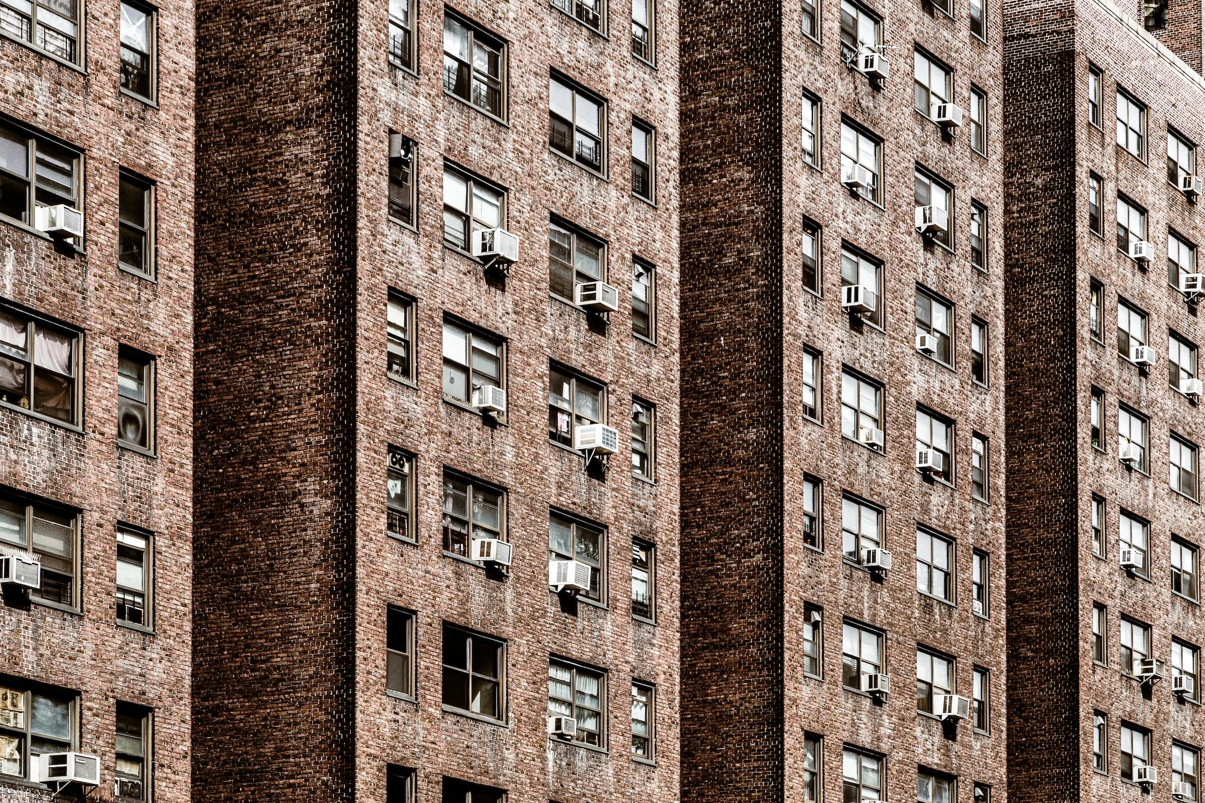
Two Bridges - Manhattan - Knickerbocker Village
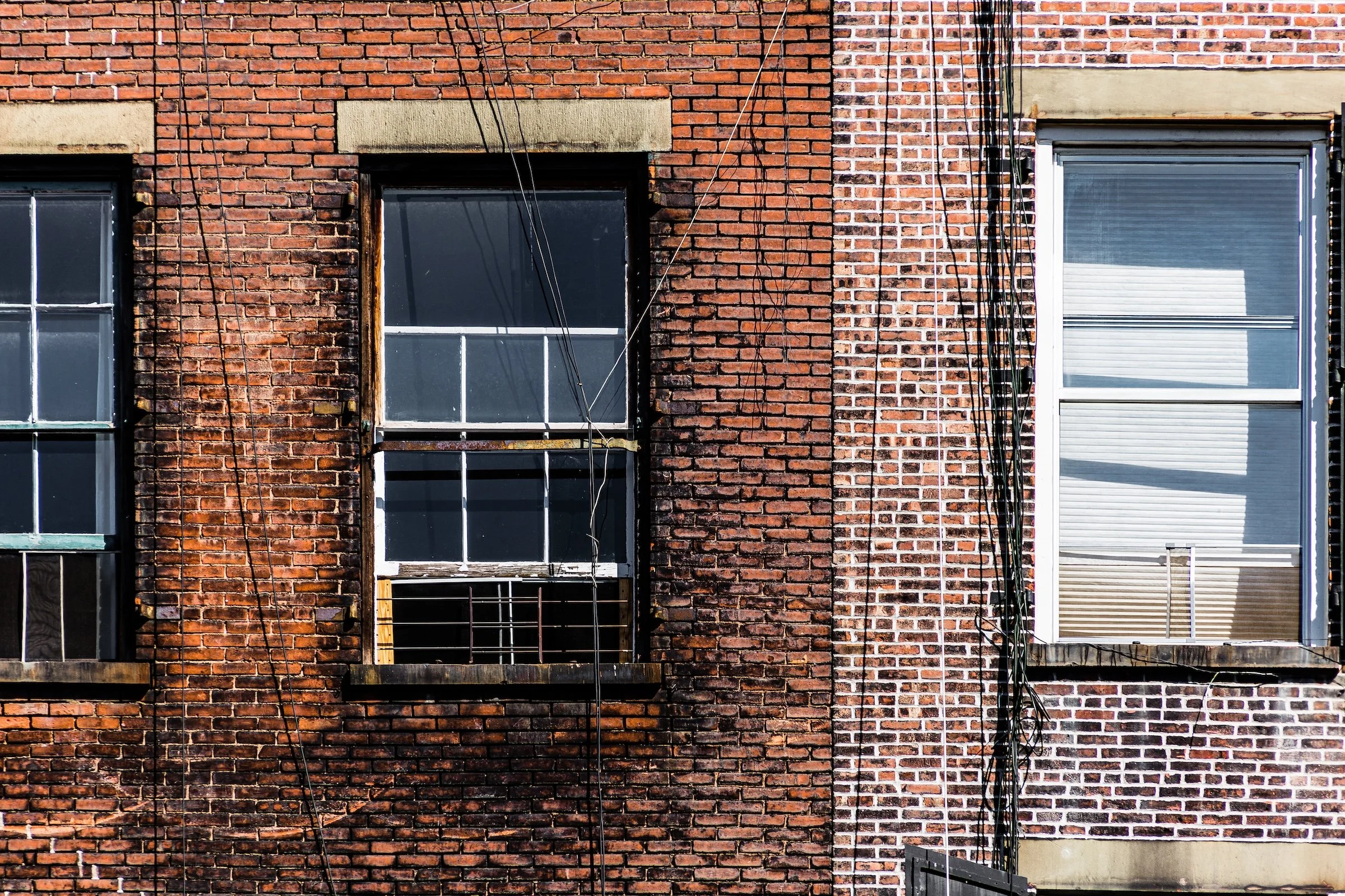
Brick becomes mass and scale: a dense field of masonry punctuated by windows and air conditioners like stitches. The texture works because it’s consistent—an enormous surface rendered clearly enough that the viewer can feel the building’s weight.
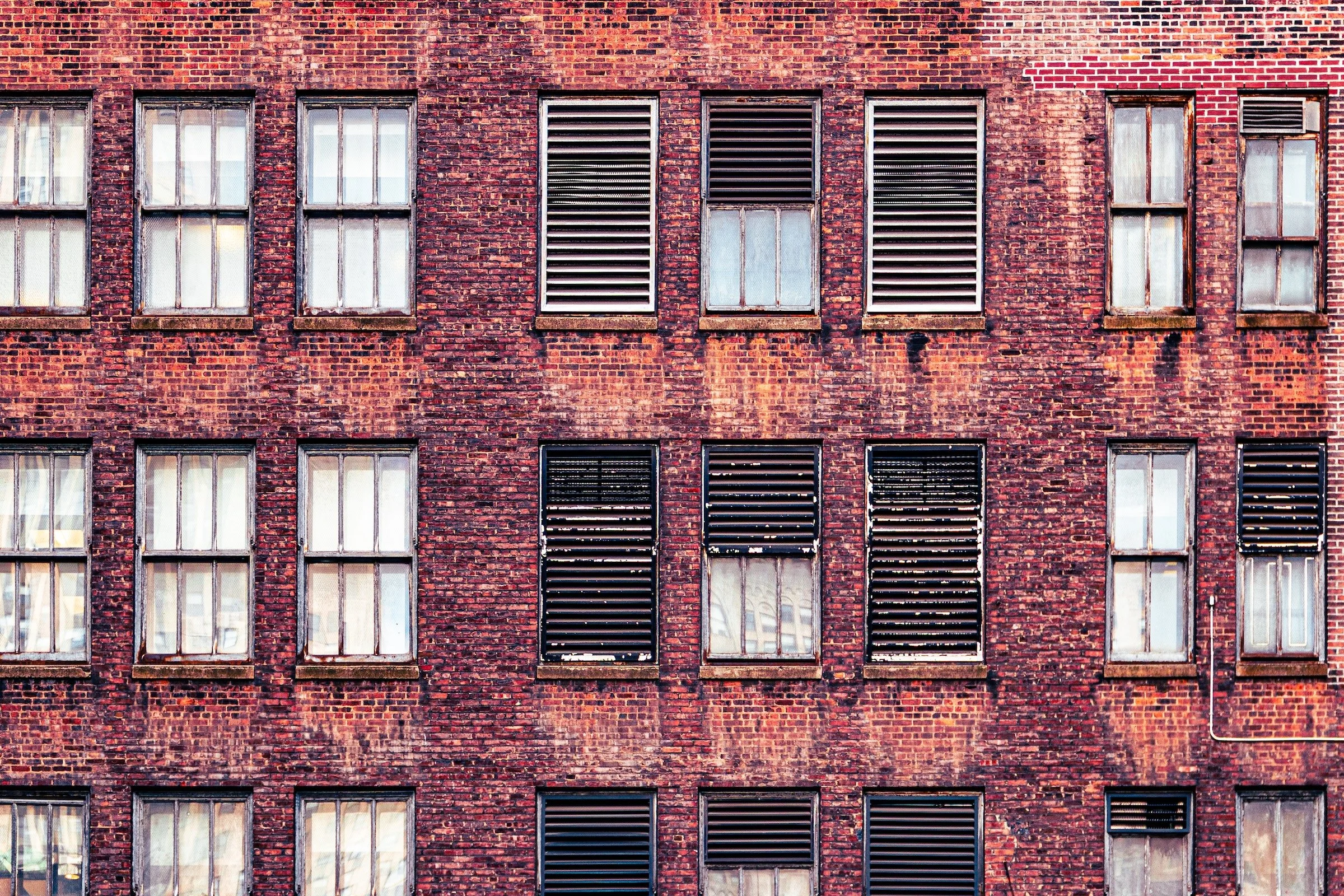
Garment / Fashion District - Manhattan - Urban Vents
This facade reads like an industrial quilt: repeated windows, dark vent panels, and subtle stains that give the brick a lived-in atmosphere. The strength is in the grid—texture plus repetition creating a calm, mechanical rhythm.
Exposure & Weathering (When the Surface Shows Its Layers)
These are the images where texture becomes narrative—peeling, cracking, eroding, revealing.
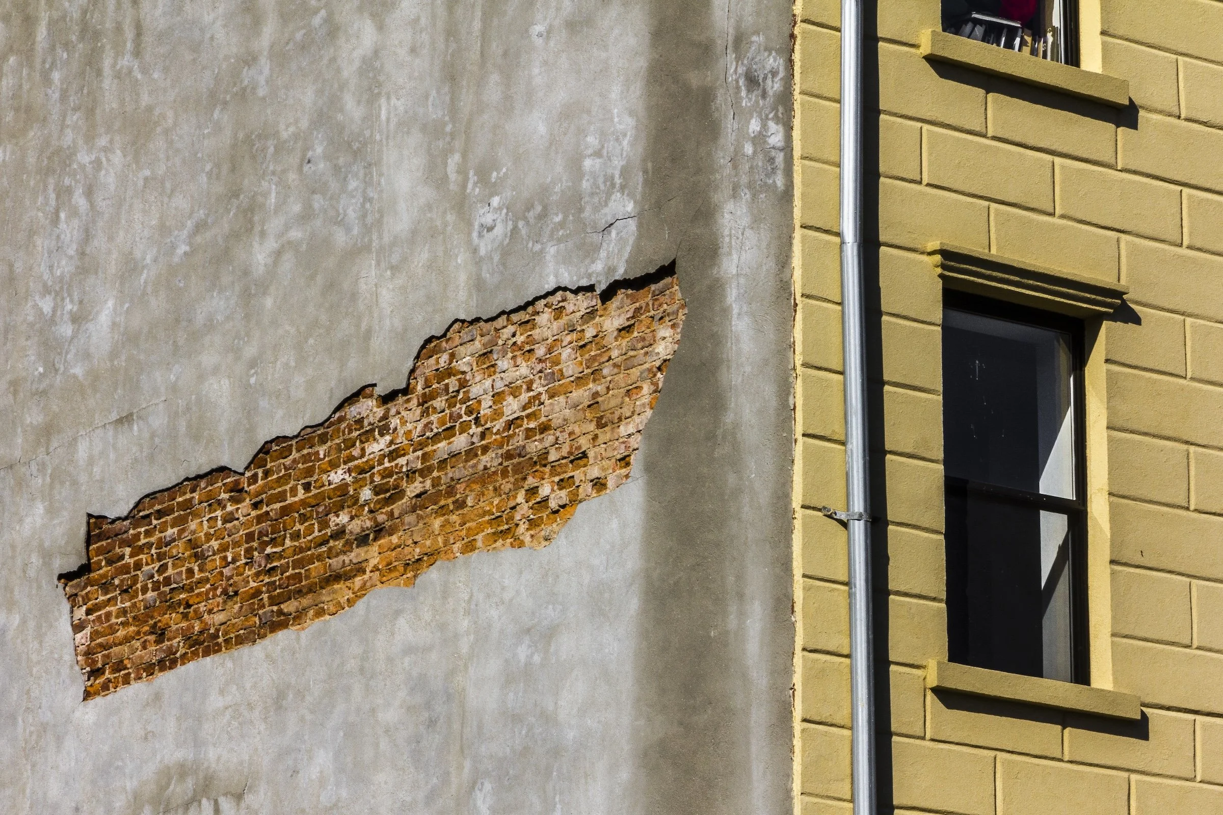
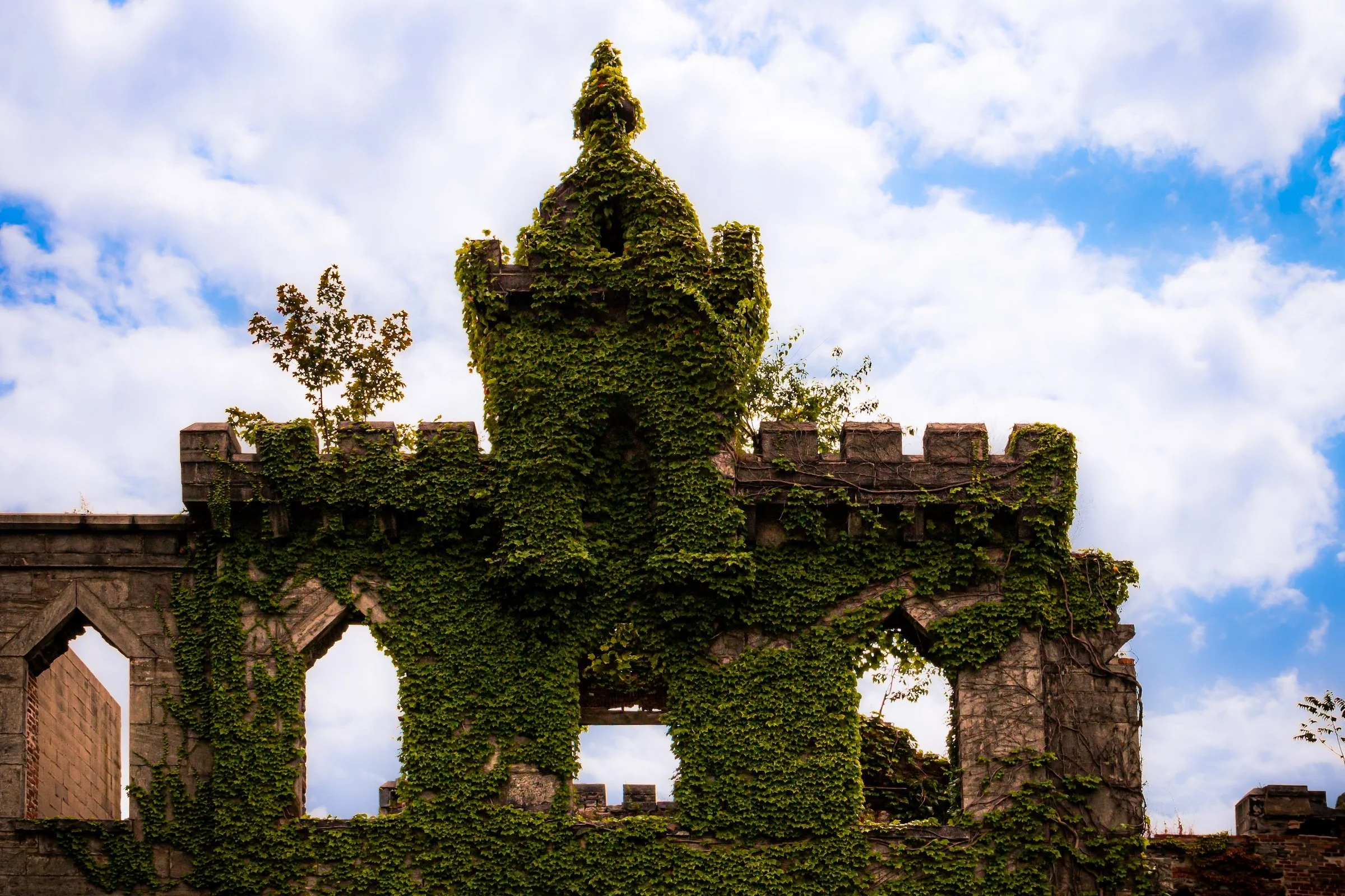
Spanish Harlem (El Barrio) - Manhattan - Exposed
Plaster breaks open to reveal brick underneath—an accidental “cross-section” of the building’s skin. The frame works because the textures are in conversation: smooth-ish stucco against rough brick, plus the clean geometry of the adjacent facade holding the scene together.
Crafted Surfaces (Ornament as Texture)
These examples show texture with intention—carved, patterned, designed—where surface becomes artwork.
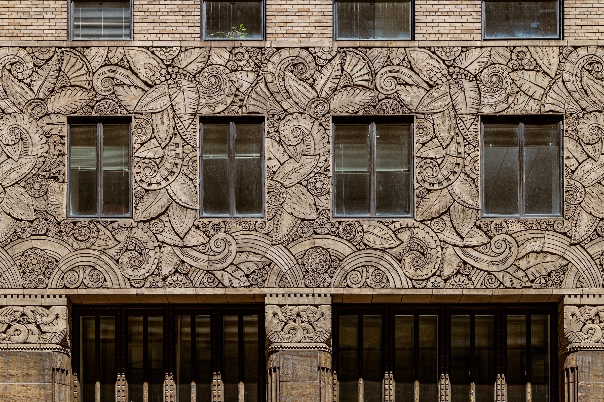
Midtown East - Manhattan - Chanin Building
A sculpted facade turns texture into illustration: swirling Art Deco forms, repeated motifs, and engraved detail that rewards lingering. The window placements keep it architectural, but the surface reads like a carved tapestry.
Industrial Skins (Mesh, Corrugation, Alleys, and Everyday Grit)
These are textures that come from utility—fences, garages, patched lanes—where the city’s working surfaces become the subject.
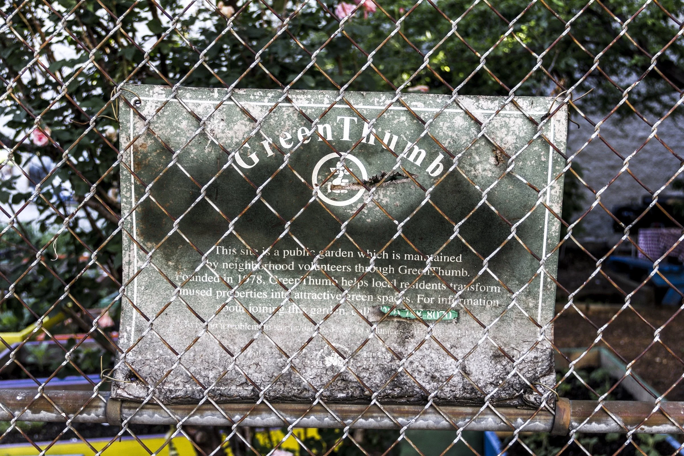
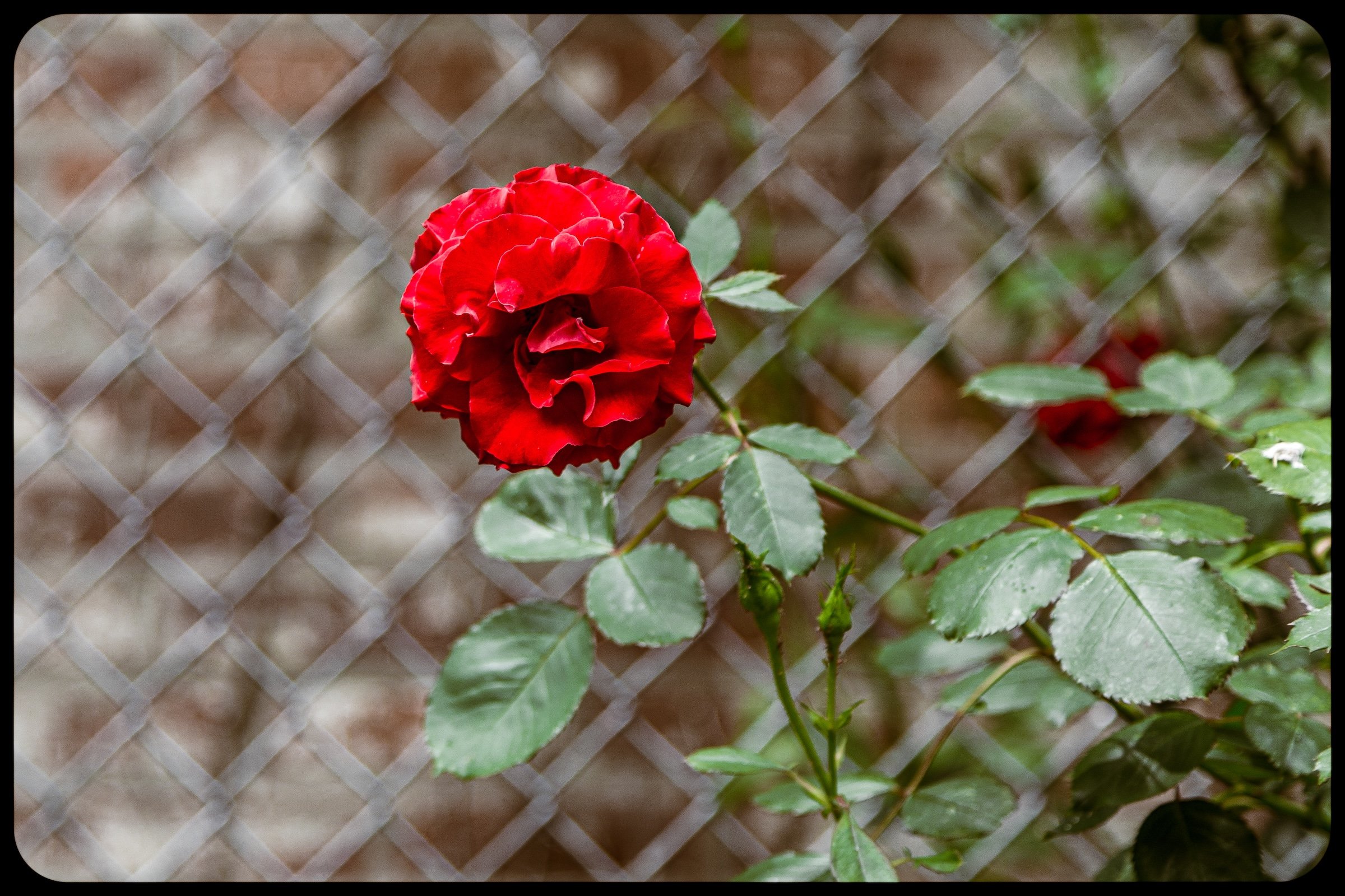
Spanish Harlem (El Barrio) - Manhattan - Green Thumb
Chain-link turns the frame into a tactile filter—rust, chipped paint, and diamond geometry layered over a weathered sign. The texture works because it stacks: metal mesh, aging lettering, and soft foliage depth behind.
Explore Further