Follow The Signs
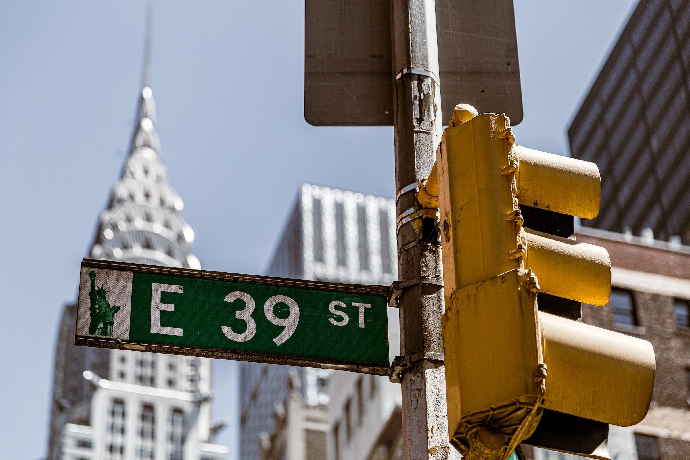
Murray Hill - Manhattan - 39th & Lex
Definition:
Photographs built around signage—street names, storefronts, municipal lettering, warnings, neon, hand-painted declarations—where the text isn’t just “in” the scene, but drives the scene. In Follow The Signs, words become structure: an anchor for composition, a shorthand for place, and a narrative cue that tells the viewer how to read what comes next.
Usage:
Use Follow The Signs when you want the city to speak in-frame.
Signs do three powerful things at once:
They locate the photograph (you’re not just seeing a street—you’re seeing Broadway, Avenue D, Bond Street).
They organize the frame (a bold rectangle of type becomes instant hierarchy).
They imply story (commands, invitations, moral declarations, late-night neon promises).
In a Lexicon sense, this isn’t “street photography” as a genre label—it’s a repeatable method of seeing: notice the city’s typography, decide what it’s “saying,” then build a frame where the message becomes meaning.
In Depth:
I think of signs as the city’s caption layer—except you don’t add it later; you discover it. When a sign is strong enough, it becomes a kind of visual gravity well. People, architecture, weather, even color all start orbiting around the text.
A few ways to work this in the field:
Make it readable, then make it interesting. Legibility gets you the hook; angle, context, and timing give it soul.
Use depth on purpose. Either isolate the sign with shallow depth of field, or keep the environment sharp so the sign feels embedded in the neighborhood.
Let the sign “point” the viewer. Arrows, street blades, and cross-streets naturally create direction. Use that to guide the eye deeper into the frame.
Wait for the right supporting cast. A sign gets dramatically better when a person, a vehicle, or a slice of weather “acts” beneath it.
Process for hierarchy. If the sign is the subject, dodge/burn and local contrast should support readability without turning the rest of the frame into collateral damage.
Below are ten launch examples showing different flavors of the concept—from clean wayfinding to neon declarations—each with a note on what the sign is doing in the frame and why it earns its keep.
Coordinates and Street-Name Anchors:
These are the city’s simplest words—and some of its strongest. Street signs and blades act like coordinates, giving the viewer both a location and a compositional spine.
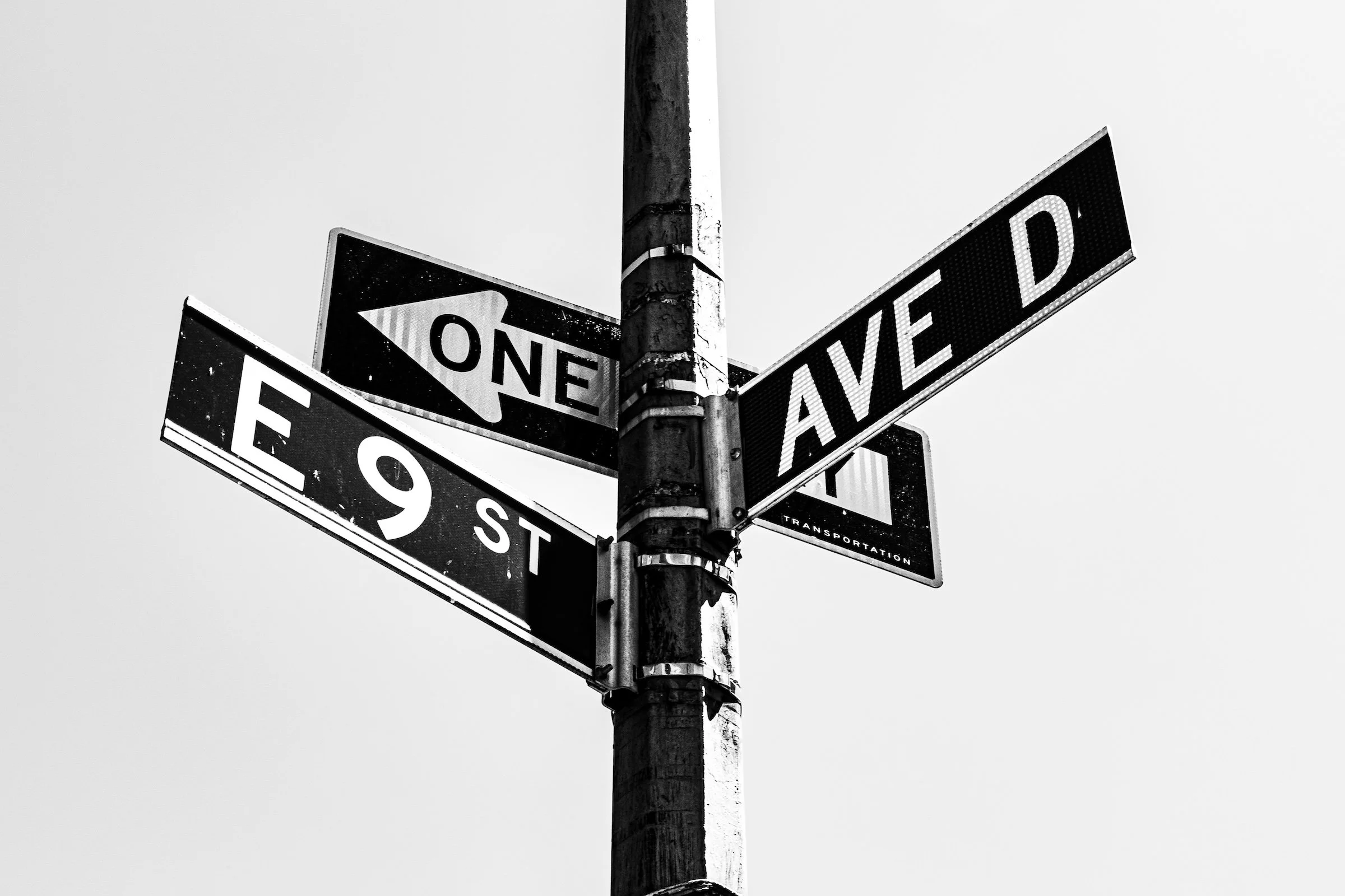
Alphabet Village - Manhattan - East 9th & Avenue D
A perfect “X marks the spot” image: the crossing blades turn the intersection into a title card. The clean sky gives the typography breathing room, and the pole becomes a vertical axis that steadies the whole frame.
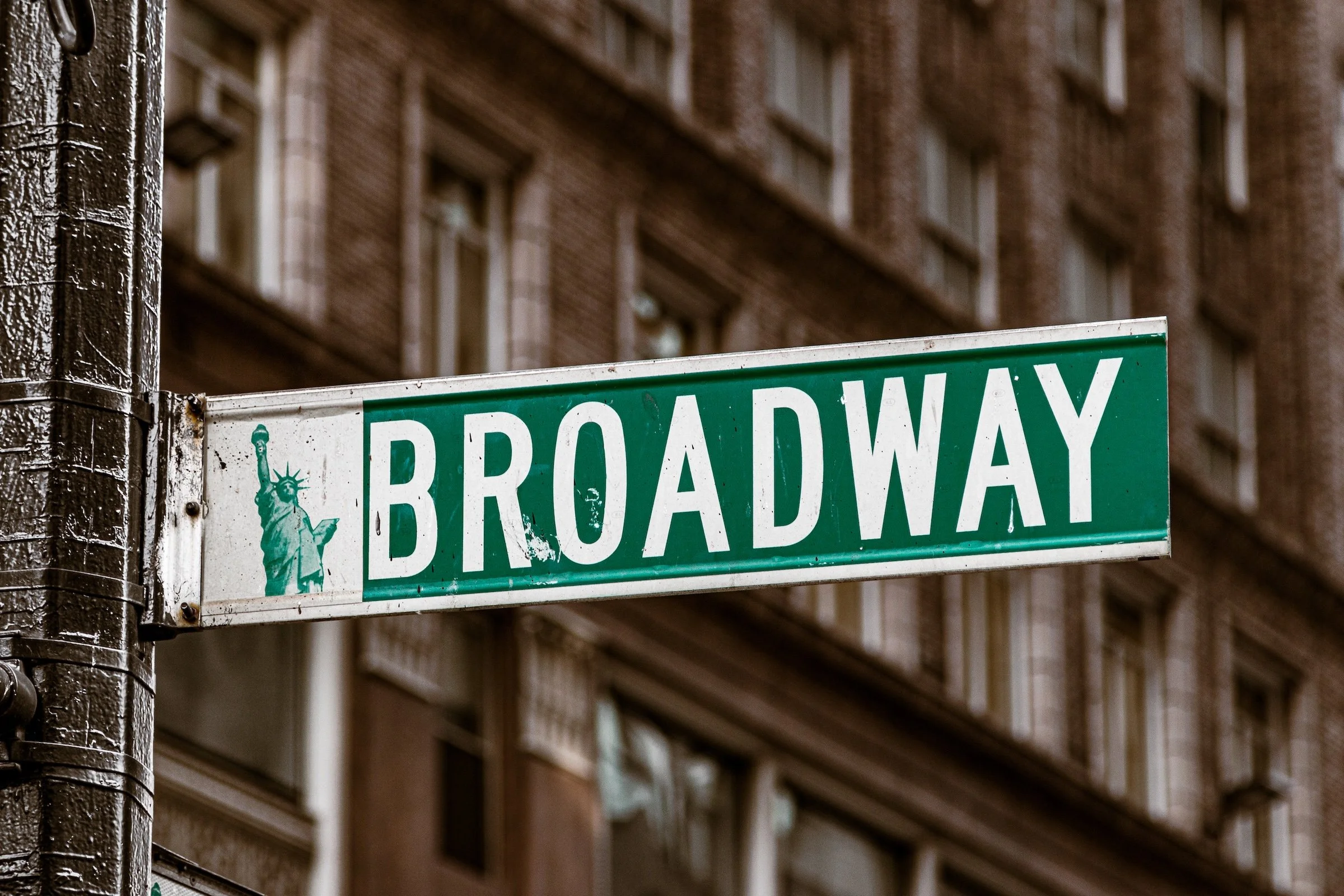
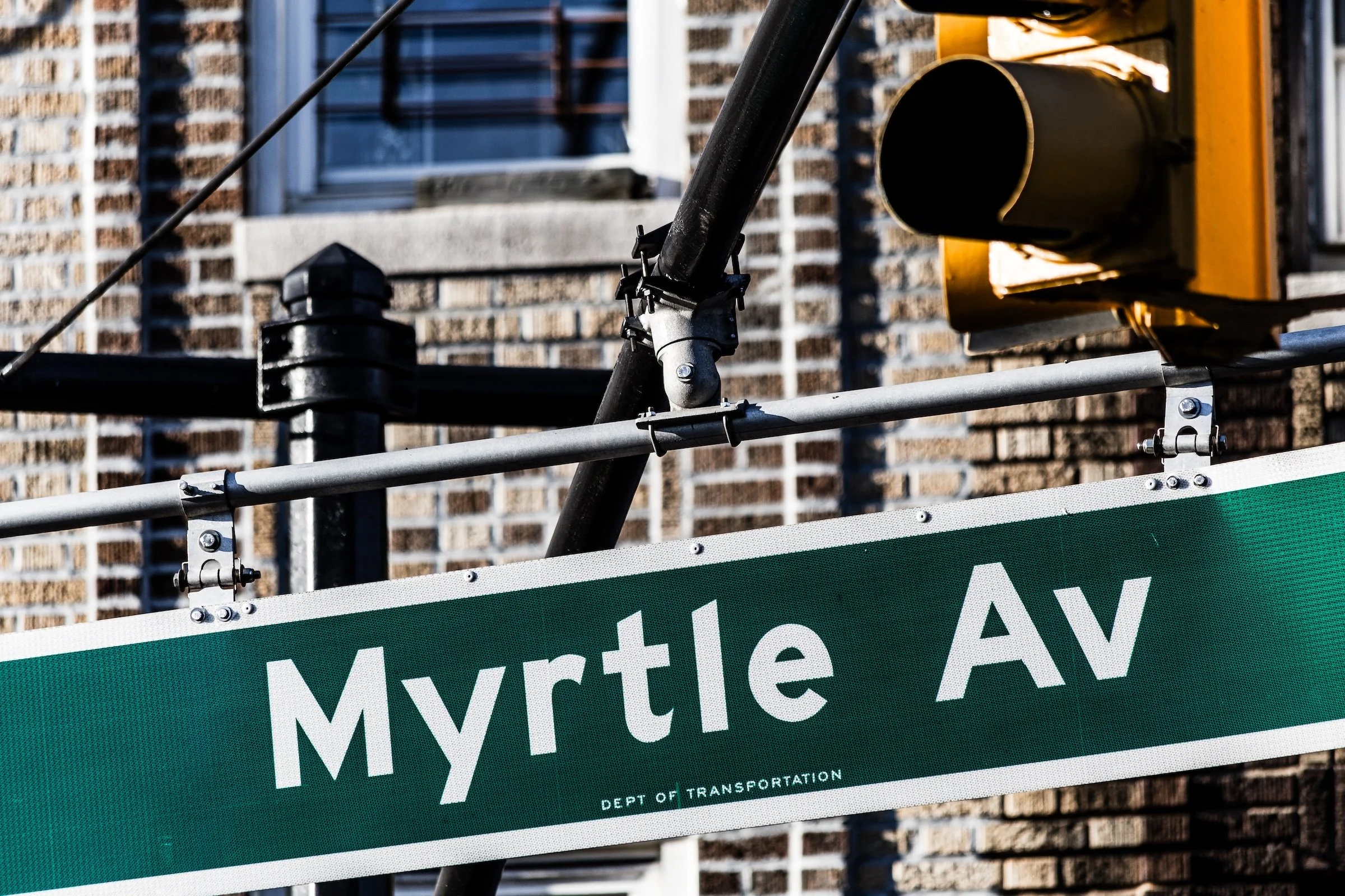
Garment-Fashion District - Manhattan - Broadway
Here the sign isn’t just a label—it’s a declaration. The tight framing makes the word feel monumental, like the street itself is a character. This is Follow The Signs at its most graphic: bold type, strong angle, minimal distractions.
Declarations, Warnings, and Night Language:
This is where signage becomes tone. Commands, temptations, and neon mood-lighting—words that don’t just locate you, they tell you what kind of city you’re in right now.

Lincoln Square - Manhattan - Frozen STOP Sign
A “command” sign made poetic by weather. The ice turns the ordinary into spectacle, and the word STOP becomes doubly literal—traffic control and time paused. Processing-wise, this kind of frame loves clarity and crisp micro-contrast (without crunch).

Hell's Kitchen (Clinton) - Manhattan - Sin Will Find You Out
This is pure urban theater: typography as prophecy. The sign is the voice of the scene, and the building façade becomes its stage. It’s also a great example of why Follow The Signs isn’t about “street” as a category—it’s about capturing the city’s written personality.
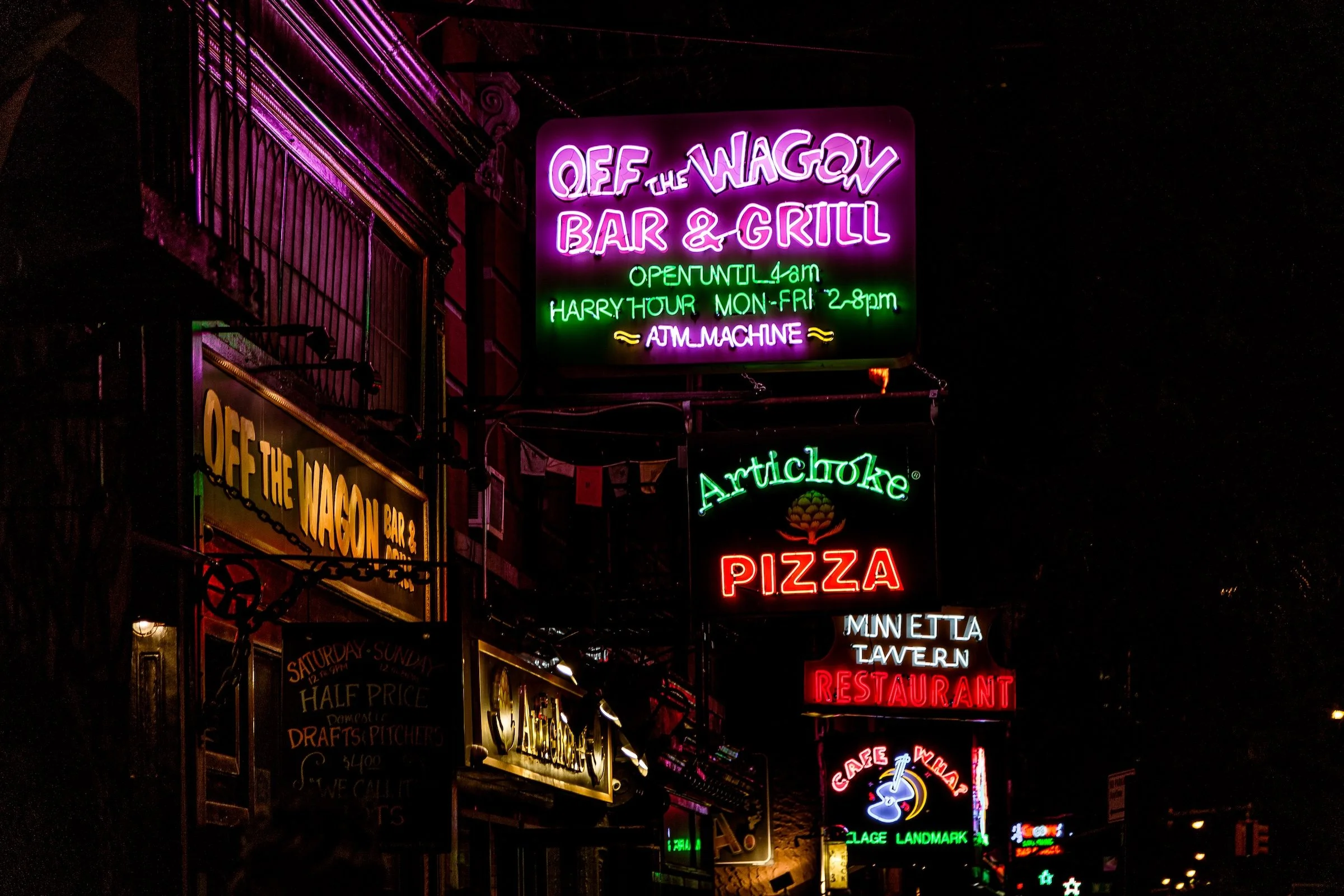
Greenwich Village - Manhattan - MacDougal Neon
Neon is signage plus atmosphere—language that glows. The stacked signs create a vertical rhythm, and the colors do emotional work (late-night warmth, chaos, invitation). In processing, let the neon keep its saturation while protecting highlights so it doesn’t blow out into mush.
Identity, Invitation, and Signage With a Soul:
Here the sign isn’t only informational—it’s identity. These are names that carry belonging, civic weight, or a welcome mat—often with the environment “decorating” the message.
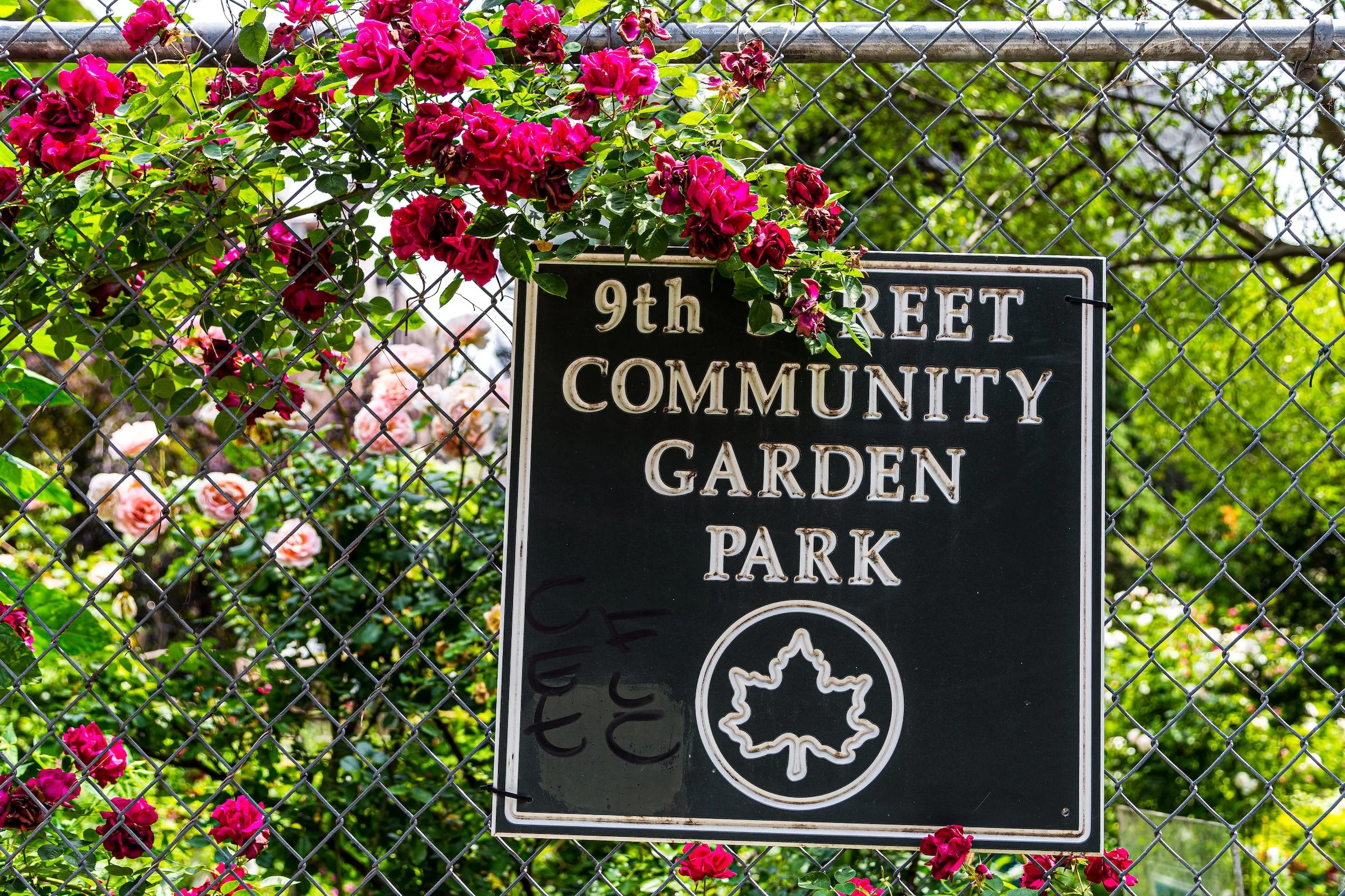
Alphabet Village - Manhattan - ABC-9 Community Garden
The roses hijack the sign (in the best way). This is signage as place-making: the words tell you what it is, but the growth tells you what it feels like. Nature becomes typographic ornament, and suddenly a simple park sign becomes a portrait of care.
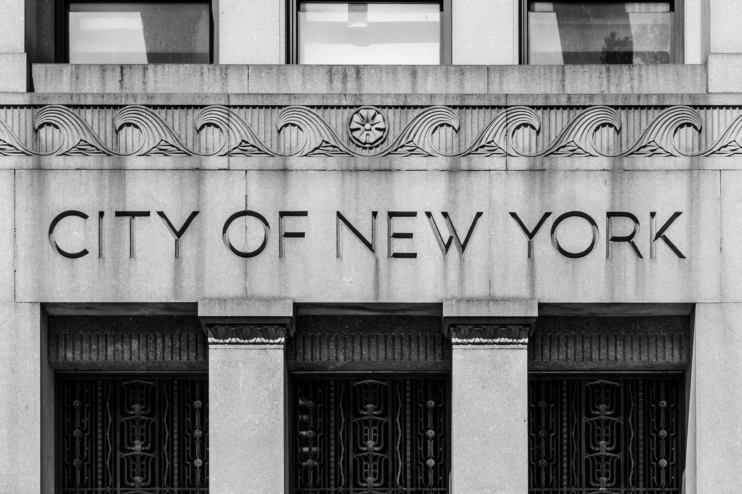
Civic Center - Manhattan - City of New York
Carved municipal lettering is the city speaking in stone—official, permanent, unbothered. The strength here is the calm authority of the type, and how the architecture frames it like a seal. This is Follow The Signs with a classical accent.
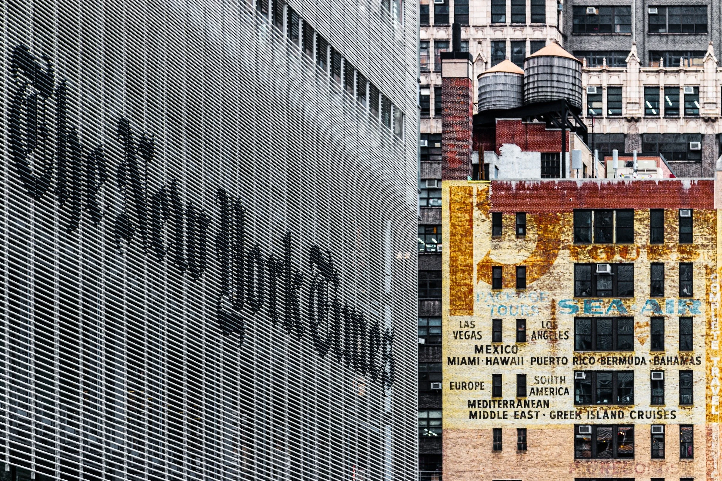
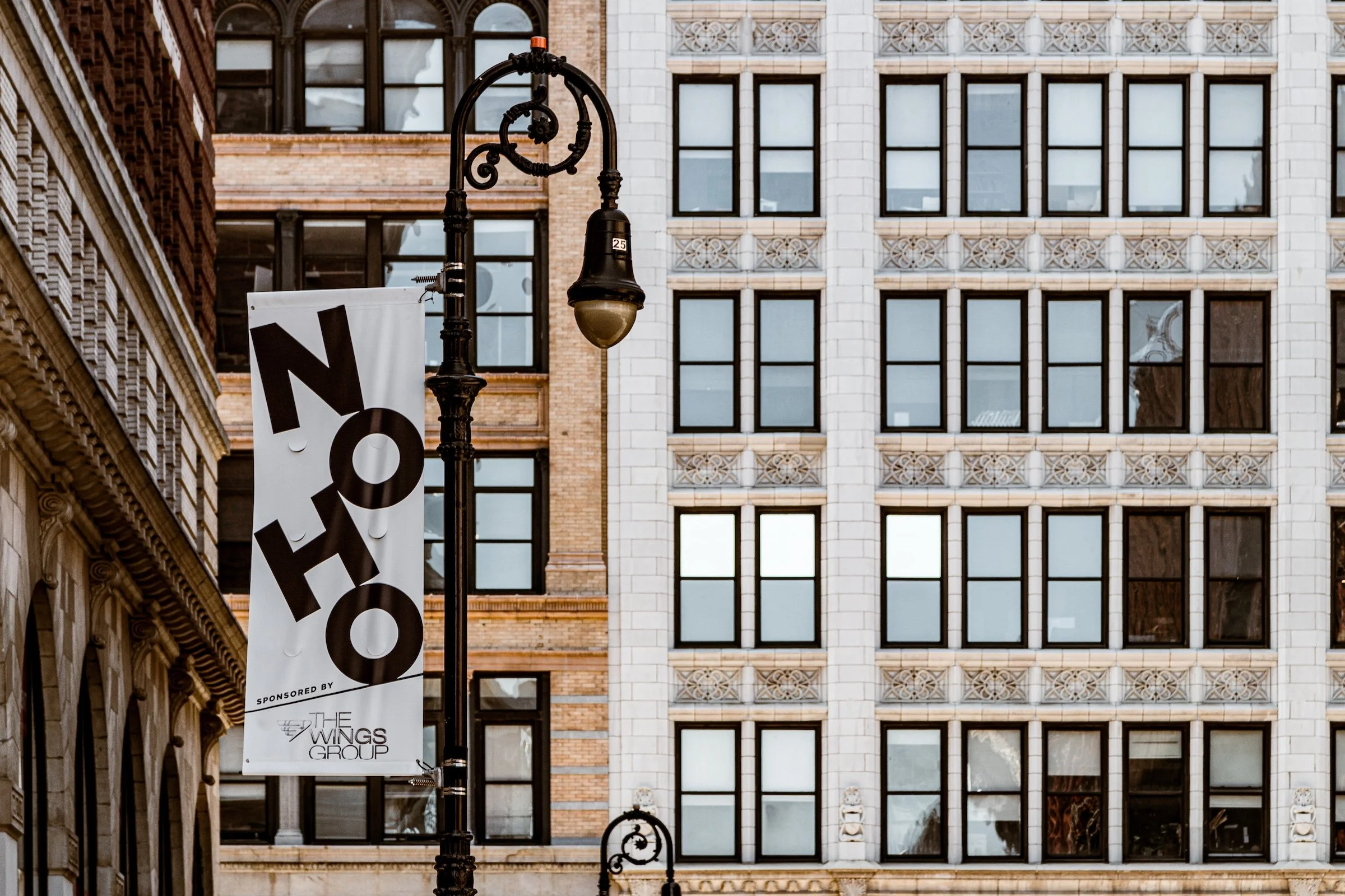
Theater District (Times Square) - Manhattan - To All Destinations
This is the “signscape” version: the city doesn’t whisper a label—it shouts a promise. The message becomes the frame’s headline, while the surrounding visual noise turns into context instead of clutter. The trick is to compose so the sign wins without needing to dominate the entire image.
Explore Further