Chromatic City
Bronx Park - The Bronx - Peacock
Definition:
Chromatic City is the practice of treating color itself as a structural element—not decoration. It’s the moment when pigment (natural or manmade) becomes the thing that organizes a frame: saturated feathers, a neon sign, a painted façade, a taxi door in the rain, a sky that behaves like a backdrop. The subject can be anything. The engine is color.
Usage:
Use Chromatic City when you want a photograph to feel alive, immediate, and intentional. Color can:
create instant hierarchy (what we notice first),
form a visual “path” through the frame,
separate layers (foreground/midground/background),
make ordinary city matter feel mythic (or playful),
turn a scene into something closer to illustration than record.
Chromatic City isn’t “bright colors = good photo.” It’s color with a job—anchoring the composition, carrying the mood, and holding the frame together even when the subject is complex.
In Depth:
I use Chromatic City as a way to name (and reliably seek) frames where color behaves like architecture. Sometimes it’s natural—autumn leaves, spring blossoms, iridescent feathers. Sometimes it’s built—painted storefronts, neon typography, signage, transit color-coding. Often it’s a collision: weather + streetlight, sky + glass towers, rain + taxi paint.
A few quick ways to spot it in the field:
Look for a dominant color “mass.” A big block of blue sky, a long band of painted façades, a pool of warm foliage—something that can carry the frame.
Find your counter-color. Strong color usually needs a foil: dark window grids, neutral stone, shadow, or clean negative space.
Watch for color that arrives (not just exists). Reflections, wet pavement, artificial light, and angle shifts can make color feel active.
Simplify your palette. When everything is saturated, nothing is. The best Chromatic City frames often read as “two or three major notes” plus texture.
Below are ten launch examples that show Chromatic City in different forms: daylight color-fields, street-level color signals, and built environments where hue becomes structure. Each image includes a brief note on what the color is doing in the frame, and why it’s a strong example of the concept.
Daylight color-fields:
These are Chromatic City frames where sunlight and open air give color room to breathe—big palettes, clean separation, and saturation that feels earned rather than forced.
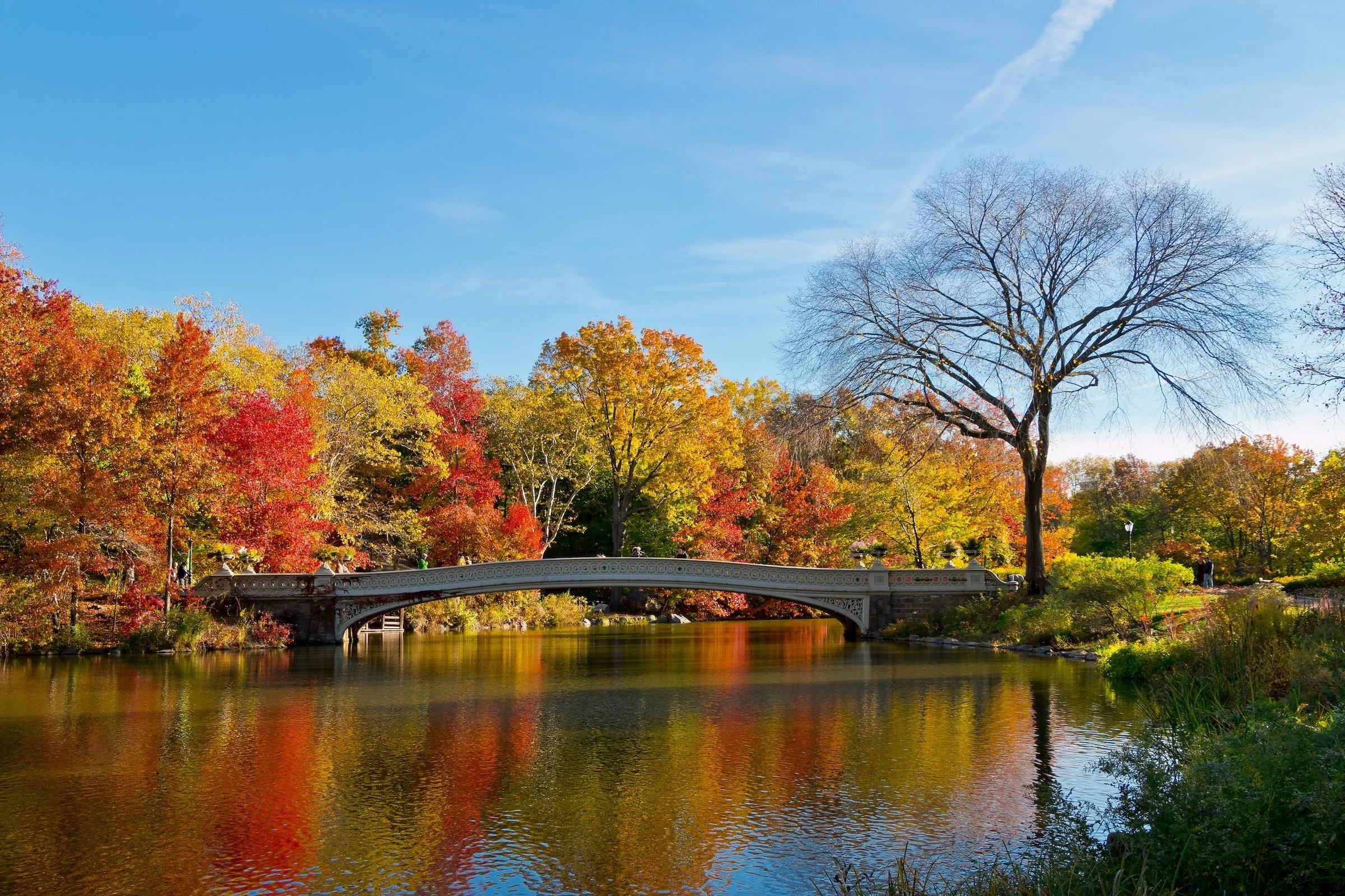
Central Park - Manhattan - Bow Bridge Autumn
Autumn color becomes the main subject, with the bridge acting like a calm spine that keeps the palette from dissolving into chaos. The move here is restraint: let the warm foliage dominate, then use the bridge’s geometry to keep the frame readable.
Kew Gardens - Queens - Spring Peaks
Spring color reads as layered, upward energy—fresh greens and blossoms pushing into sky. The trick is to keep the bright notes cleanly separated (branches, blooms, sky) so the frame feels like a deliberate palette instead of visual noise.
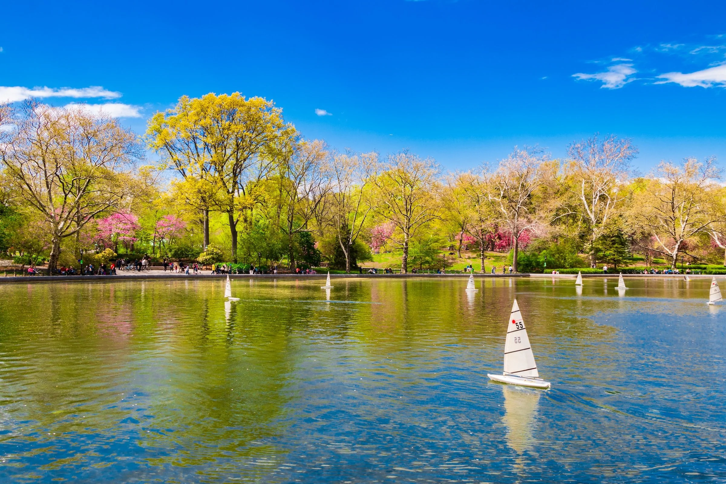
Central Park - Manhattan - Model Boats
The lake functions like a soft color stage—greens, blues, and tiny sail shapes that punctuate the surface. This is Chromatic City at “quiet volume”: the color isn’t screaming, but it’s doing the organizing, turning small subjects into a coherent pattern.

Street-level color signals:
Here, color is doing what cities do best: communicating. Signs, paint, transit, and street grit become a vocabulary—hue as message, mood, and identity.
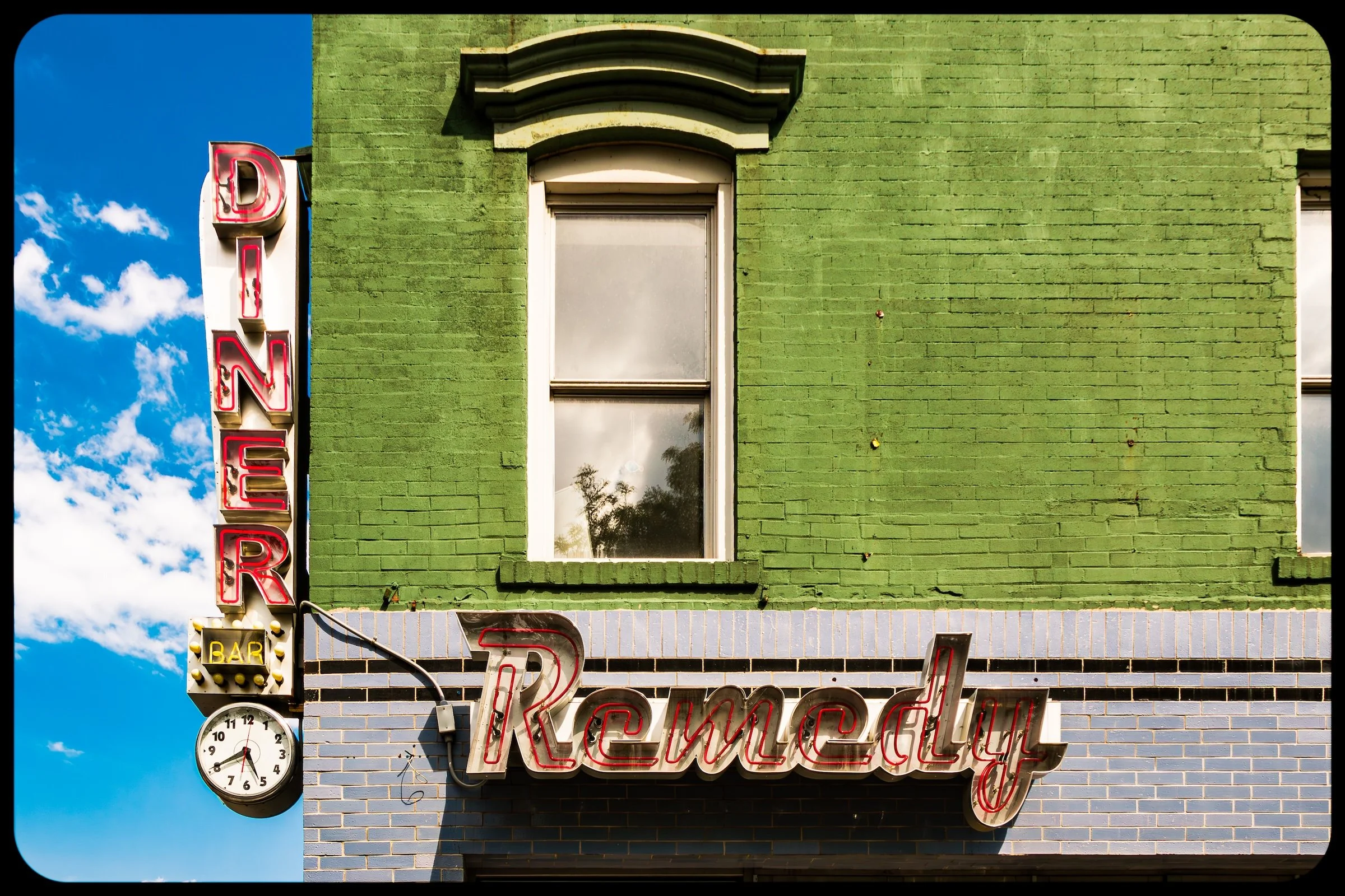
Lower East Side - Manhattan - Diner Remedy
Neon + typography + a single dominant wall color becomes the whole structure. The lesson: when you find a sign that already contains design intelligence, don’t “complicate” it—compose so the letters and color blocks feel like a poster you discovered in the wild.

Spanish Harlem (El Barrio) - Manhattan - Barrio Color
Color as cultural signature. The façade becomes a confident statement, and the framing works because it lets the color be the story without needing explanation. The best versions of this strategy keep lines straight and edges clean so the palette reads as intentional, not incidental.
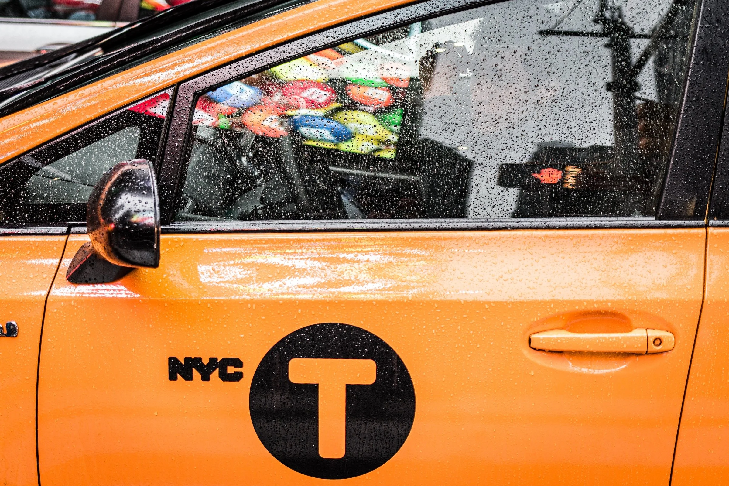
Theater District (Times Square) - Manhattan - NYC T
Rain turns the taxi into a saturated icon—yellow becomes subject, texture, and mood all at once. The power move is specificity: include just enough surrounding context (drops, reflections, hints of the street) to make the color feel earned by weather and place.
Built color geometry:
These examples show Chromatic City where color and structure fuse—grids, façades, and illumination creating frames that feel architectural, graphic, and designed.
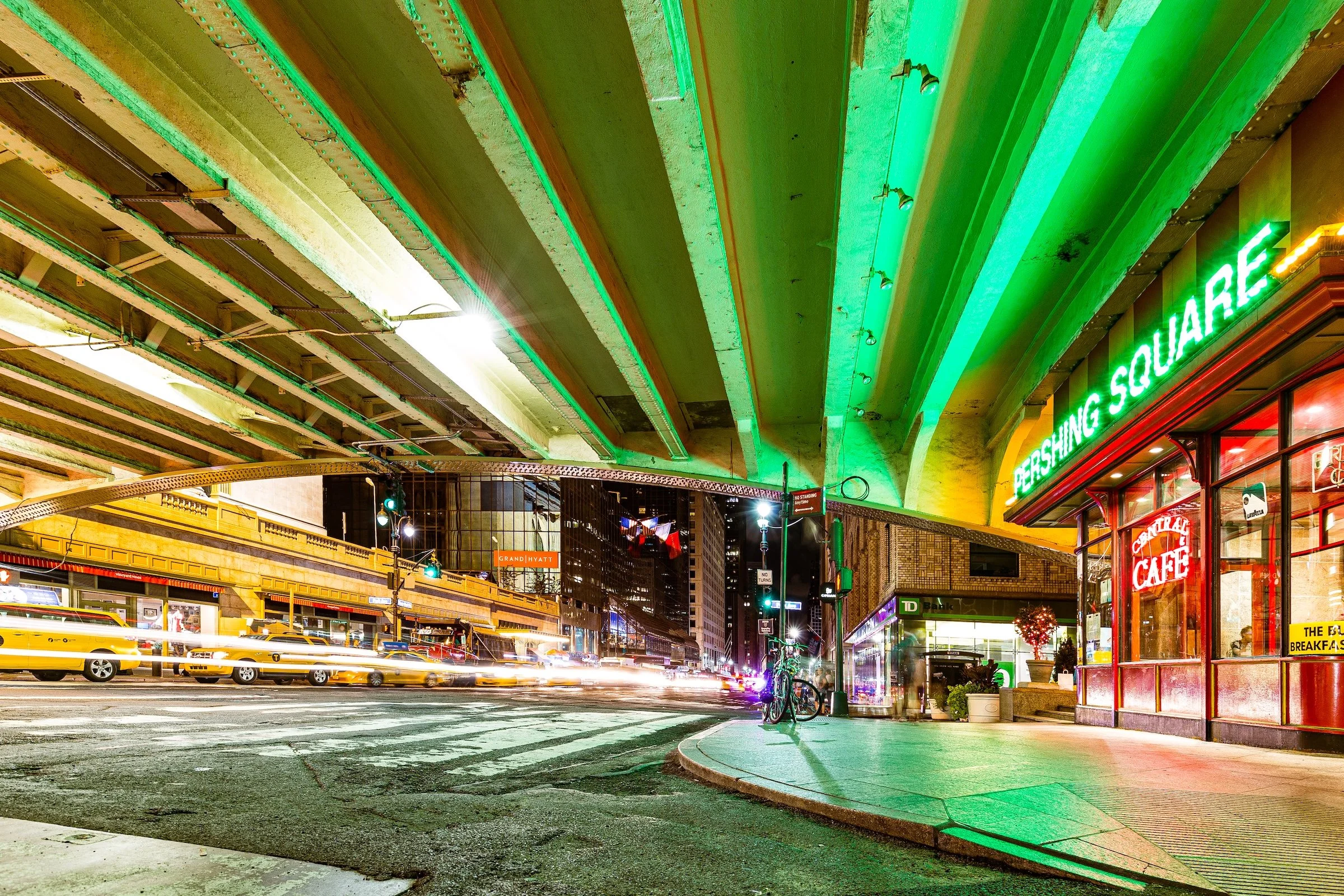
Midtown East - Manhattan - Pershing Square Illuminated
Artificial light turns the scene into staged theater. The color isn’t simply “pretty”—it’s directing attention, carving zones, and giving the night a palette. Expose to protect highlights so the color feels luminous rather than blown out.
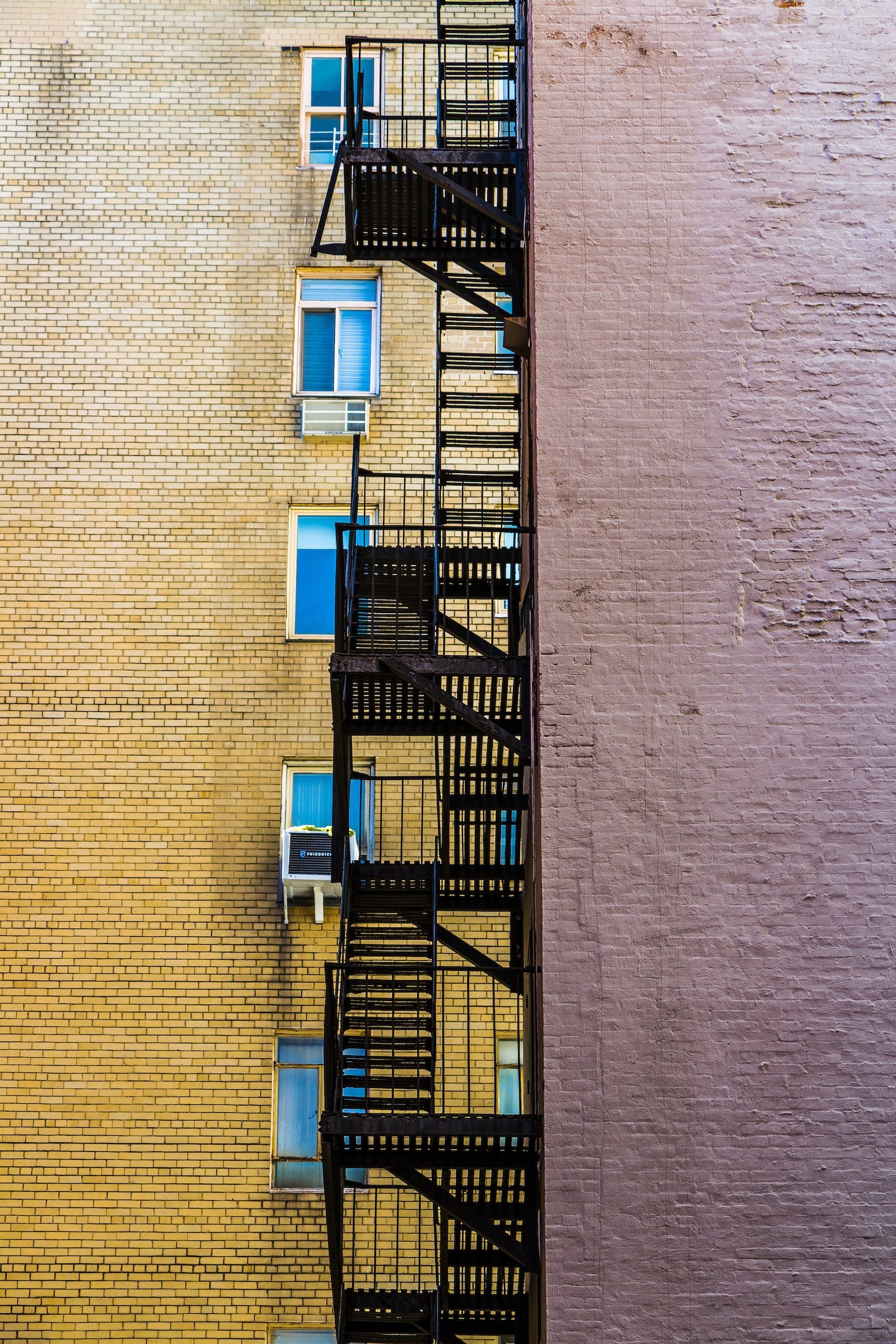
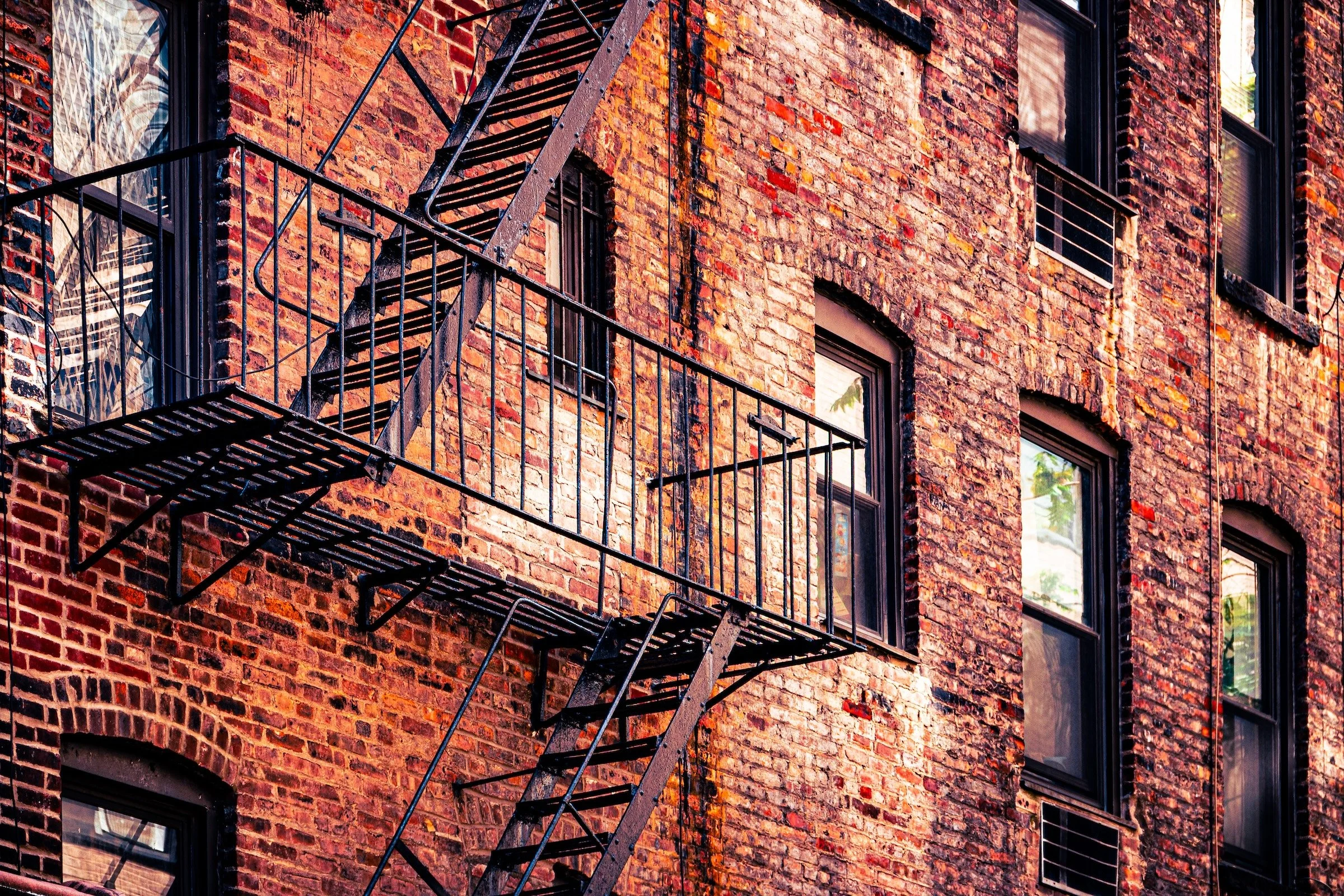
Upper East Side - Manhattan - The Other Side
This one is about color blocks + hard lines: the fire escape reads like drawn ink, and the wall planes behave like flat paint. The composition succeeds because it commits—clean verticals, confident negative space, and a limited palette that feels intentional.
Explore Further