Receding Planes
Definition:
A depth-building strategy where the frame is constructed from overlapping layers—walls, buildings, fences, lots, signs, trees—so that space steps backward in clear stages. Receding Planes emphasizes how the city is built: surfaces in front of surfaces, corridors inside corridors.
Usage:
Use Receding Planes to make density readable. It turns messy urban overlap into an intentional structure, guiding the eye through foreground, mid-ground, and background with a sense of inevitability—like the viewer is being pulled forward.
In Depth:
Depth is not automatic. Cities are visually loud; everything competes. Receding Planes is how you impose order without flattening the scene.
The “planes” can be anything:
a near wall + a far wall,
a parked car + storefronts + a distant tower,
a sign cluster + mid-rise + skyline,
a tree line + bridge + far shoreline.
Field habits that help:
Look for edges: the boundary of a building, a wall, a billboard, a fence. Planes are defined by edges.
Use contrast separation: one plane darker, one lighter, one softer—so the layers don’t merge.
Let one object act as a “doorway” into depth: a gap between buildings, a street opening, a vacant lot, a corridor.
Compose so the frame has a clear entry point (foreground anchor) and a clear destination (background reward).
Below are ten examples where depth is built from lots, blocks, corridors, and signposts—space arranged into steps.
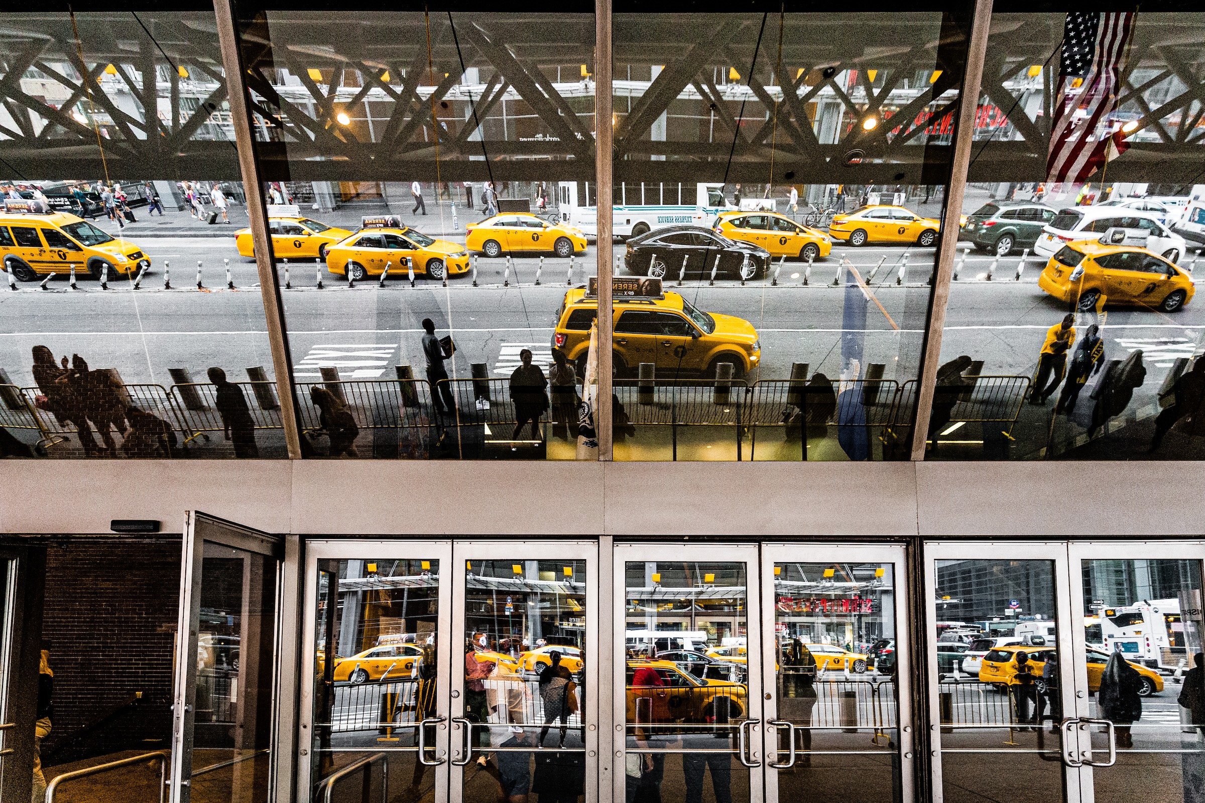
Corridors and Urban Canyons:
Depth created by street walls, building faces, and repeating vertical edges.
Financial District - Manhattan - Broadway In FiDi
Classic canyon depth: the street corridor narrows toward a distant pull. The strength here is clean alignment—edges behave like rails guiding the eye.
Signs, Streets, and Directed Looking:
Where graphic objects (signs, intersections, landmarks) create an intentional pathway through space.
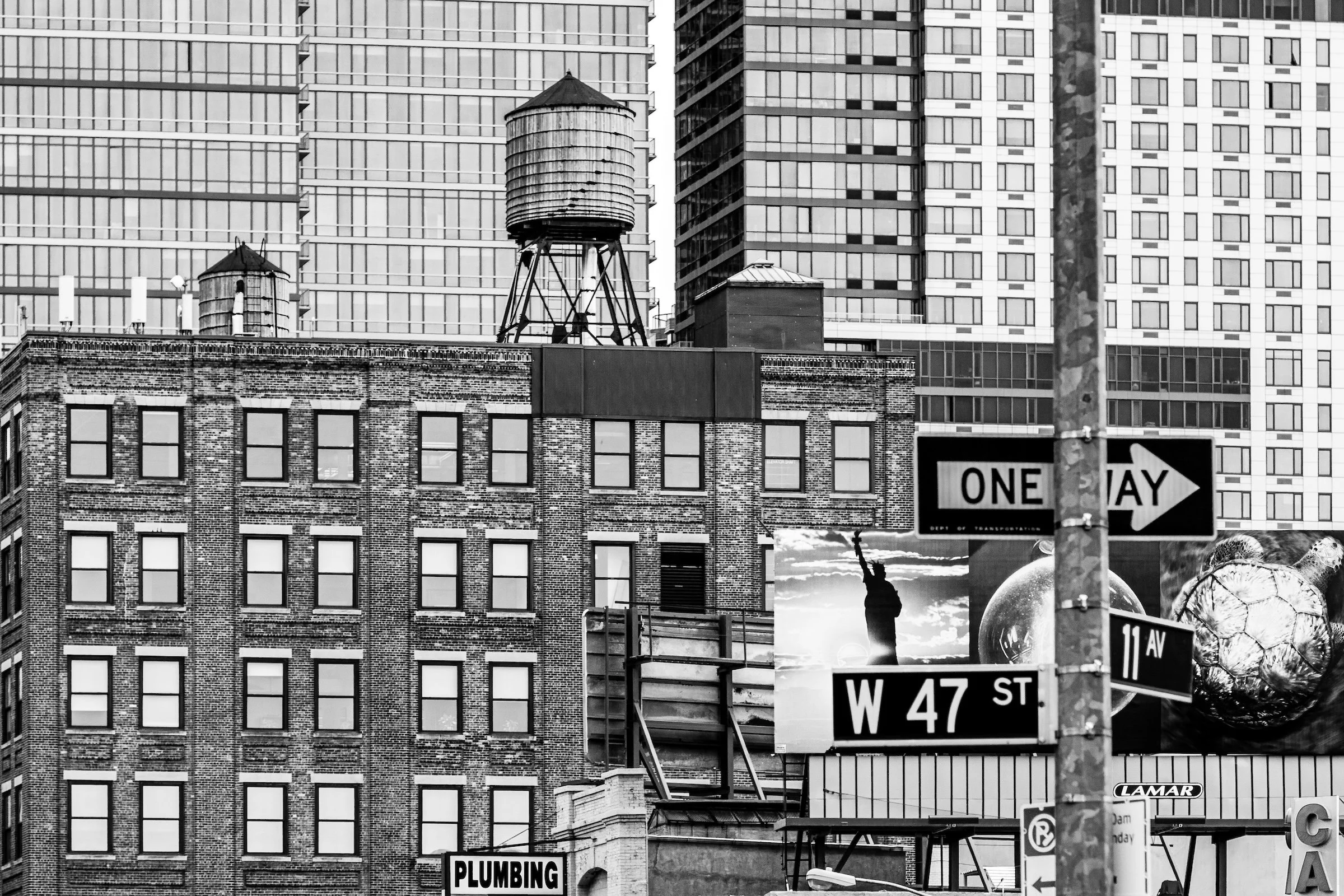
Hell's Kitchen (Clinton) - Manhattan - 47th & 11th
Street signage and building massing work like arrows—planes arranged with a sense of direction. The trick is balance: keep the signs strong, but don’t let them block the deeper reward.
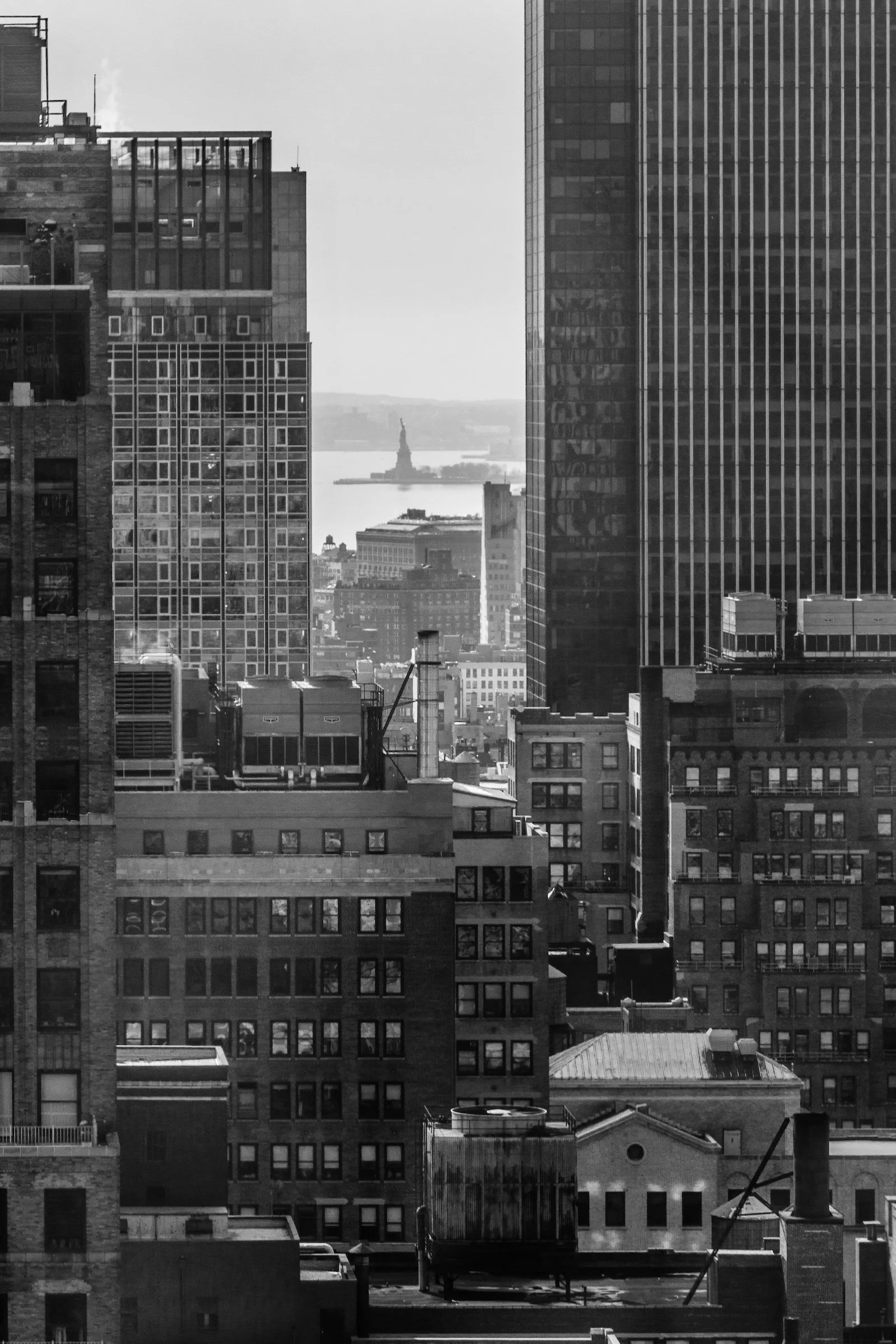
Theater District (Times Square) - Manhattan - Statue of Liberty
A distant icon becomes the “destination plane.” Everything else—billboards, mid-rises, street clutter—becomes the layered journey toward that tiny, surprising endpoint.
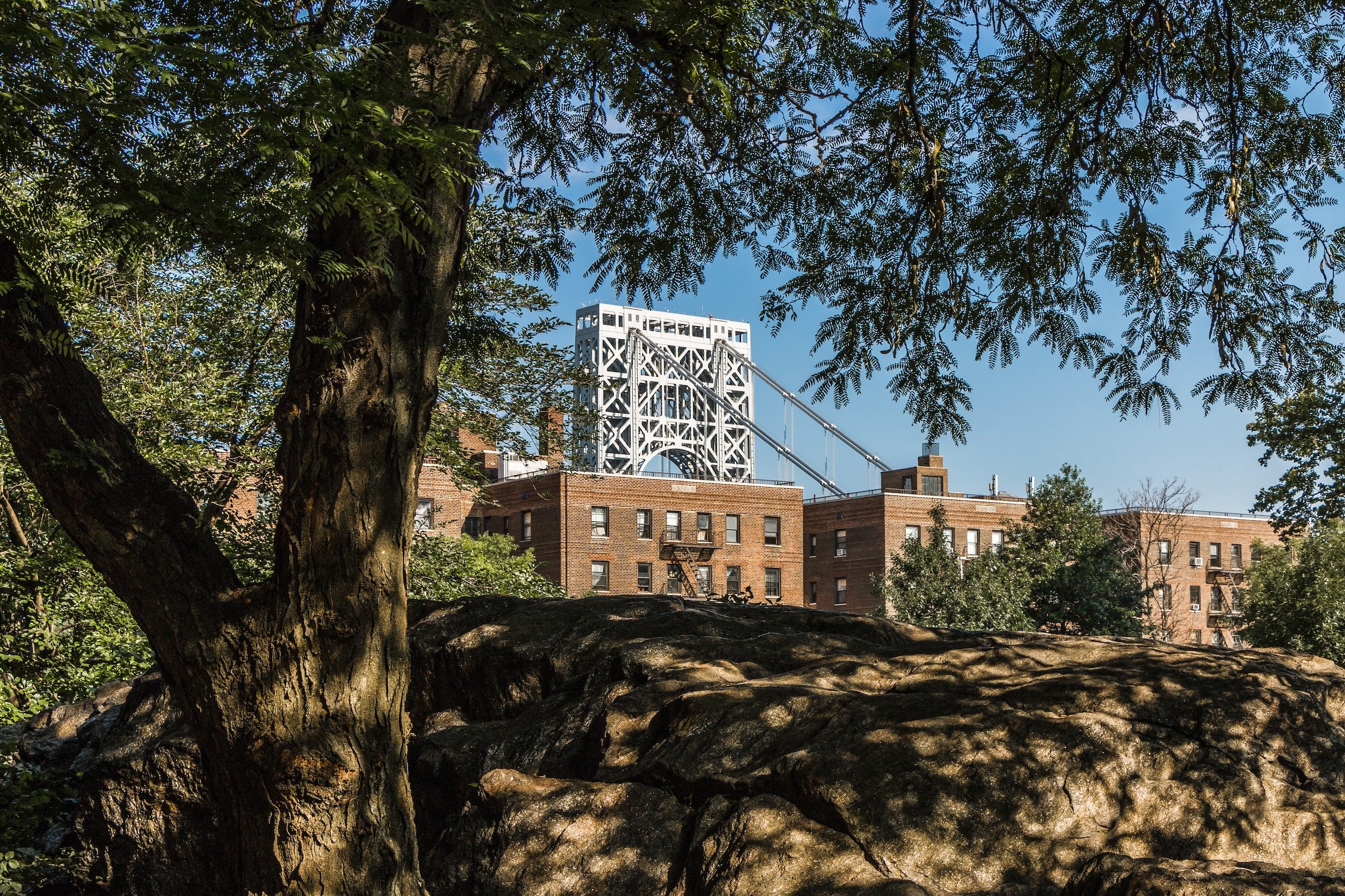
Washington Heights - Manhattan - J Hood Wright Park
Trees + rocks + bridge structure create a natural-to-urban stack. When foreground nature frames background infrastructure, the planes feel intentional rather than incidental.
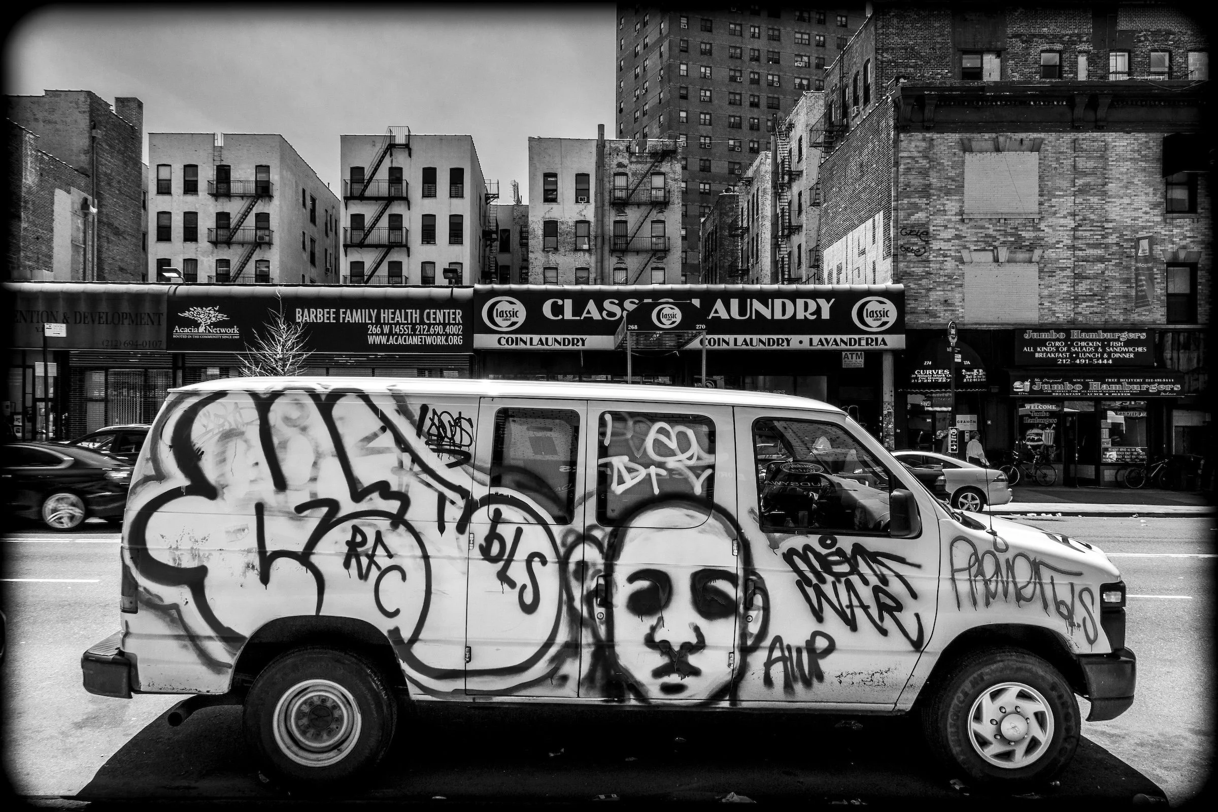
Neighborhood Overlap and Layered Texture:
Depth built from mixed materials—cobblestone, brick, glass, Parisian street edges—where the city reads as stacked surfaces.
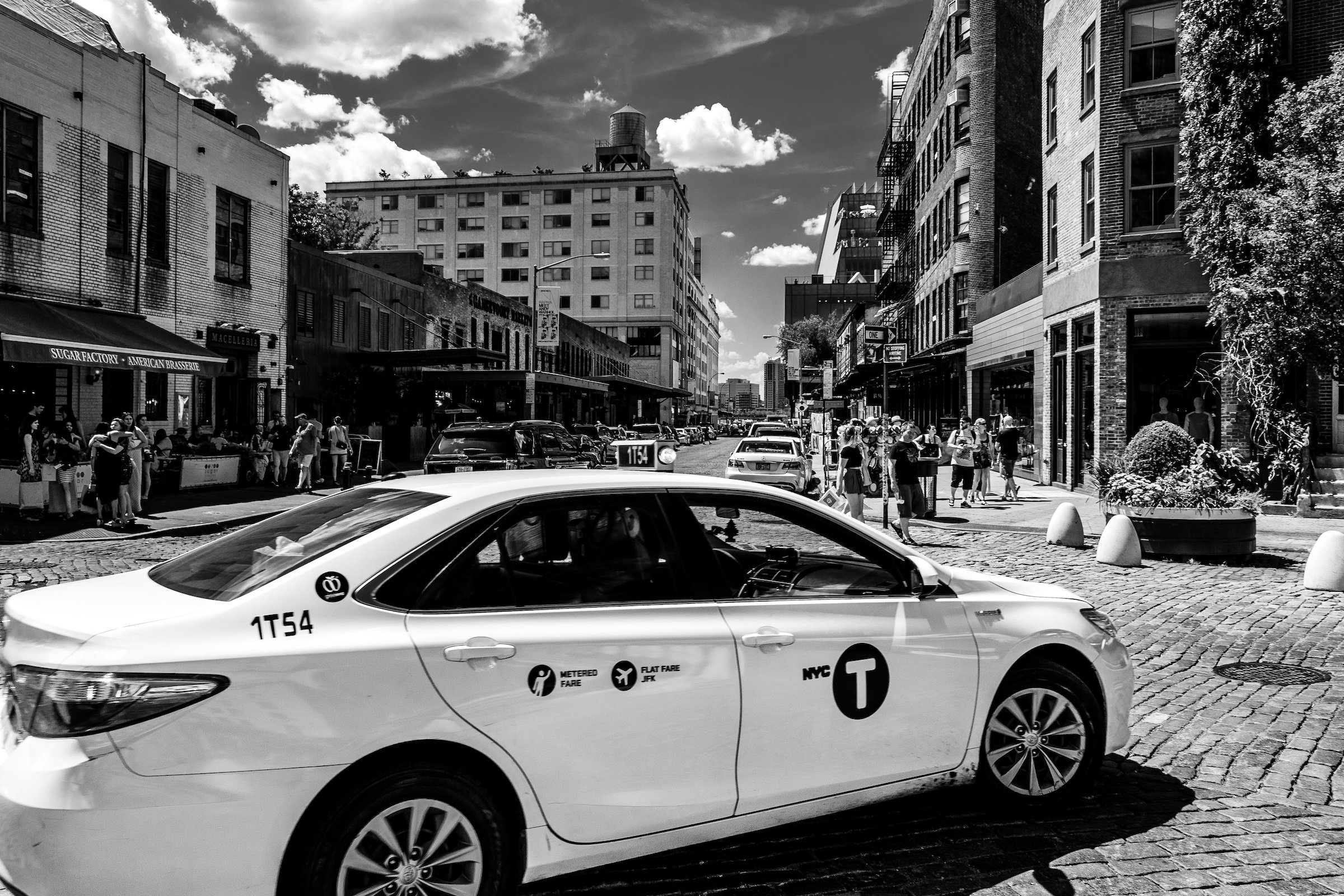
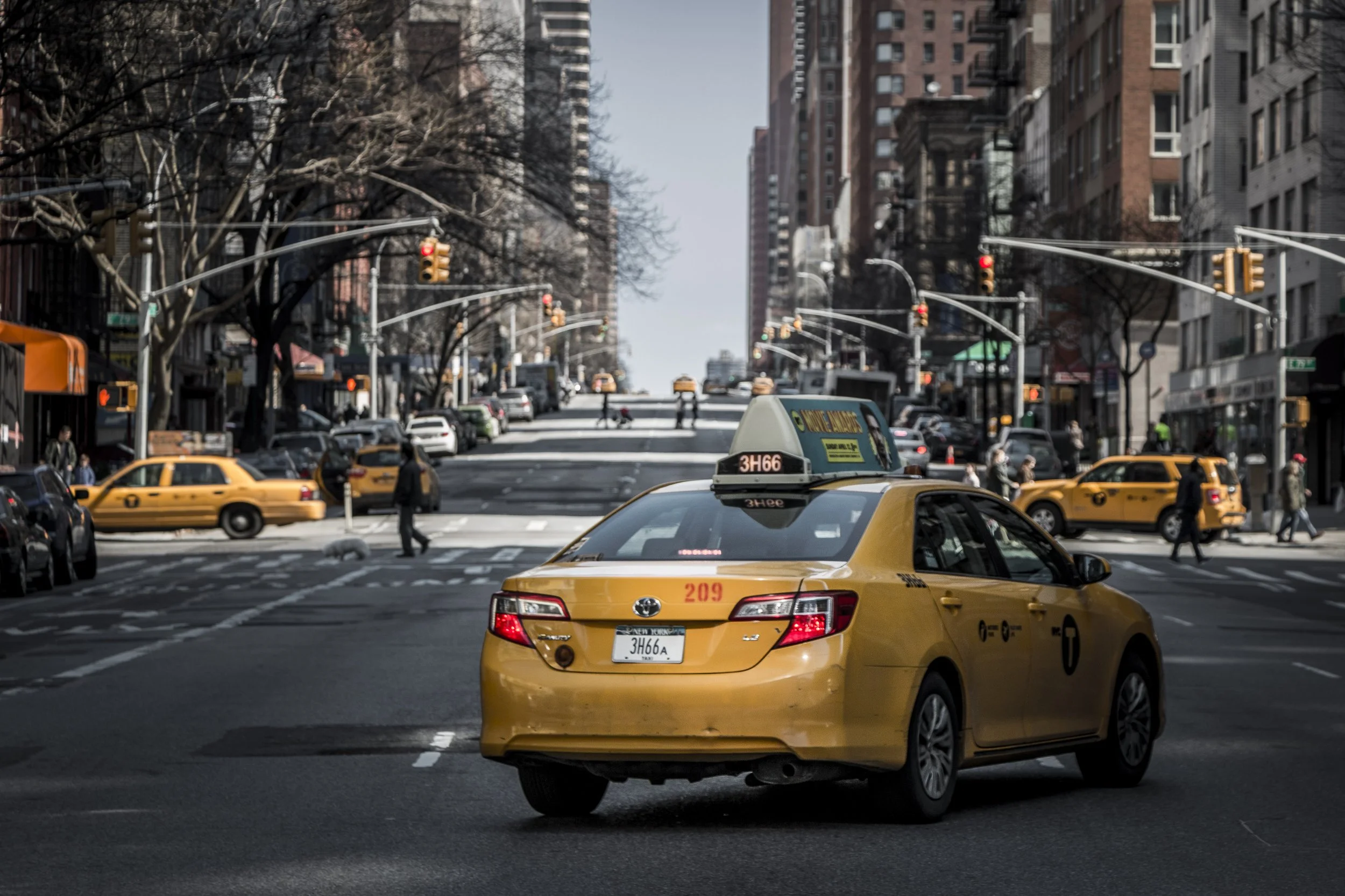
Meatpacking District - Manhattan - Taxi On Cobble
The taxi is a moving mid-plane against a stable cobblestone foreground and a layered street wall beyond. Receding Planes doesn’t require stillness—just clear separation.
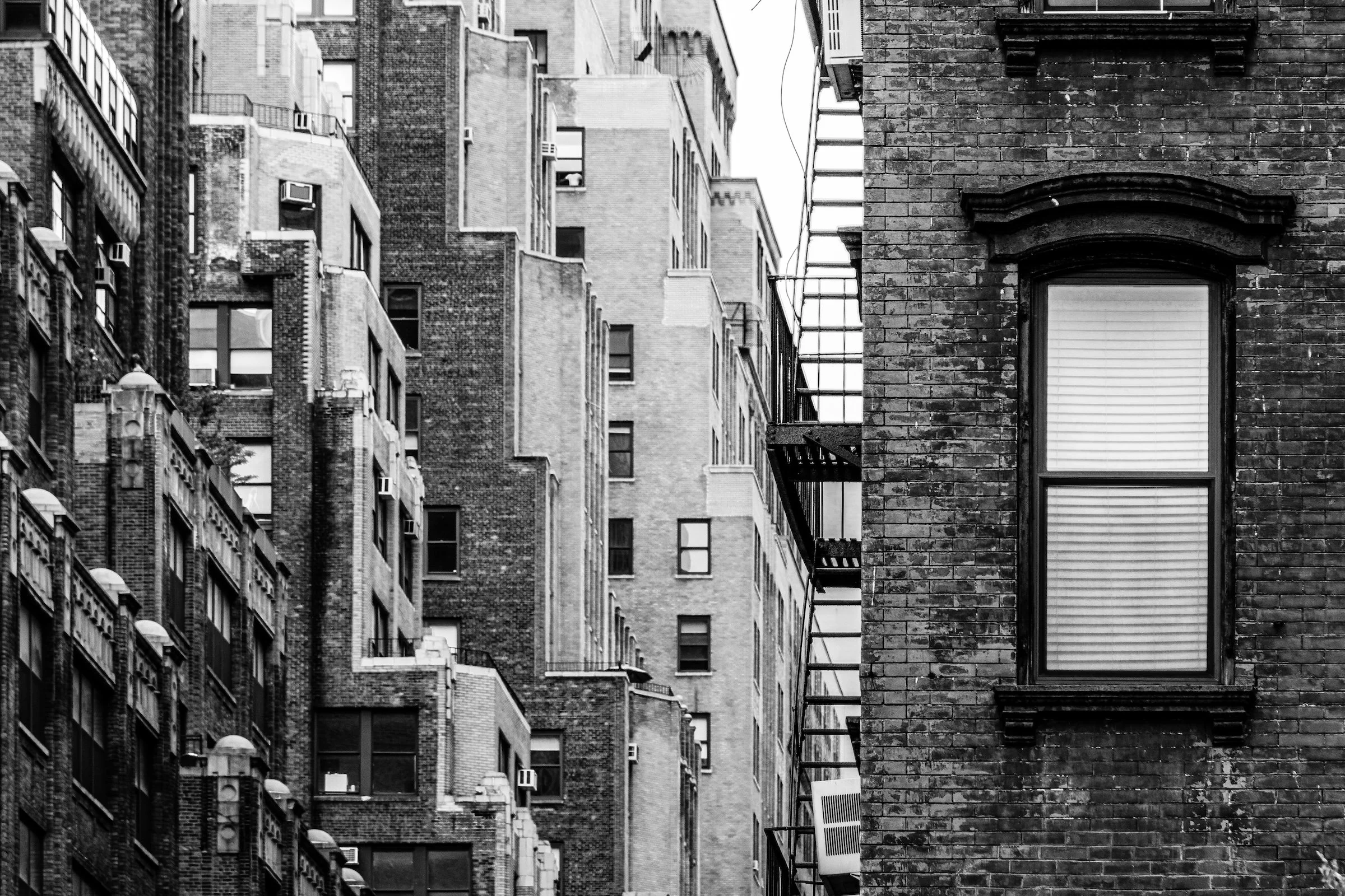
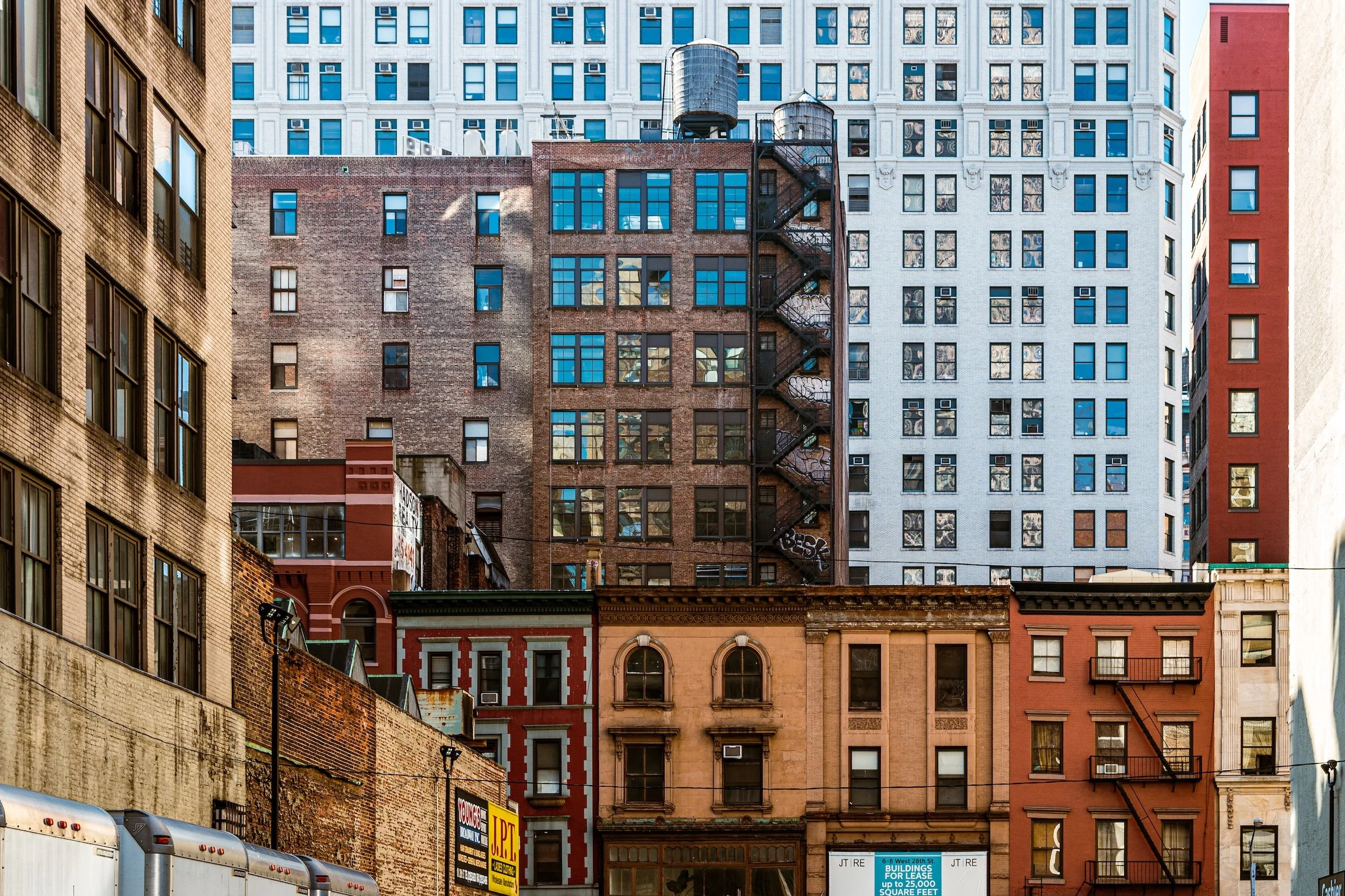
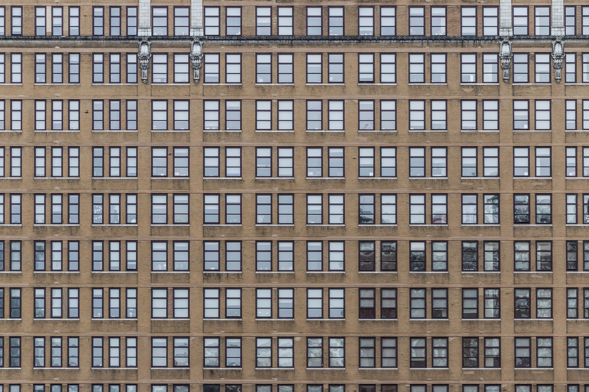
Garment / Fashion District - Manhattan - Windows
Window grids and repeating façade patterns create “depth by rhythm.” Planes become readable when repetition is consistent and edges stay clean.
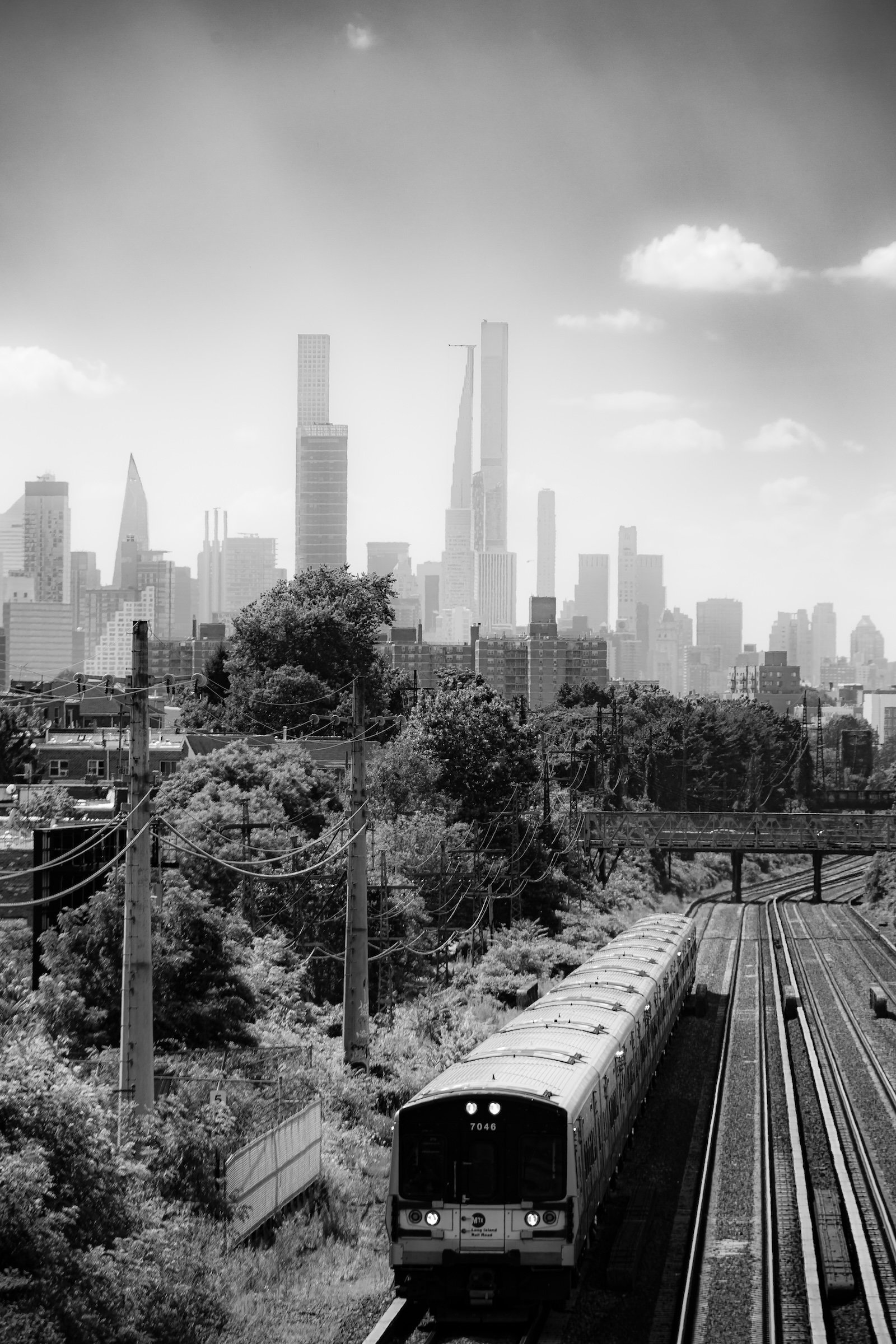
Middle Village - Queens - A Manhattan Mood
Distance makes the skyline feel like a final layer behind the nearer neighborhood textures. The success here is tonal separation: nearer plane darker/clearer, farther plane softer.
Explore Further