Geometric City
Definition:
Geometric City is the practice of photographing the built environment as shape-first design—where buildings become grids, diagonals, tessellations, curves, and repeating modules. The city stops being “a place” and starts behaving like a living diagram: planes of glass, stacked windows, rigid columns, spirals of steel, and improbable angles that turn perspective into pattern.
Usage:
You can use Geometric City to make an image feel precise, graphic, and intentional—even when the subject is everyday architecture. Geometry becomes your composition engine: it can create rhythm, tension, balance, and visual momentum. It’s especially powerful when you want a photograph to read like design rather than documentation.
Geometric City is also a way of seeing that travels well. It’s not tied to any one borough or skyline. Anywhere you have modern façades, older masonry grids, transit infrastructure, or strong structural repetition, geometry is waiting to be framed.
In Depth:
I think of Geometric City as urban pattern-hunting with compositional discipline. The goal isn’t just “cool architecture.” It’s finding moments where the city’s underlying logic becomes visible—where repetition, symmetry, contrast, and clean edges take over.
A few quick ways to spot it in the field:
Look for repetition first: window grids, panel seams, balcony stacks, brick courses, scaffolding, louvers.
Use angle as a tool: shift left/right, tilt up/down, rotate the camera—small moves can “lock” lines into alignment.
Decide what the frame is about: grid vs. diagonal vs. curve. Don’t let three competing geometries fight for control.
Consider B/W intentionally: when color distracts from structure, black-and-white turns geometry into the subject.
Below are ten launch examples that show Geometric City in different forms: tiled façades, vertical rhythm, diagonal tension, and circular/curved structures. Each image includes a brief note on what the geometry is doing in the frame—and why it’s a strong example of the concept.
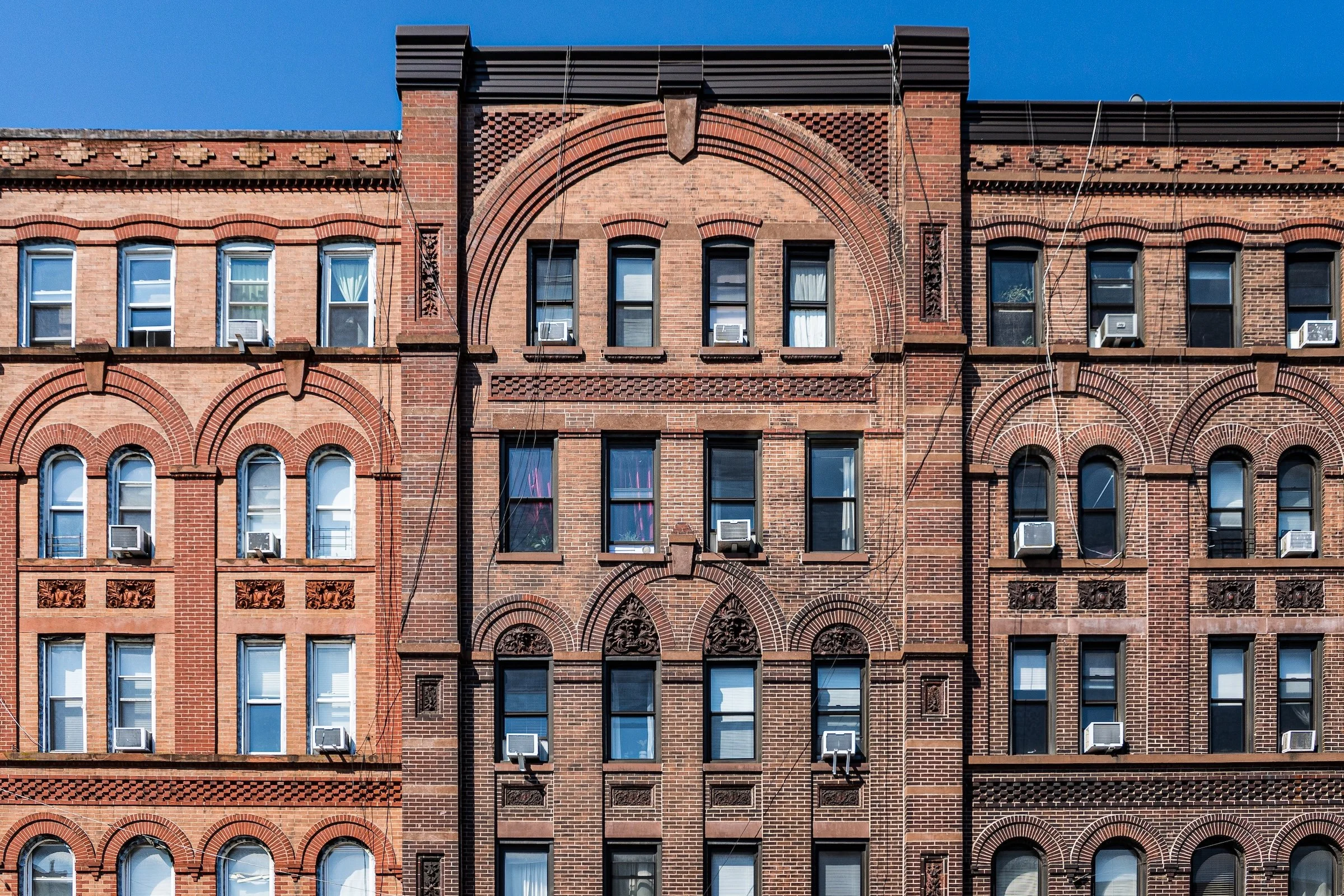
Tessellations and façade grids:
These frames treat the city like a patterned surface—tiles, panels, and repeated windows that create a clean, almost architectural “weave.”
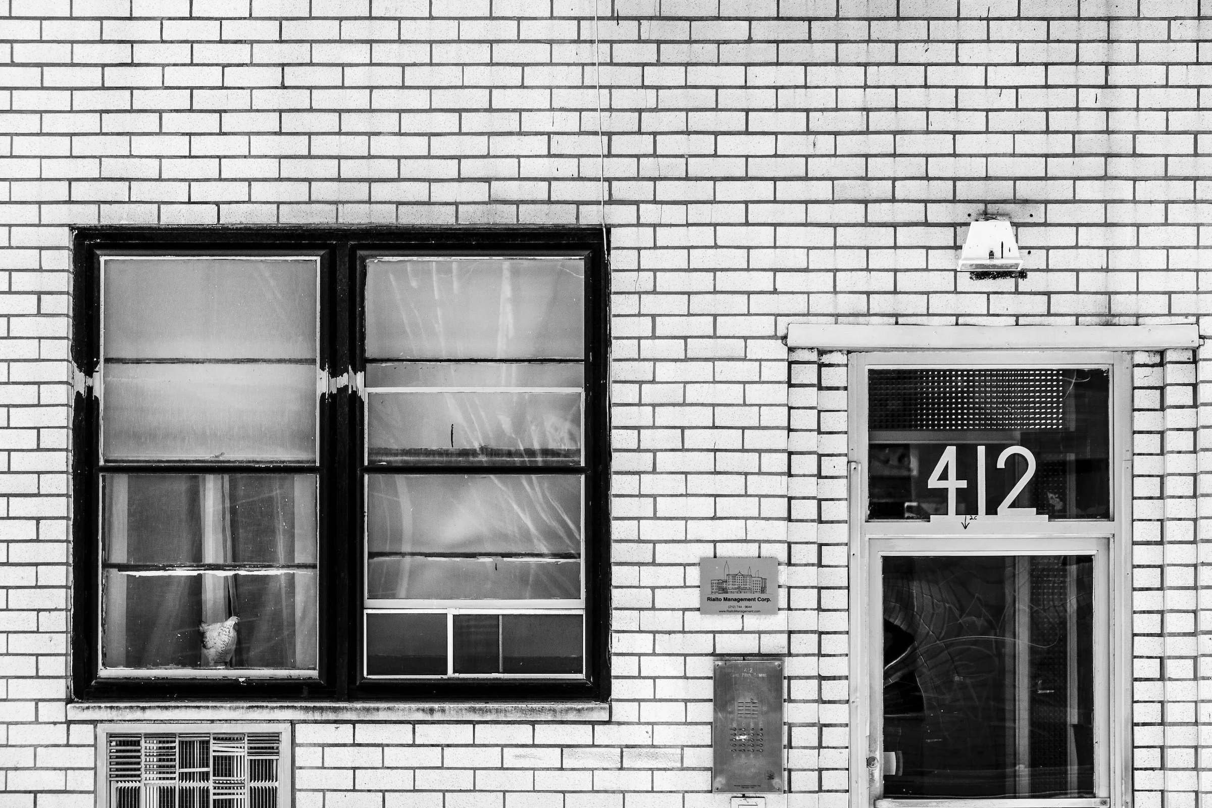
Upper East Side - Manhattan - Quadrilaterals
A façade grid becomes the subject outright: repeating rectangles, subtle tonal shifts, and a pattern that feels both orderly and alive. The trick is restraint—keep the frame clean so the geometry reads as deliberate design rather than background texture.
Midtown East - Manhattan - Park Avenue Geometry
This is geometry as rhythm: stacked verticals and repeating modules that pull the eye through the frame like a measured beat. When lines are this strong, tiny camera movements matter—square up your edges and let the repetition do the heavy lifting.
Lincoln Square - Manhattan - Via Purifico
Here the geometry feels almost architectural calligraphy: crisp angles and repeating structural elements that make the building read like a constructed drawing. This is a great place for black-and-white, because it emphasizes the logic of the forms over the distraction of color.
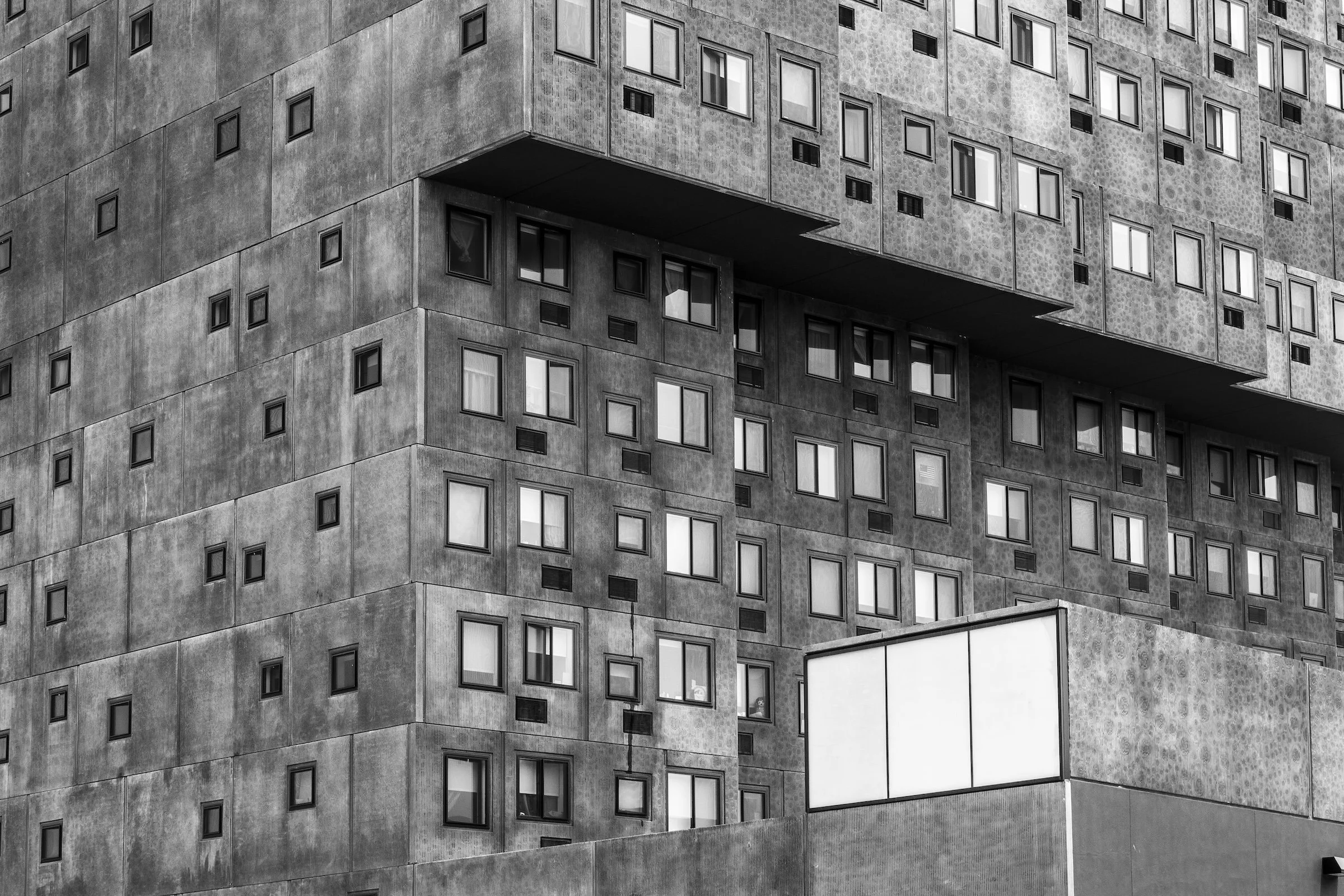
Sugar Hill - Manhattan - The Gray Building
A perfect example of how “simple” can be powerful: tight repetition, strong tonal blocks, and an unapologetically structural look. When a building has this kind of modular muscle, composition is about choosing the cleanest crop and letting the pattern hold the frame.
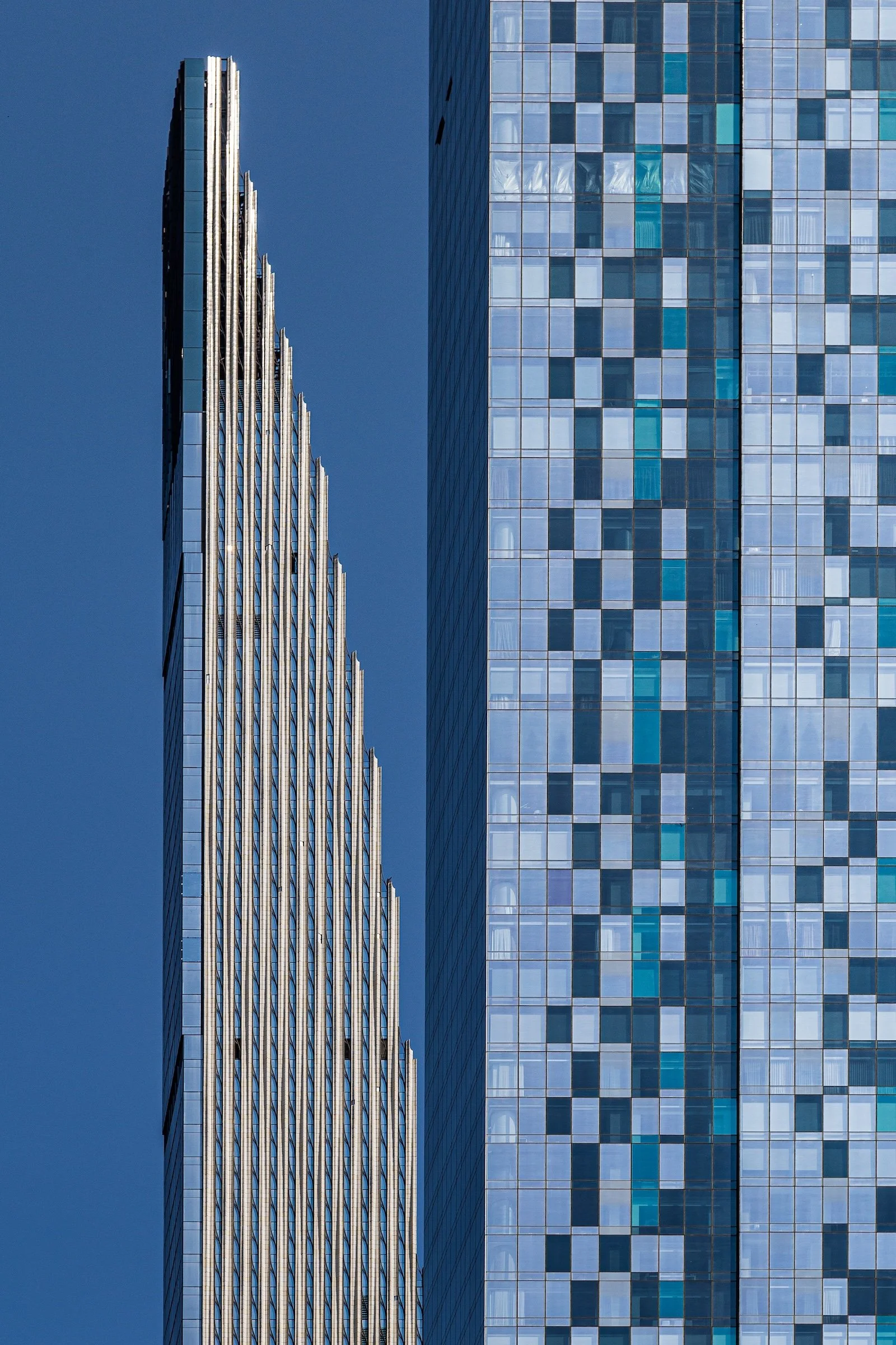
Vertical rhythm:
These images lean into the city’s “upward” language—columns, stacks, and narrow repetitions that create height and tension.
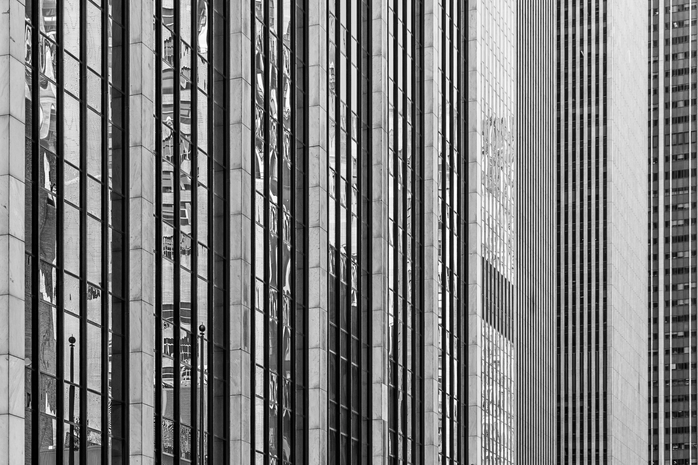
Vertical lines become a kind of visual gravity. The frame feels tall even without showing the full building, because the repetition implies infinite continuation. Keep your perspective steady and let the lines form a controlled “ladder” through the image.
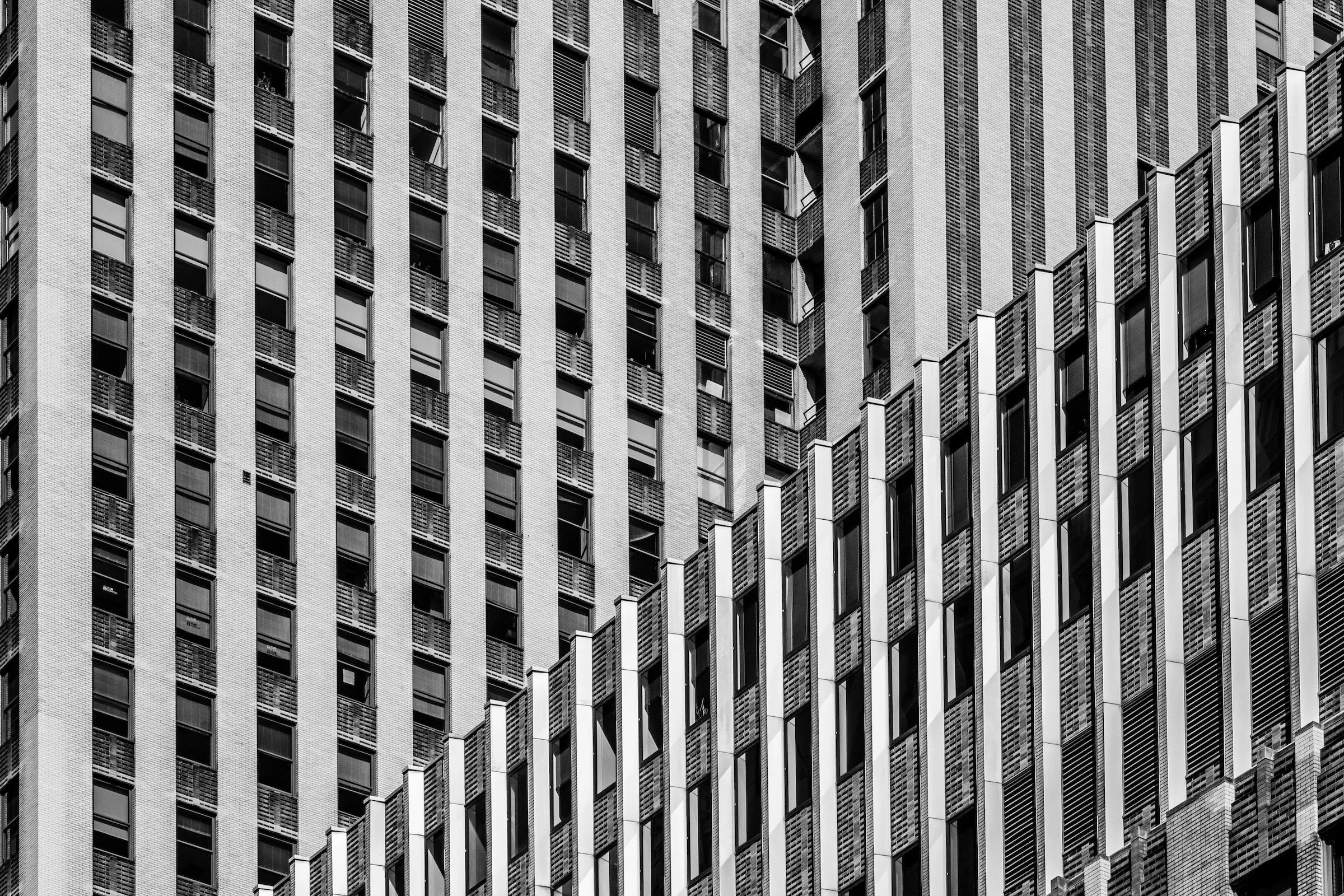
Murray Hill - Manhattan - Daily News Building
This is vertical geometry with personality—clean structure, iconic repetition, and a façade that feels engineered to be read as pattern. With subjects like this, your job is to simplify: isolate the geometry that defines the building and remove anything that breaks the rhythm.
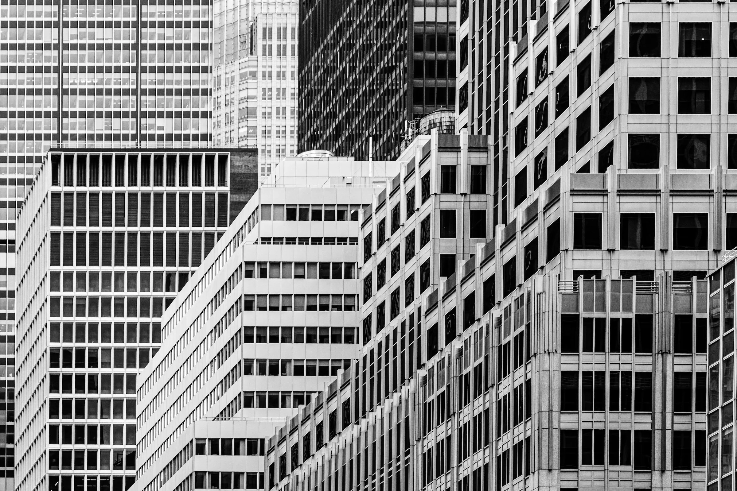
Diagonals, triangles, and tension:
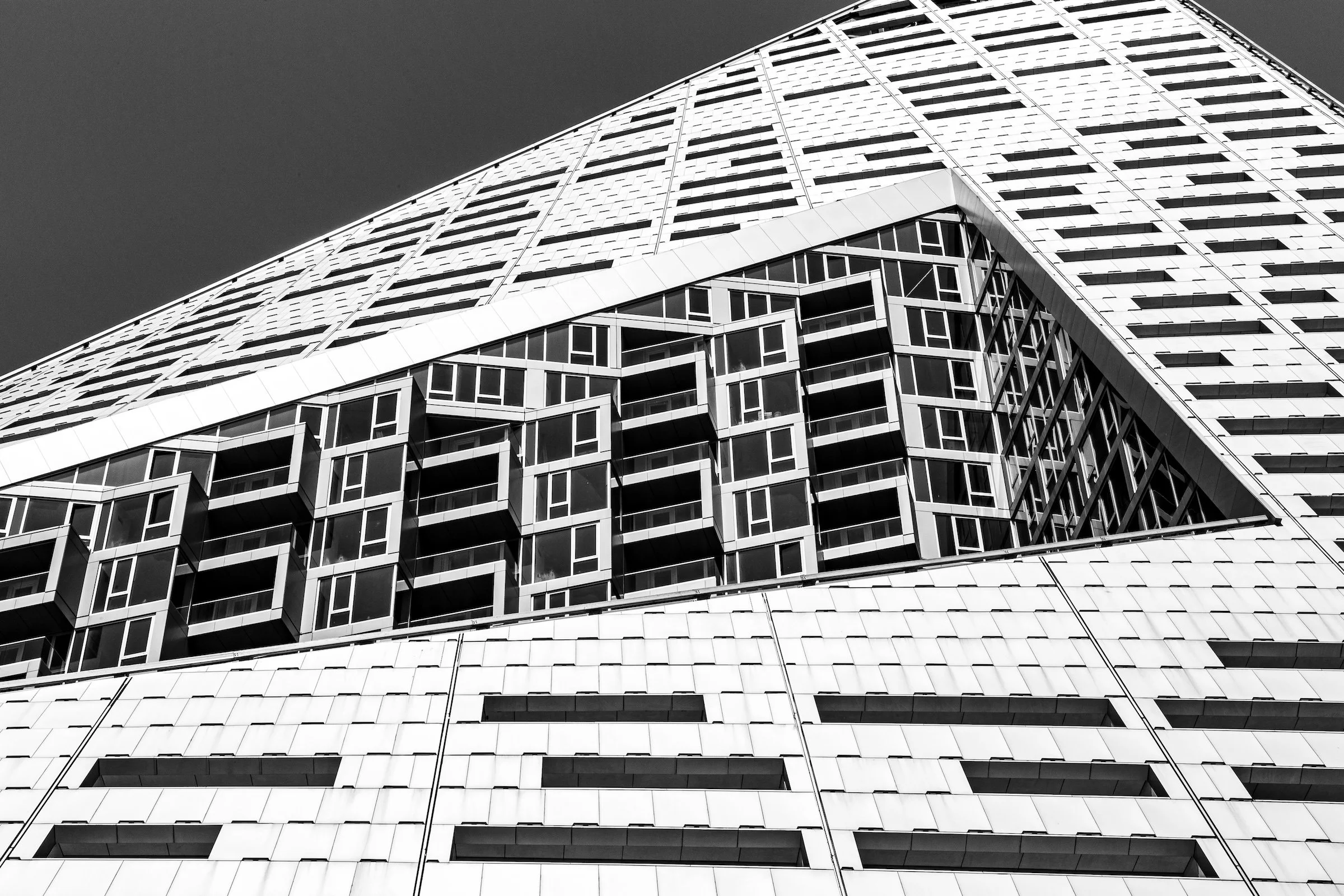
This is geometry with attitude—angles that slice the frame, create momentum, and introduce a controlled sense of instability.
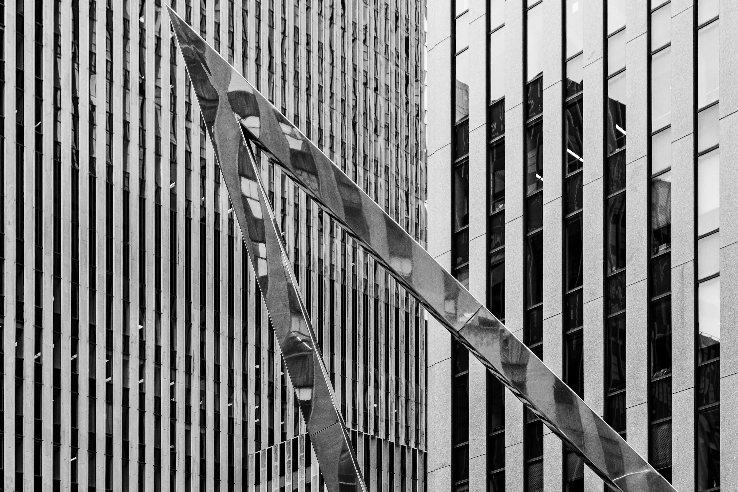
Two different geometric languages in one frame: one tower reads as rigid repetition, the other as a more complex vertical presence. The interest comes from contrast—a dialogue between forms. Compose so the relationship is clear (either opposition or alignment), not accidental overlap.
Curves, circles, and spatial distortion:
These images show the city stepping out of straight-line logic—where architecture becomes vortex, dome, arc, and optical illusion.
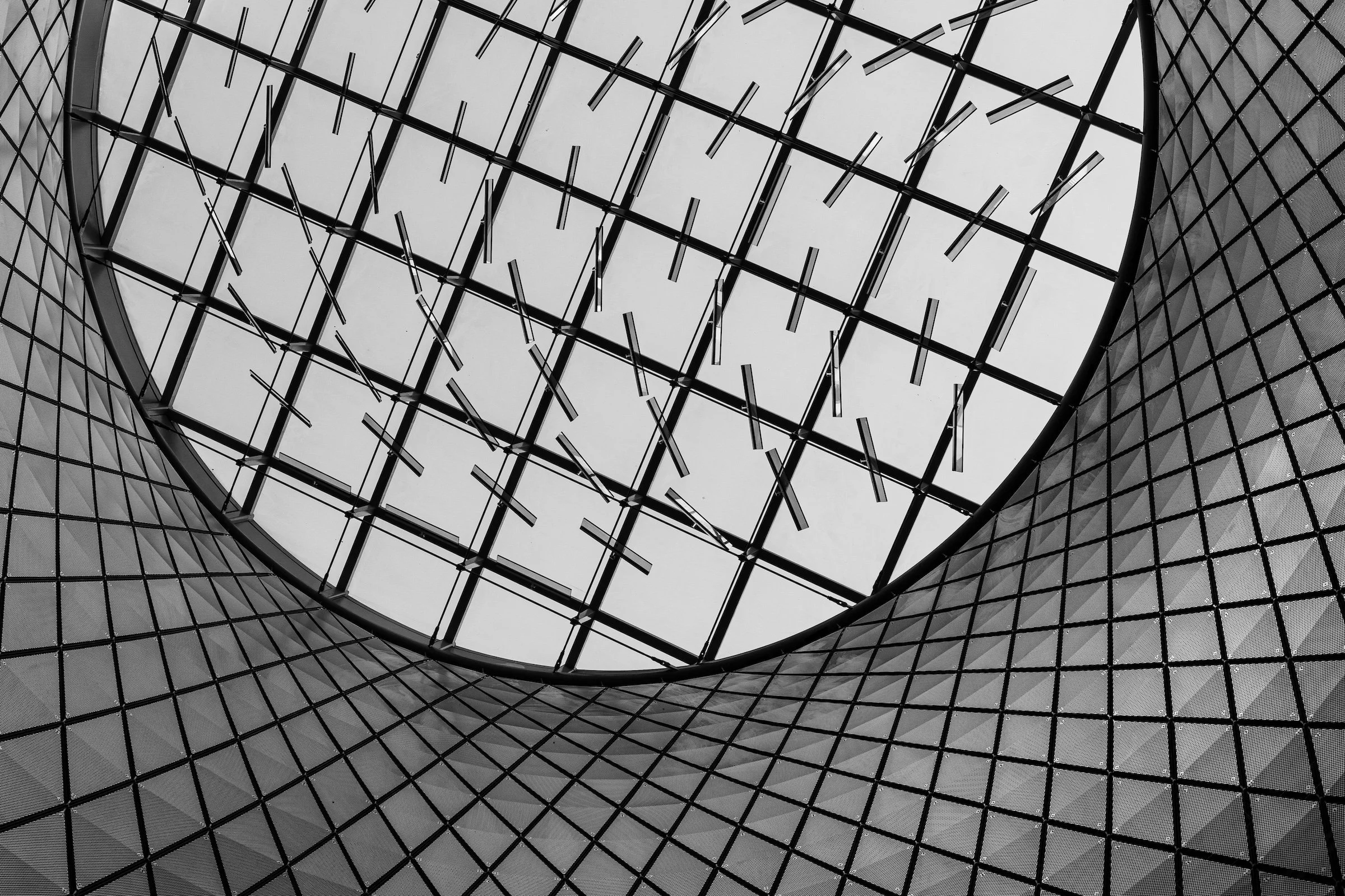
Financial District - Manhattan - Vortex
A circular structure turns the frame into a gravitational field. Curves pull the viewer inward, and the geometry feels almost kinetic—as if the building is spinning. With shapes like this, center and symmetry can be your friend, but only if you commit fully.
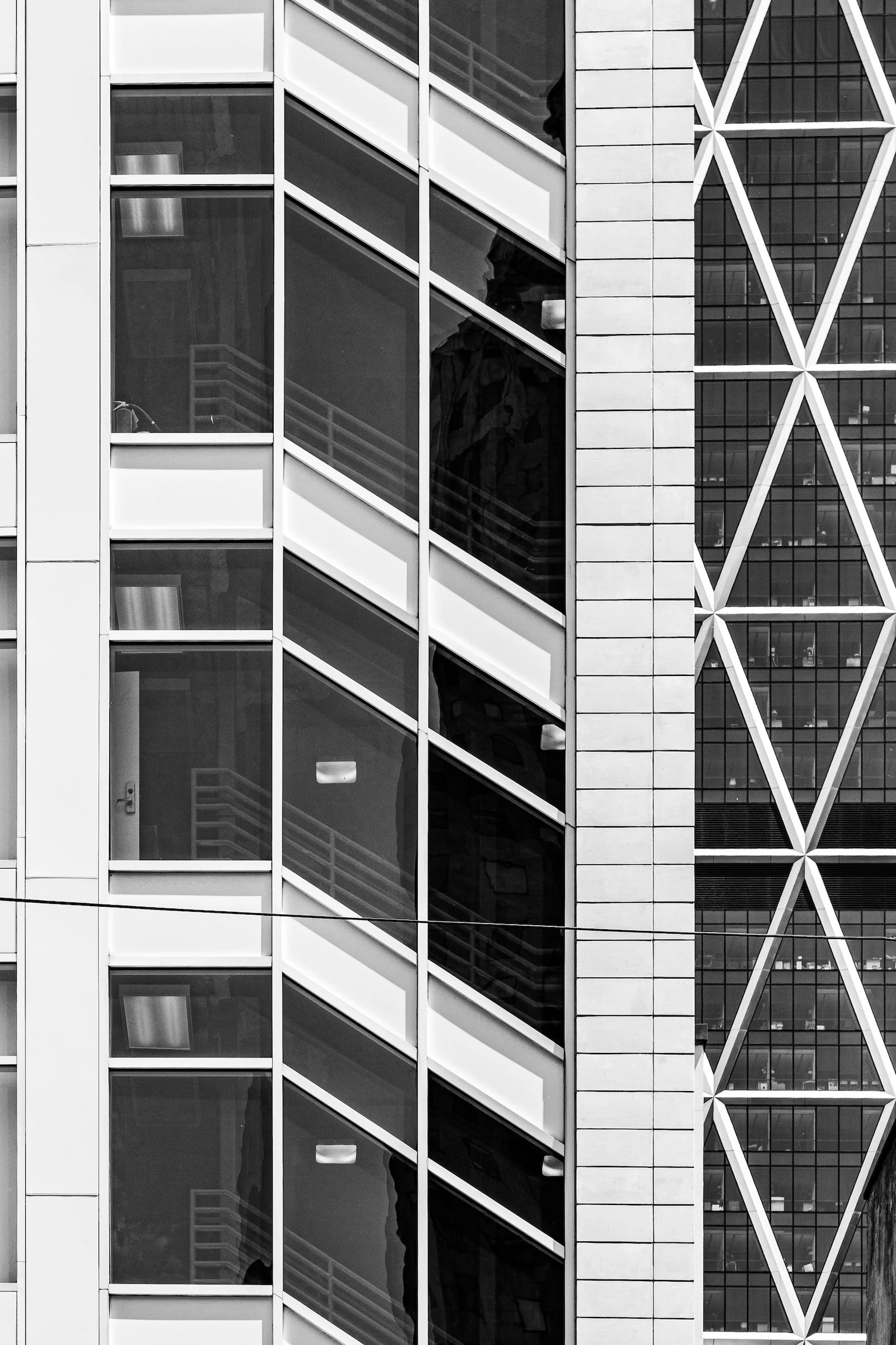
Hell's Kitchen (Clinton) - Manhattan - Angles and Lines
A beautiful hybrid of curve and grid: the structure bends while the internal pattern stays disciplined. This is one of the most satisfying geometry moments—when the city shows both control (repetition) and motion (curvature) in the same breath.
Explore Further