Upright Alignment
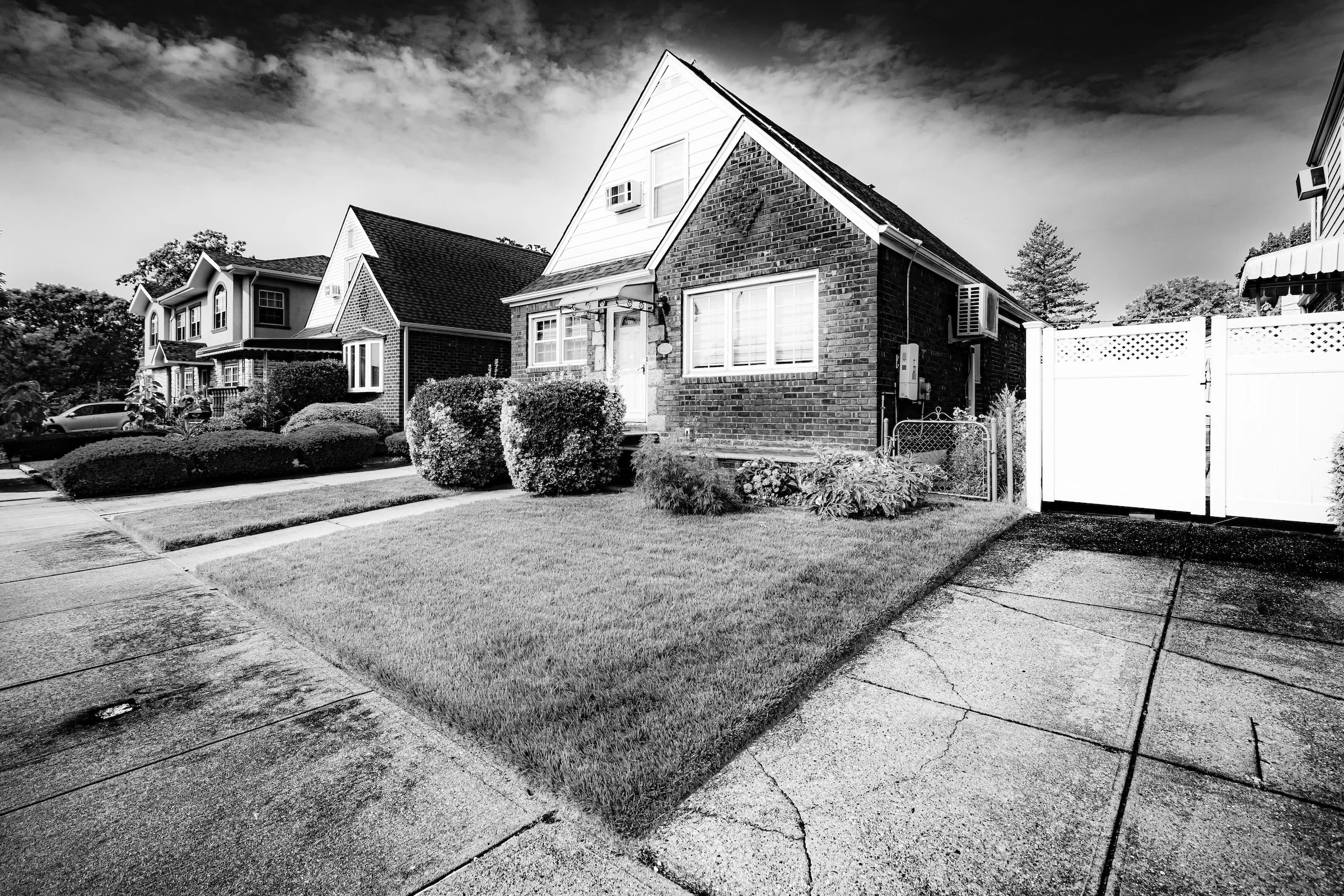
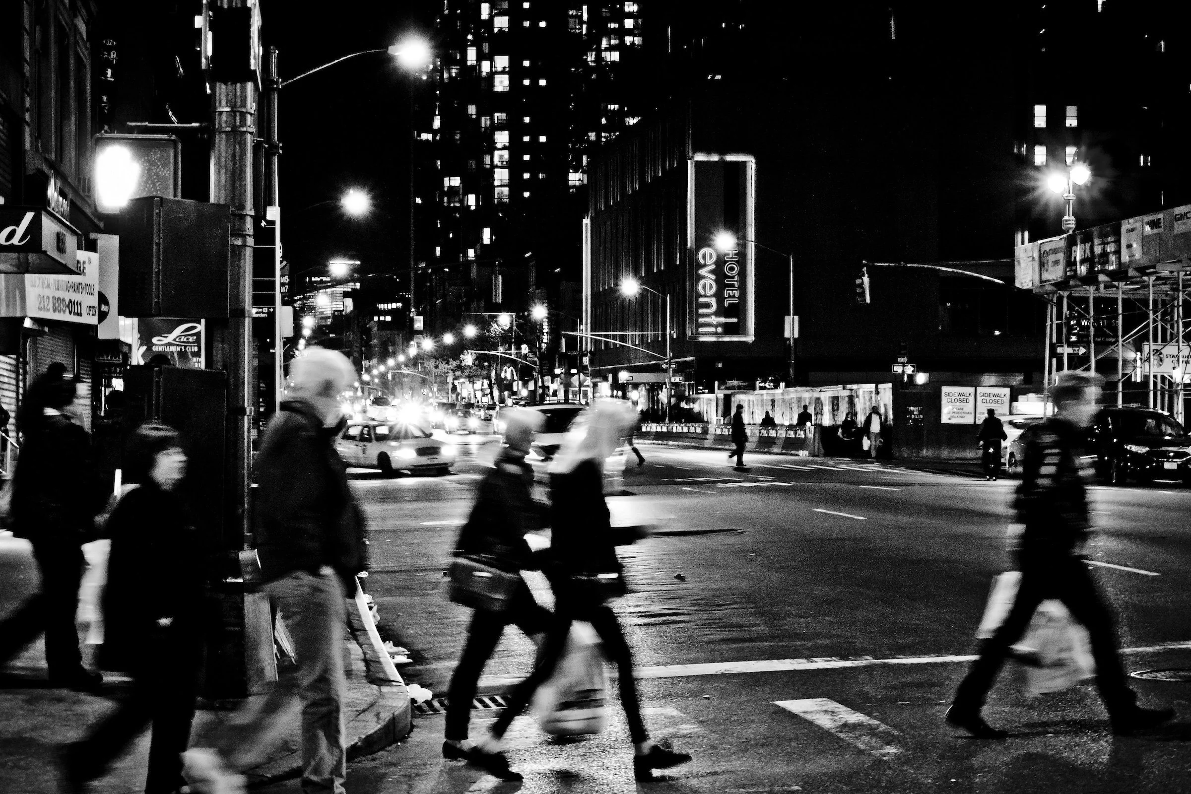
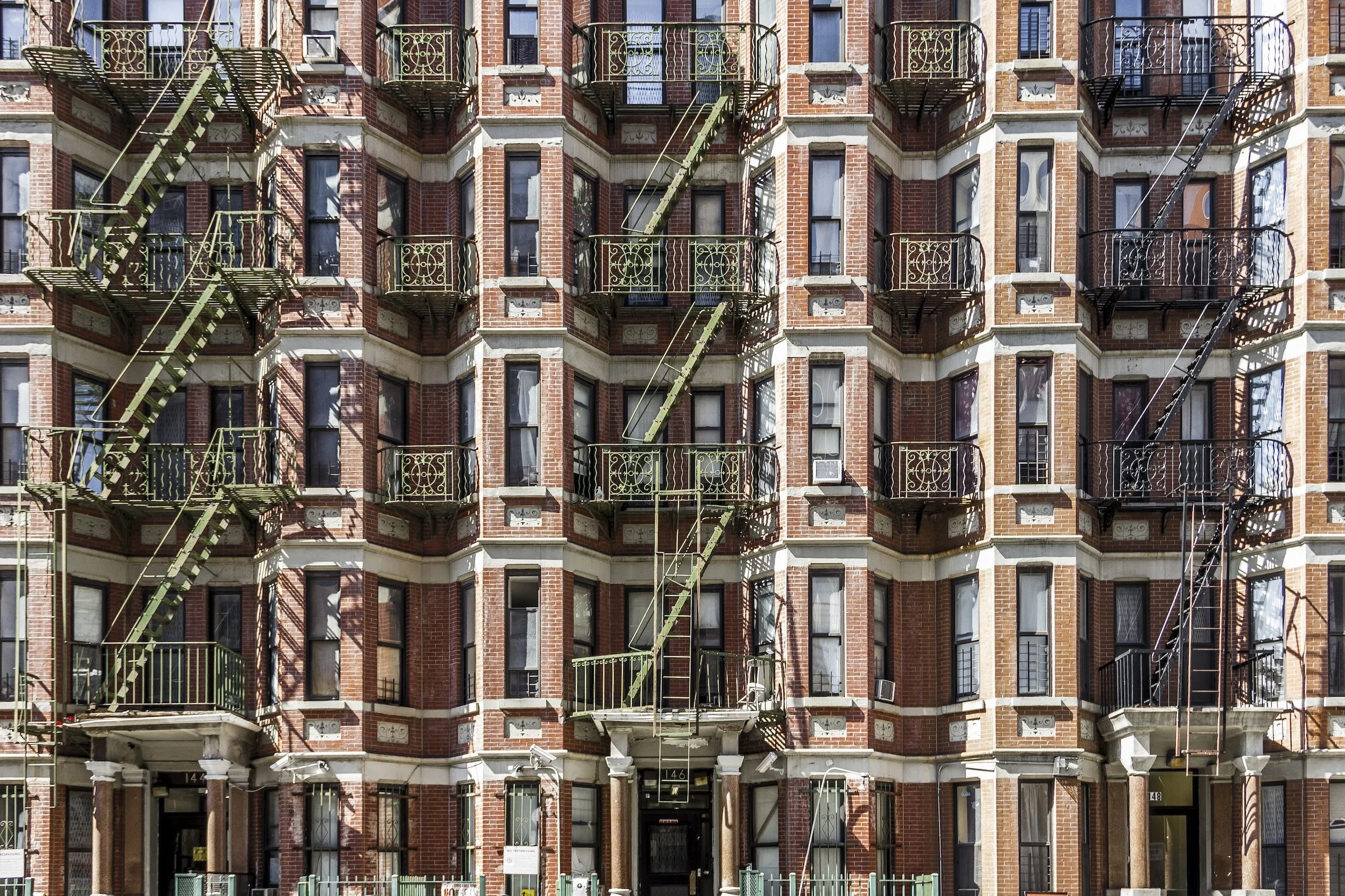
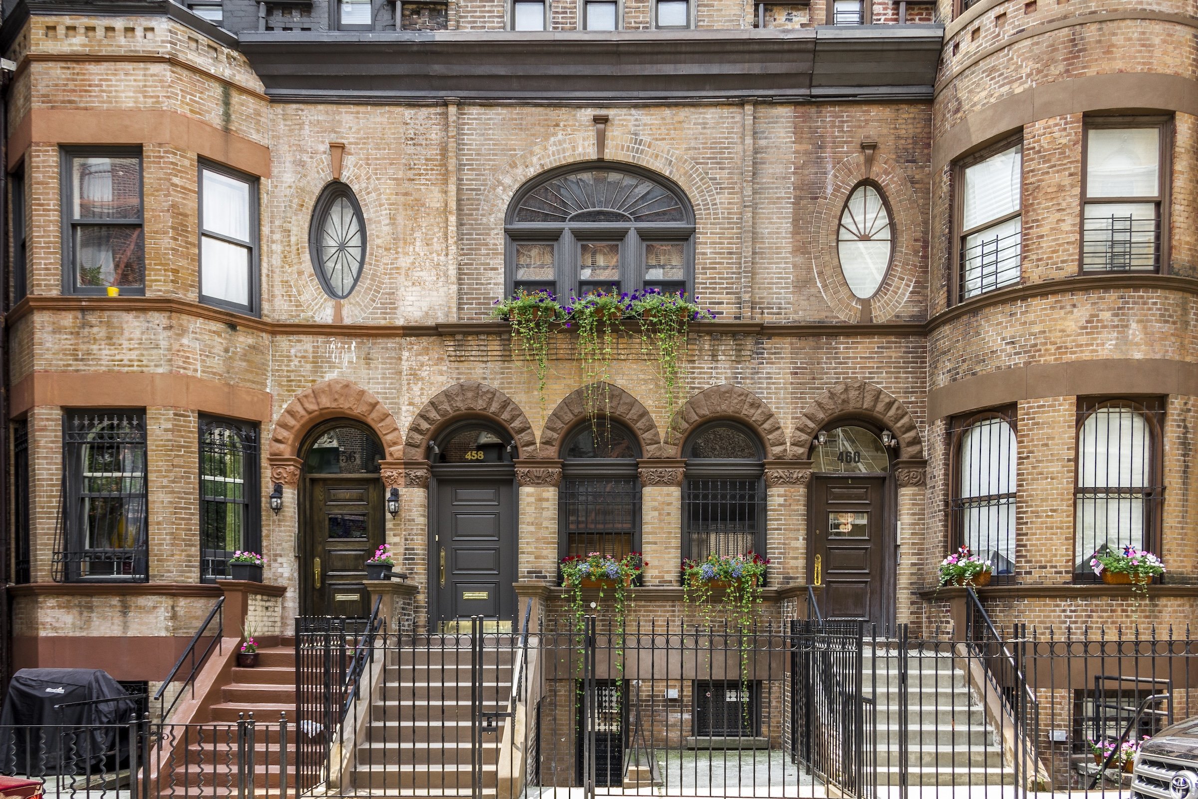
Greenpoint - Brooklyn - Faces
Definition:
Upright Alignment is the practice of photographing architecture so it stands straight—verticals stay vertical, horizons stay level, and the building reads like a composed portrait rather than a collapsing snapshot. It’s the “square-up” instinct: the frame becomes an act of respect for structure.
Usage:
Use Upright Alignment when you want the city to feel stable, intentional, and designed. This approach is especially powerful for:
facade portraits (one building as the subject),
streetscapes with repeating windows and bays,
ornament and symmetry that falls apart if verticals tilt,
any scene where you want clarity over drama.
Upright Alignment is not about making images feel sterile—it’s about giving architecture its proper posture, so details, pattern, and rhythm can speak without visual wobble.
In Depth:
Most of the time, handheld street photography produces a subtle “lean”—buildings taper inward, vertical lines slant, and the whole scene feels a little tipsy. Sometimes that’s fine, even expressive. Upright Alignment is what happens when you choose the opposite: you decide that the building’s geometry is the story, and you protect that geometry.
I treat Upright Alignment as a Lexicon term because it’s a repeatable field behavior—almost a switch you flip in your brain:
Find the true vertical. Door frames, window mullions, corner edges, pilasters—pick one and honor it.
Commit to a frontal stance. When possible, stand parallel to the facade. Even a small shift cleans up perspective chaos.
Let symmetry work. Upright frames love centered anchors, mirrored windows, and balanced weight.
Correct gently, not aggressively. The goal is “standing straight,” not “plastic perfection.”
Use tilt intentionally. If you do tilt, it should be a choice with a reason—not an accident.
The payoff is huge: ornament becomes legible, repetition becomes musical, and the viewer reads the image as an architectural portrait—calm, confident, and precise.
The ten examples below show Upright Alignment in different modes: strict facade portraits, rhythmic grids, and arch-driven compositions where vertical posture turns complexity into clarity.
Facade Portraits (Buildings as Faces)
These images treat a building like a subject with personality—centered, squared, and presented with the calm authority of a portrait.
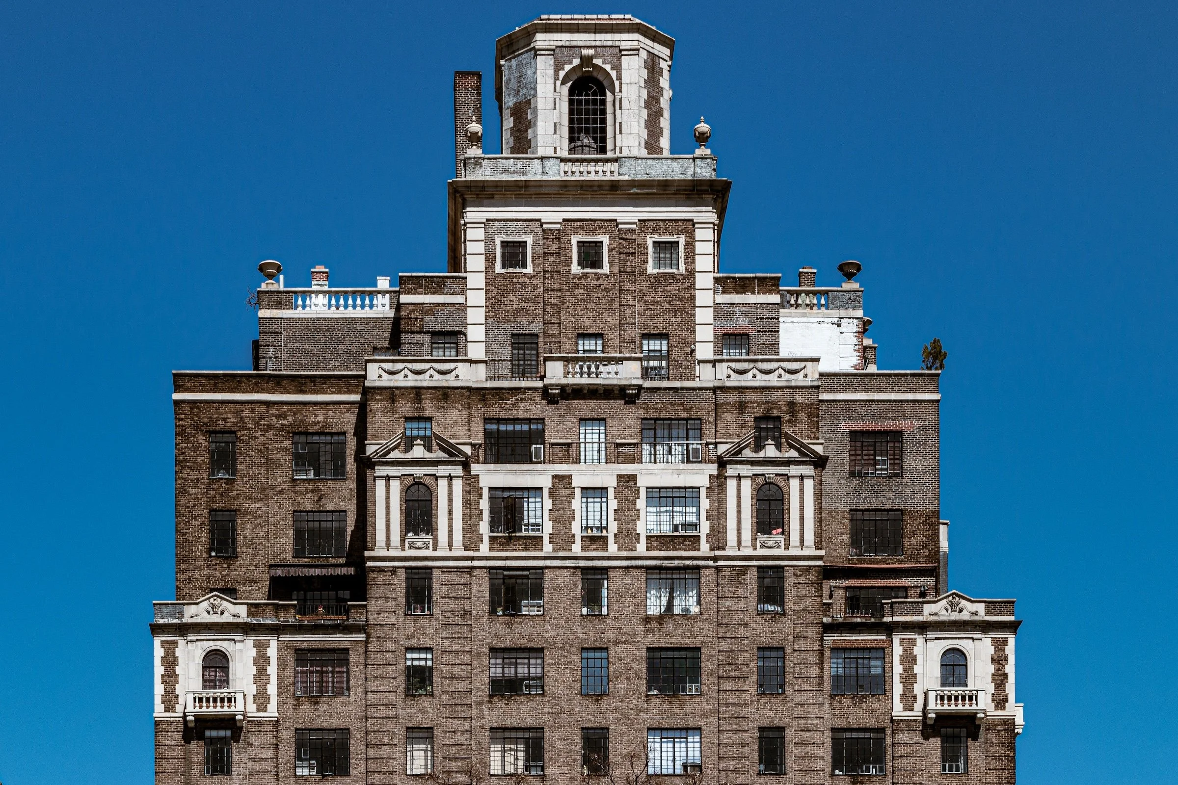
West Village - Manhattan - 1 Christopher Street
A stacked composition that depends on upright discipline: the building rises like a totem against the sky. The symmetry and tiered setbacks land cleanly because the verticals hold steady all the way up.
Vertical Rhythm (Grids, Bays, and Repetition)
These frames lean into repeated vertical units—windows, bays, pilasters—where alignment turns the city into organized cadence.
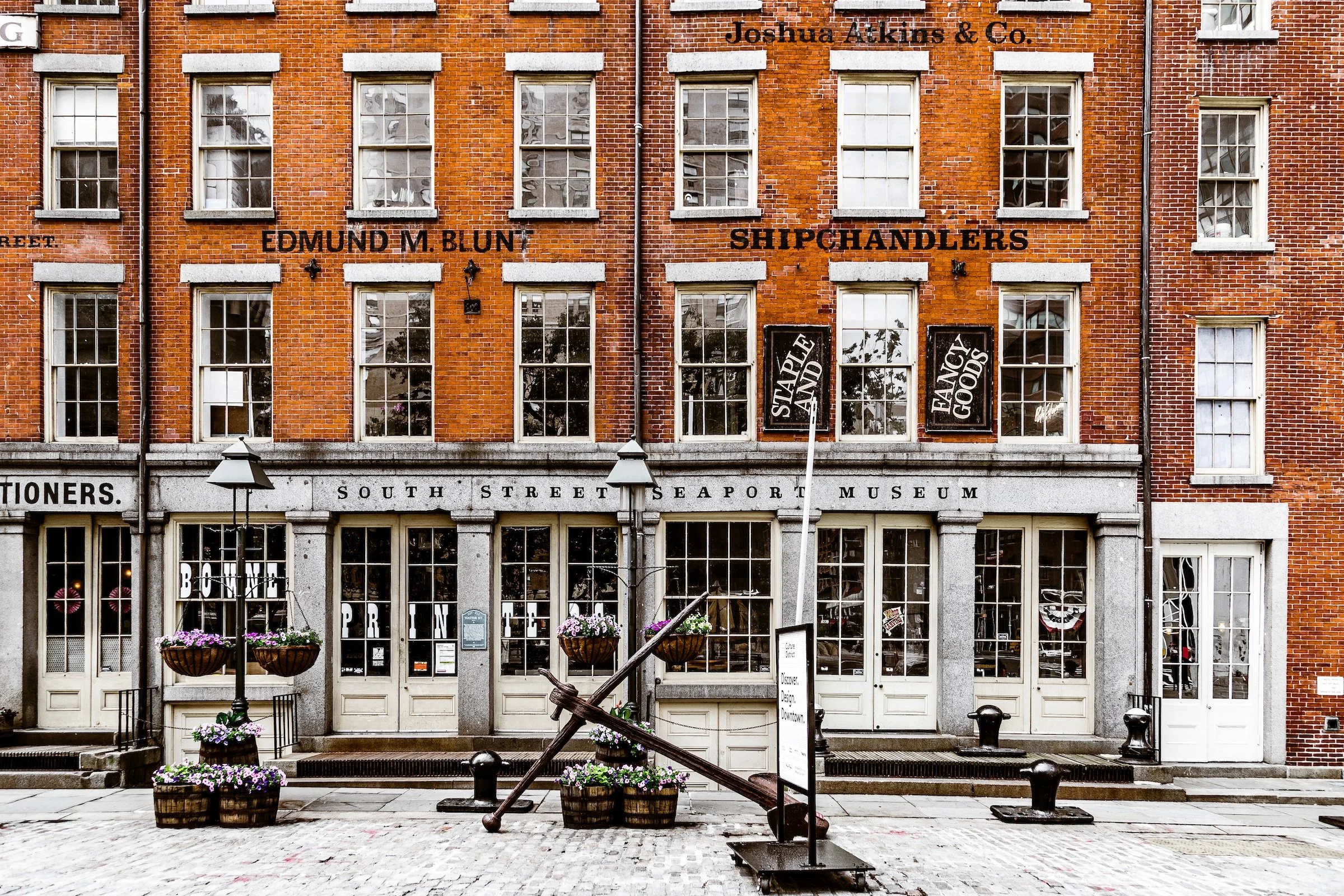
South Street Seaport - Manhattan - Museum
The storefront windows march across the facade in steady intervals. Keeping the frame squared makes the entire building read like a curated display—almost like the architecture is presenting itself as an exhibit.
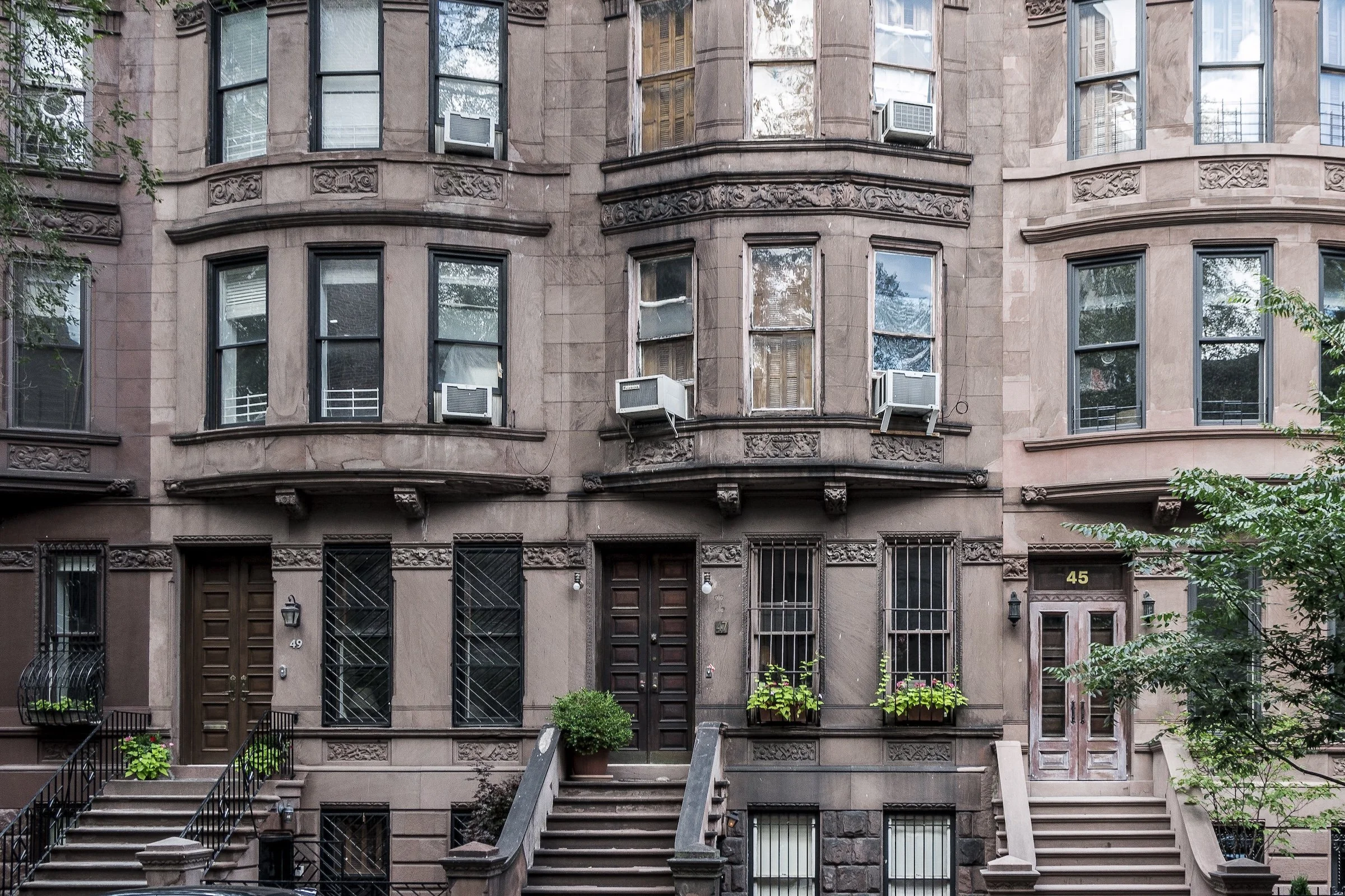
Upper West Side - Manhattan - Brownstones
Brownstones live on vertical repetition: stoops, doors, window stacks, and railings. Upright alignment preserves the neighborhood’s “orderly elegance,” letting the steps and facade details act like a repeating musical phrase.
Arches & Classical Order (Curves That Need Straight Lines)
Arches are curves, but they depend on straight posture. When the frame is upright, arches feel monumental and intentional rather than warped.
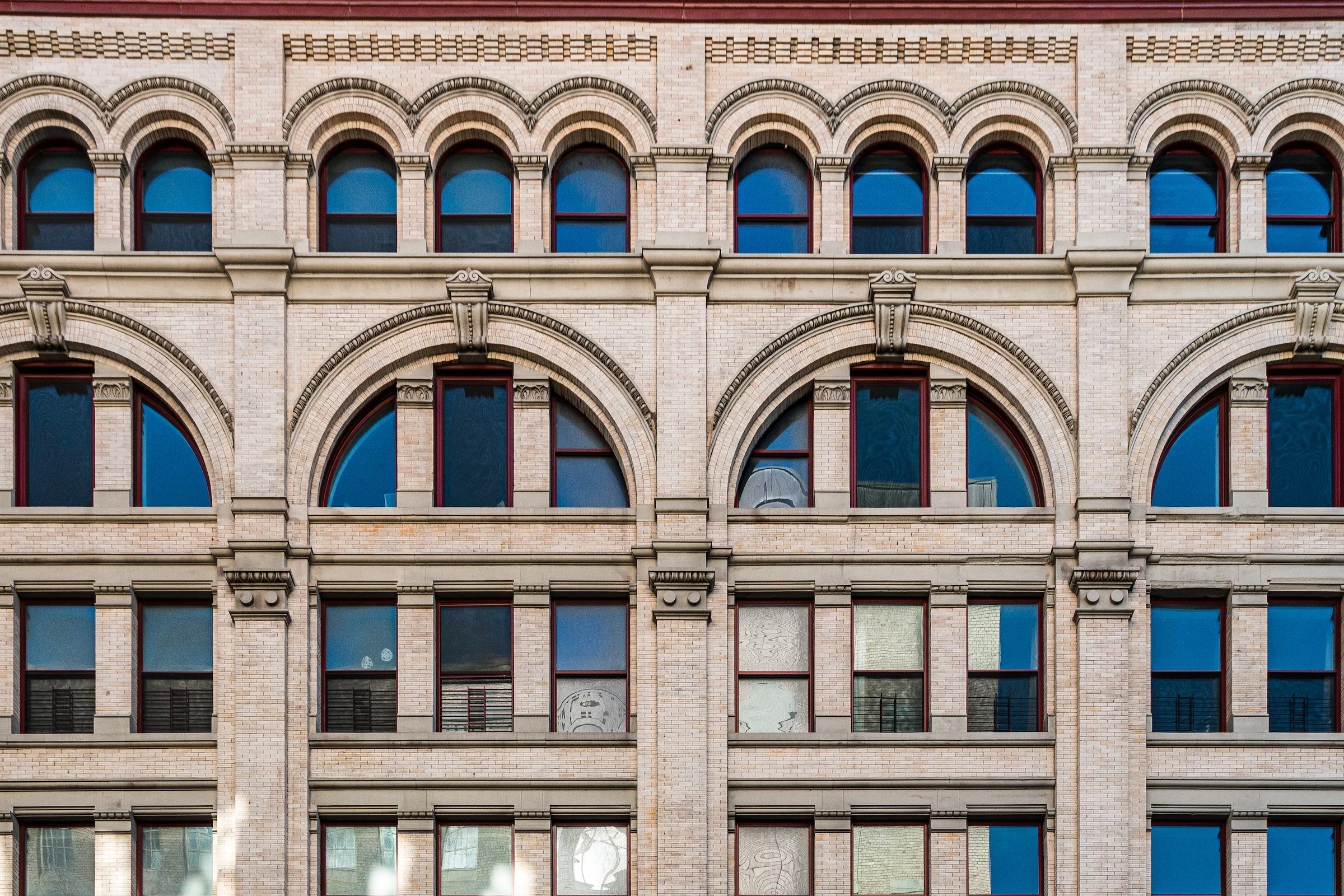
Hudson Square - Manhattan - Arches
A masterclass in architectural grammar: repeated arches across multiple stories. Upright alignment makes the repetition feel ceremonial—like a colonnade—so the eye reads the building as a coherent system.
Sugar Hill - Manhattan - Classic Sugar Hill
Curved frontage, arched openings, and soft masonry tones—this is “elegance through structure.” The frame’s upright discipline allows the curves to feel graceful rather than distorted.
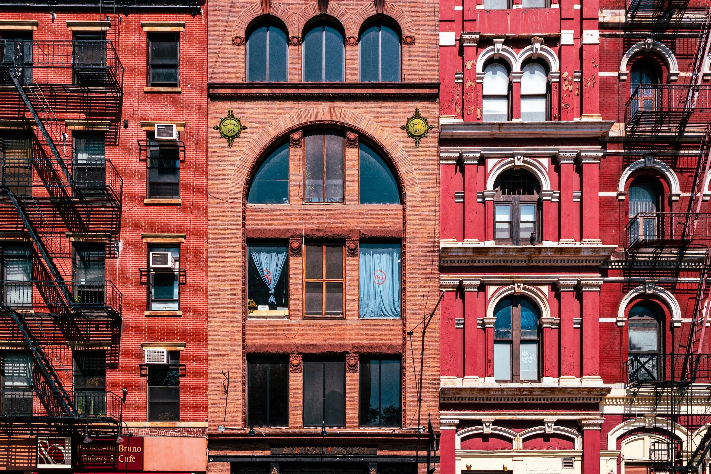
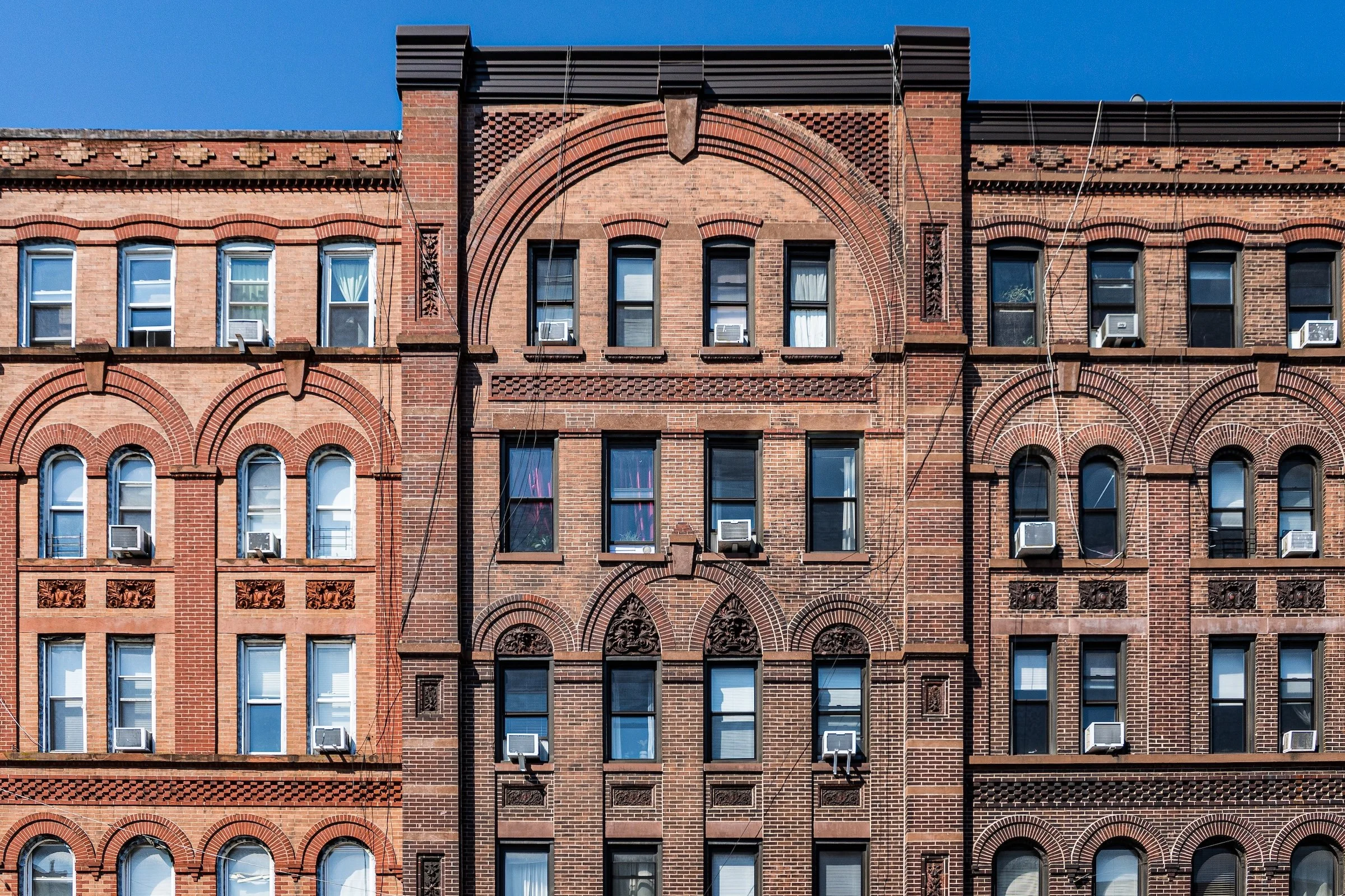
Greenwich Village - Manhattan - 1858 & 1891
Two neighboring facades with distinct personalities—stitched together by shared vertical logic. Upright alignment keeps the conversation legible: arches, window stacks, and decorative differences read clearly without the buildings “arguing” through perspective slant.
Ornament & Detail Bands (When the Building Becomes a Blueprint)
These images emphasize the crafted middle zones of facades—cornices, friezes, banding—where straight posture turns detail into design.
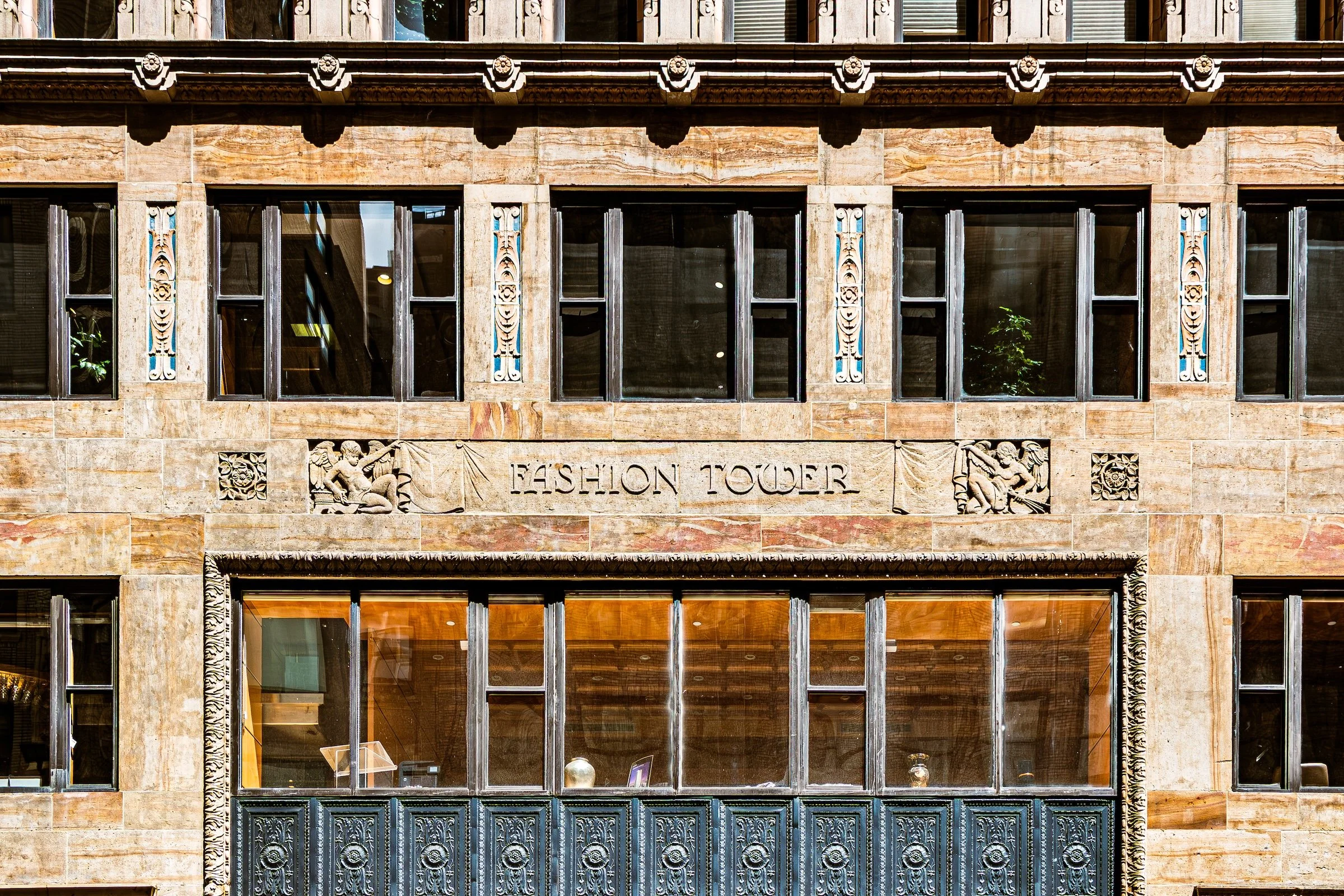
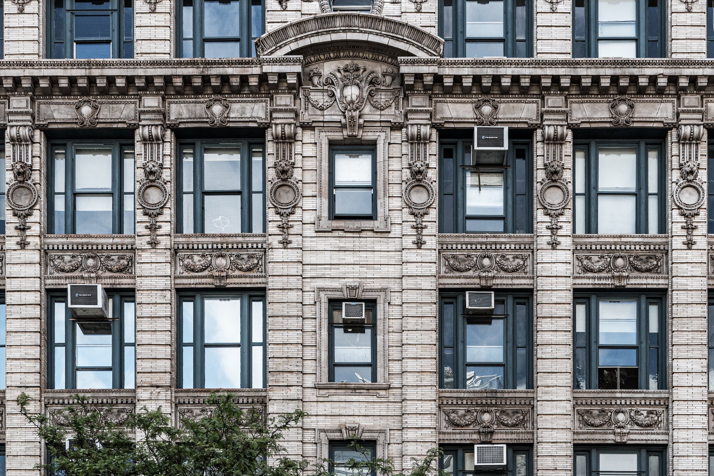
Garment / Fashion District - Manhattan - Fashion Tower
A tight architectural excerpt where horizontal and vertical elements need to stay disciplined. Upright alignment keeps the window grid and decorative banding clean, so the facade reads like a deliberate engraving.
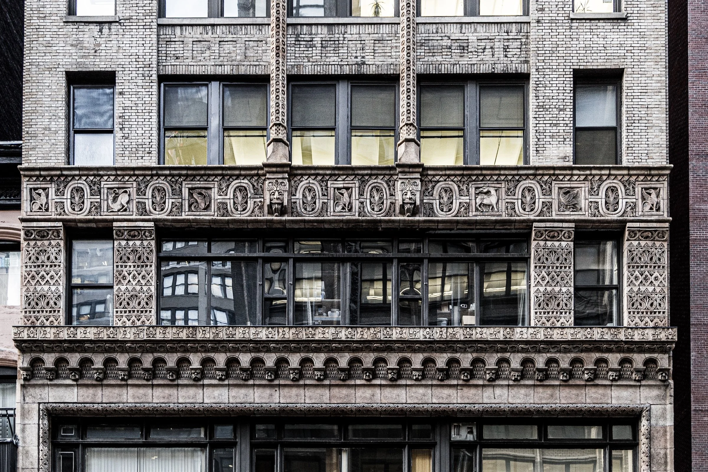
Garment / Fashion District - Manhattan - W38 Neo-Classicism
Neo-classical detail thrives on proportion. With the frame held upright, the ornament feels balanced and intentional, and the viewer can appreciate the craftsmanship without the subtle “lean” that makes classical buildings feel off-kilter.
Explore Further