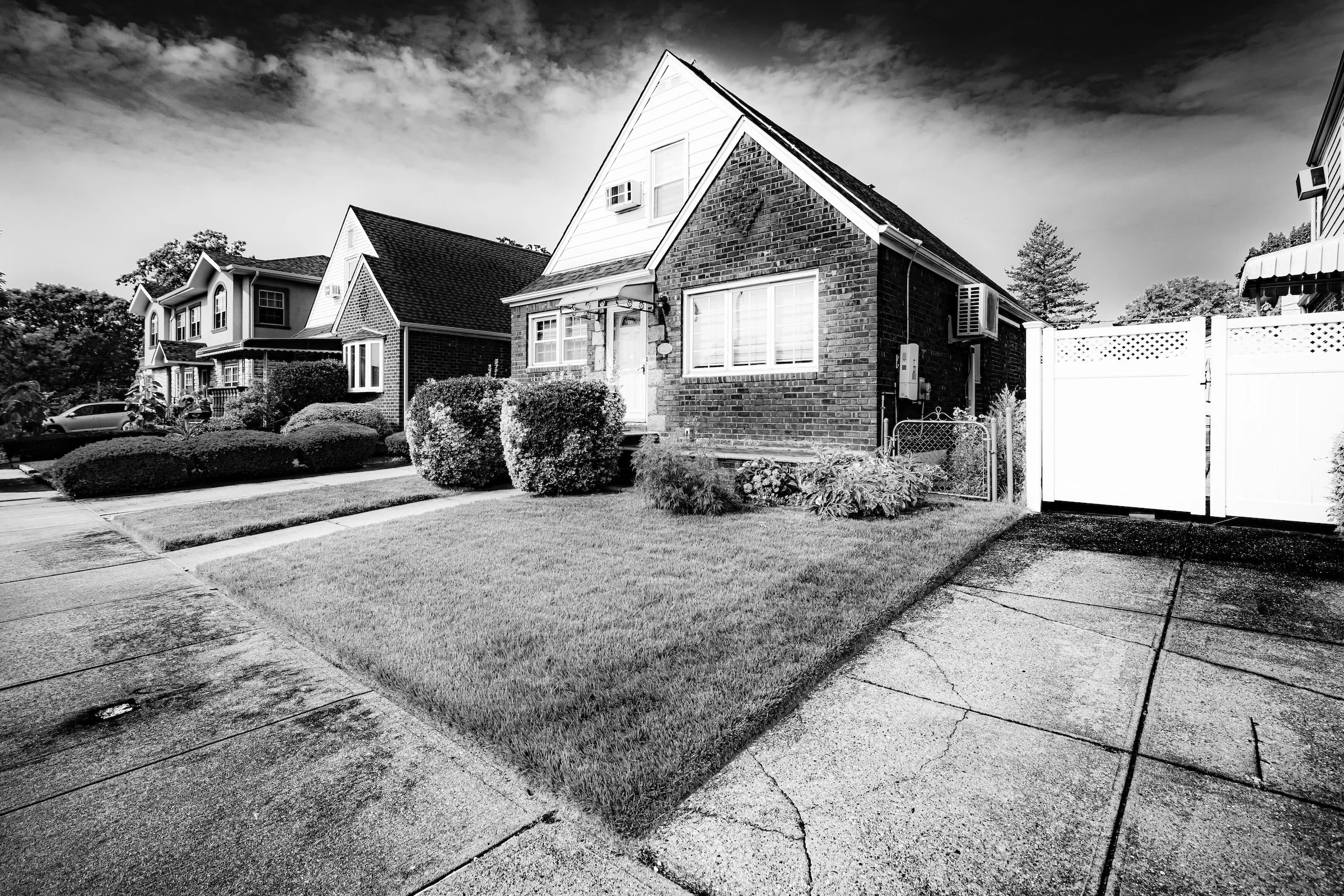
Abstractions
West Village — Manhattan — Color Under the Paint
Definition:
Abstractions turns the city into pure visual language—shape, color, texture, rhythm—so the image can stand on its own even if the viewer never identifies the literal subject.
Usage:
Abstractions are often found at the edges of attention: a peeling wall, a weathered window frame, a seam between materials, a patch of paint exposing brick beneath. The goal is not to “capture a thing,” but to build a frame where composition is carried by structure—blocks of color, graphic divisions, repeating textures, and deliberate cropping.
This strategy is especially useful inside a larger shoot because it changes pace. Abstractions act like punctuation: they reset the viewer’s eye, introduce visual rhythm, and turn documentation into design.
In Depth:
I use Abstractions as a Lexicon term to name a specific shift in intent: the moment when the city stops being “a place” and becomes visual material. This isn’t just “a close-up,” and it isn’t simply “texture.” Abstractions are images where shape, color, and structure carry the photograph so completely that the literal subject becomes optional. If the viewer can’t immediately identify what they’re looking at—but the image still feels composed and satisfying—that’s usually the territory.
Abstractions are useful because they let me photograph the city the way it often feels while walking: not as a sequence of landmarks, but as a constant stream of patterns and fragments—painted doors, chipped stone, steel seams, brick fields, accidental color-blocks. In a series, abstractions become connective tissue. They create cohesion across neighborhoods, seasons, and even countries, because the language of shape and surface travels better than any single subject.
They’re also wonderfully portable. Any place with built surfaces contains abstractions, and once you’ve trained yourself to see them, they show up everywhere. That’s why they belong in the Photographic Lexicon: this is a repeatable way of seeing, not a one-off trick.
A few quick ways to spot them in the field:
Stop looking at “things” and start scanning across surfaces for geometry—seams, grids, arcs, and color fields.
Move closer than feels reasonable, then crop further. Abstractions often require ruthless simplification.
Look for clean divisions: window frames, mortar lines, edges where materials meet.
Use sidelight when you want relief and grit; use flatter light when you want pure color and graphic shape.
Ask one question: if I removed context, would this still work as an image?
Below are ten launch examples that show Abstractions in different forms: color-block fragments, weathered surfaces, graphic seams, and compositions where the city becomes a kind of accidental painting. Each image includes a brief note on what the abstraction is doing in the frame, and why I consider it a strong example of the concept.
Color-Block Abstractions (The City as Painting)
These are the frames where color and division do most of the work—like found murals made of brick, plaster, and time.
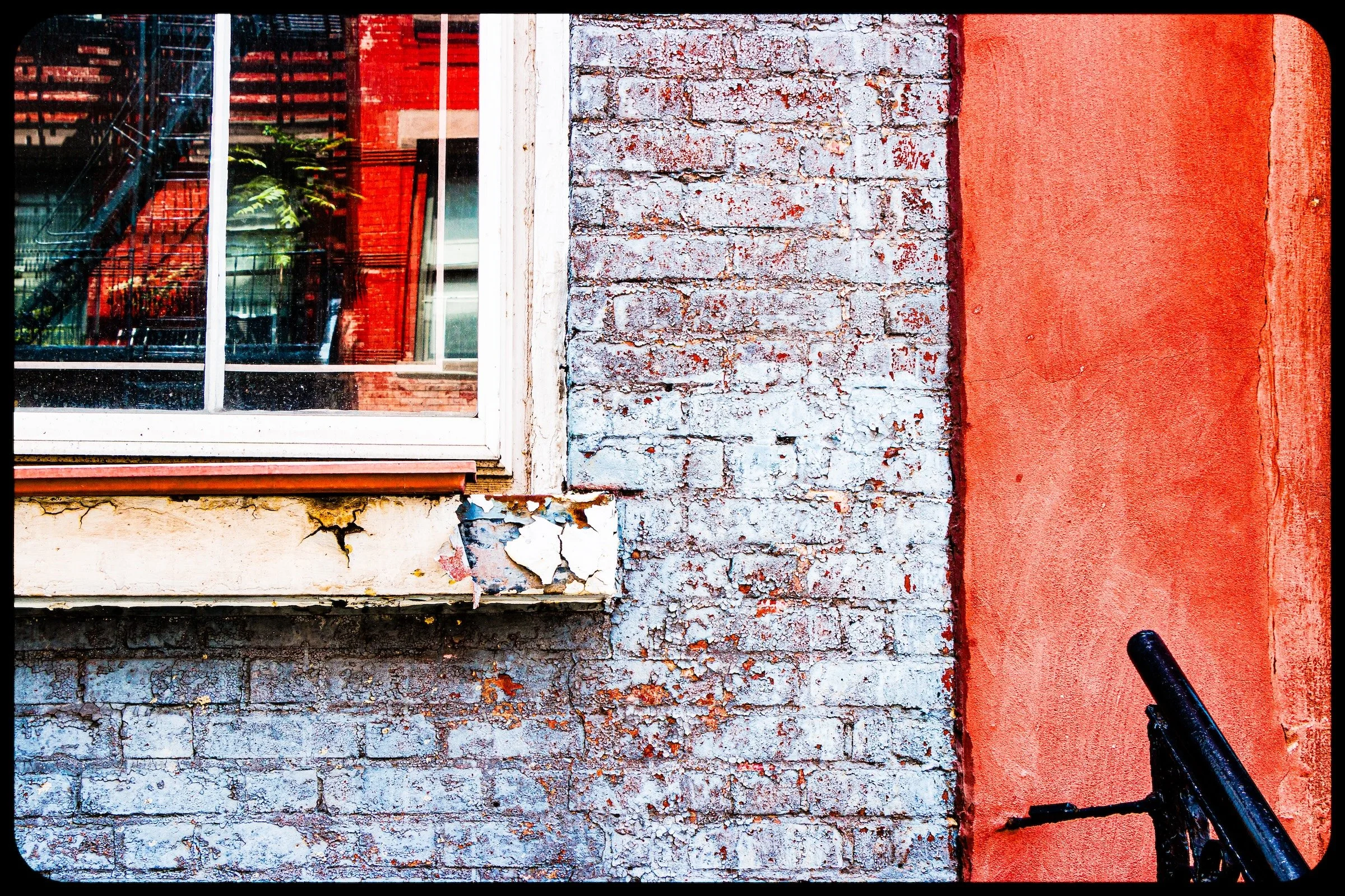
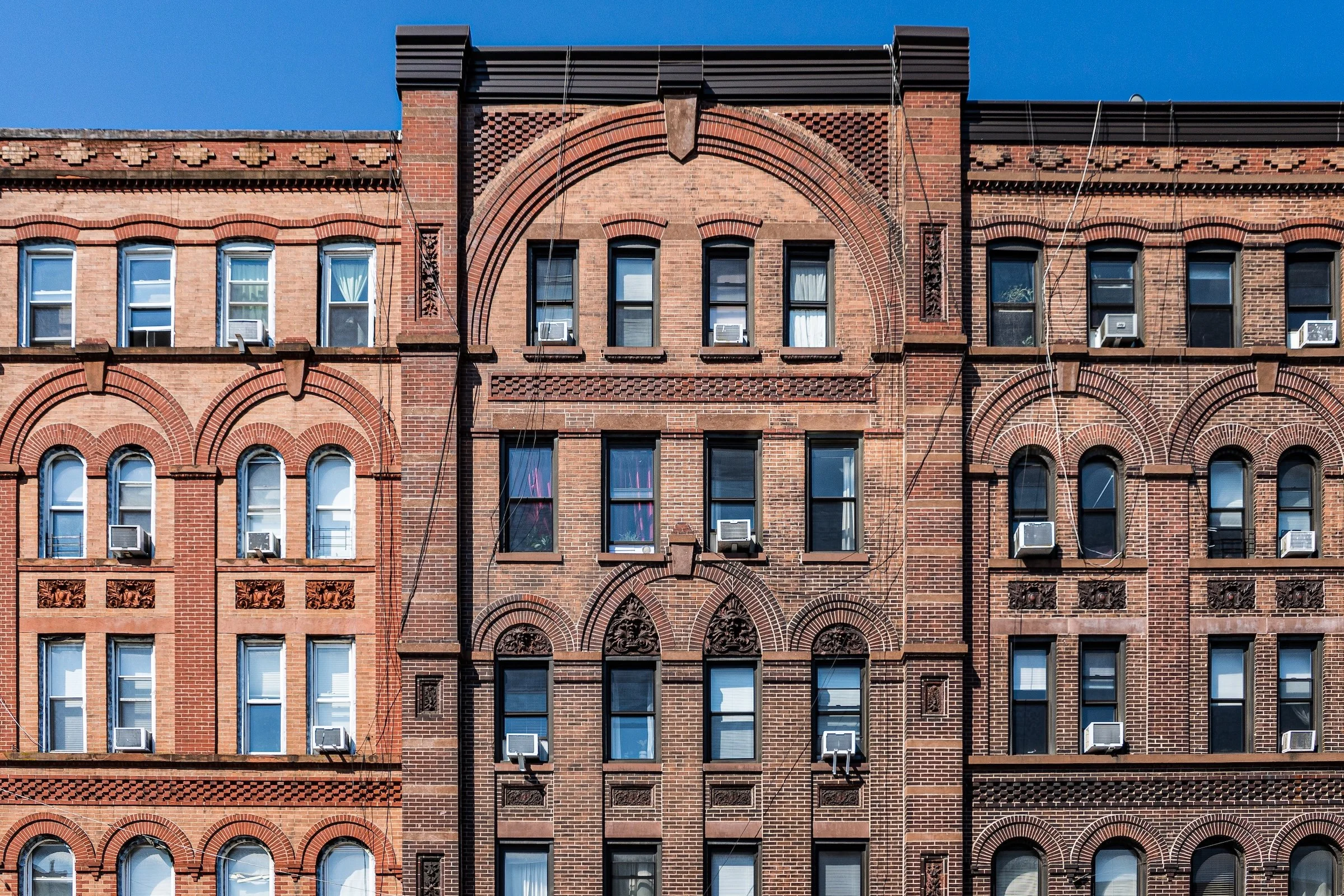
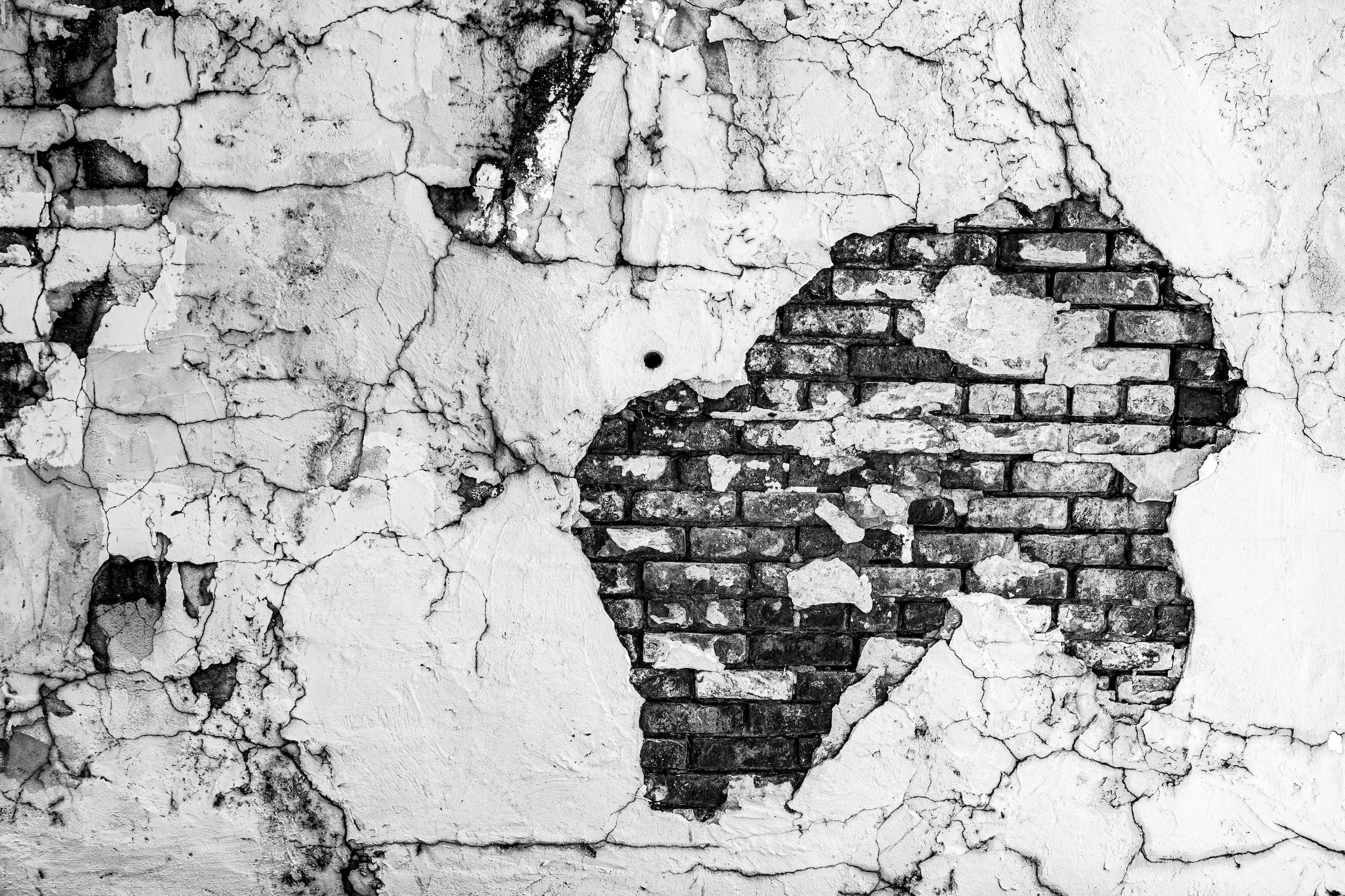
West Village — Manhattan — Window & Brick Triptych
The frame reads as a three-part composition: glass, paint, and exposed brick arranged in clean vertical blocks. The subject becomes secondary to the structure—your eye moves through the panels like a gallery piece.

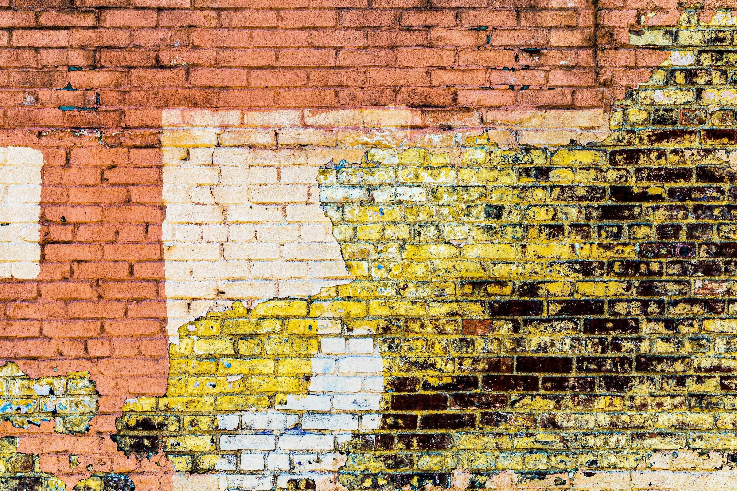
West Village — Manhattan — Chipped Palette
The power here is the tension between surfaces: the worn paint, the brick beneath, and the sharp edges that divide the frame into graphic zones. It’s a perfect example of how decay can function as composition instead of distraction.

Texture-First Abstractions (Material as Subject)
In these examples, the surface itself carries the photograph—grit, peeling layers, cracks, and patina arranged with intention.
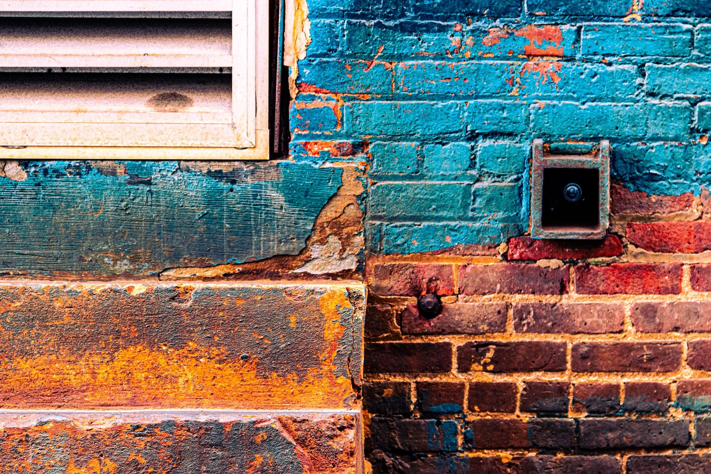
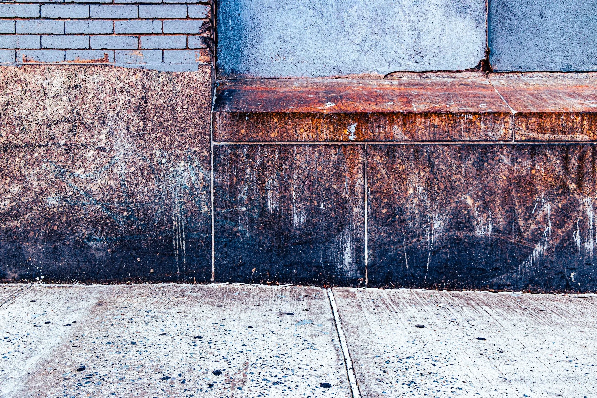
West Chelsea — Manhattan — Weathered Grid
The underlying structure—brick lines and edges—acts like scaffolding for the texture on top. The result feels tactile: you can almost feel the roughness just by looking, which is exactly what a texture-first abstraction should do.
Graphic Seams (Edges, Corners, and Divisions)
These are abstractions built from boundaries—where materials meet and the city draws its own lines.

Hell’s Kitchen (Clinton) — Manhattan — Corner Tension
The frame is held together by edges: a hard vertical division, a clean corner, and a crop that turns architecture into geometry. This is the abstraction strategy at its simplest and most powerful—let the seam become the subject.
Hell’s Kitchen (Clinton) — Manhattan — Composed Fragments
This one has the collage-feel without becoming busy: multiple surfaces, multiple textures, but arranged so the frame stays coherent. It’s a strong reminder that abstraction is not “random close-up”—it’s design through selection.
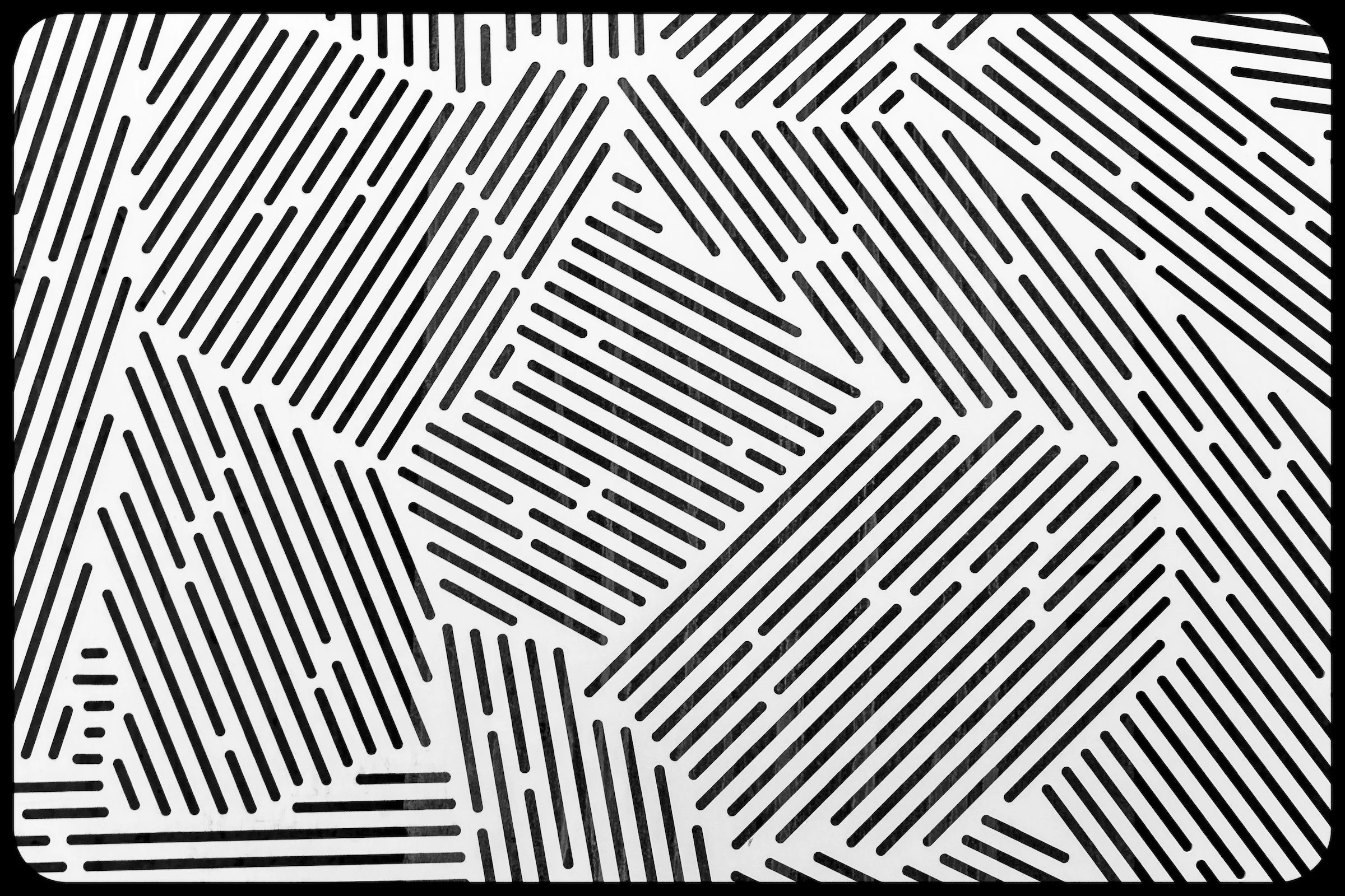
Cypress Hills — Brooklyn — Pattern Without Context
This example leans into pure structure—repeating marks and graphic rhythm that could almost be mistaken for intentional design. It’s abstraction as visual puzzle: you don’t need to know what it is to know it works.
Rosebank — Staten Island — Wall as Portrait
The surface here feels like a character: weathered, layered, and expressive without needing any literal subject. Abstractions like this are “portraiture” of the built world—an image of personality rather than place.
Explore Further