Bigger Than The Frame
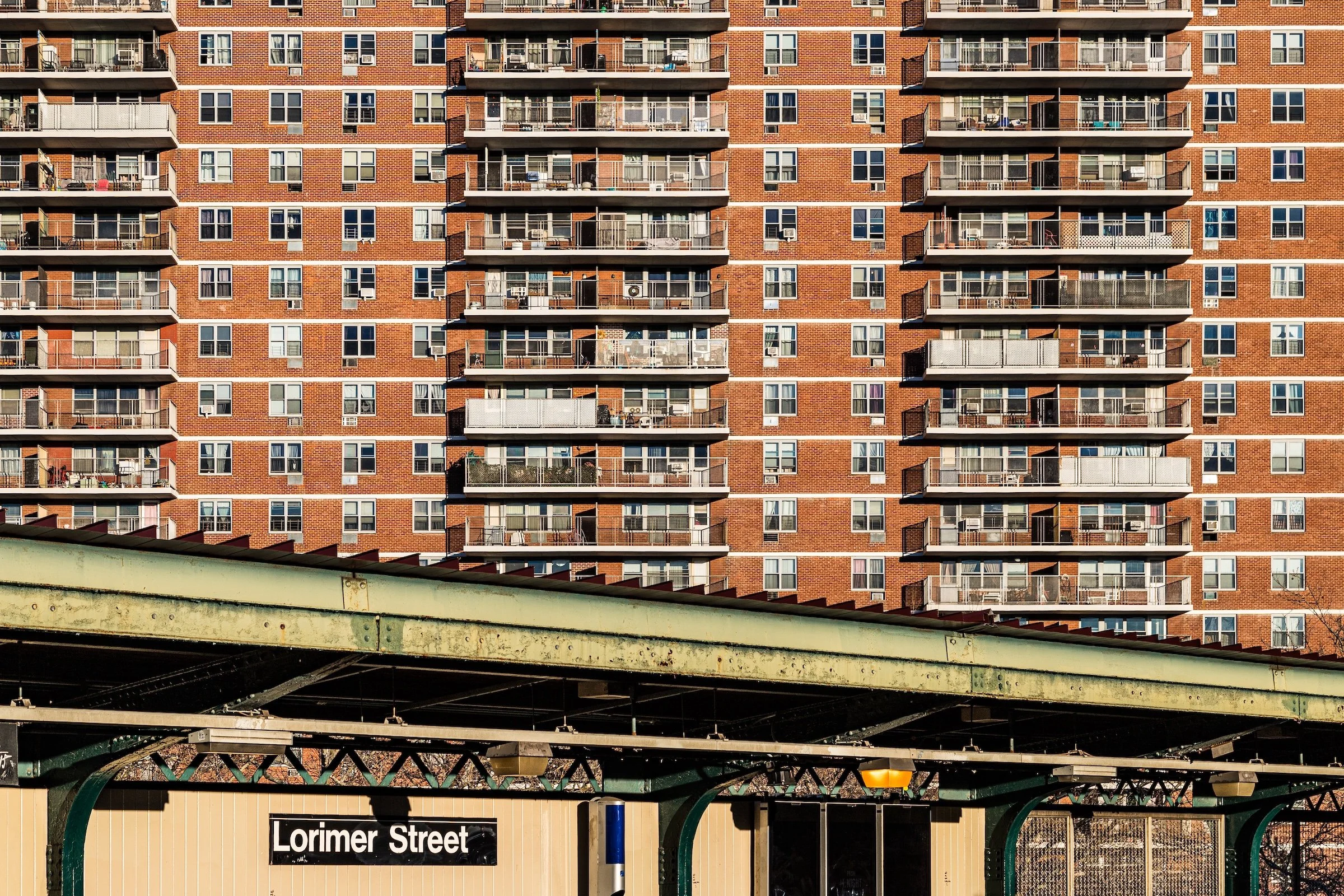
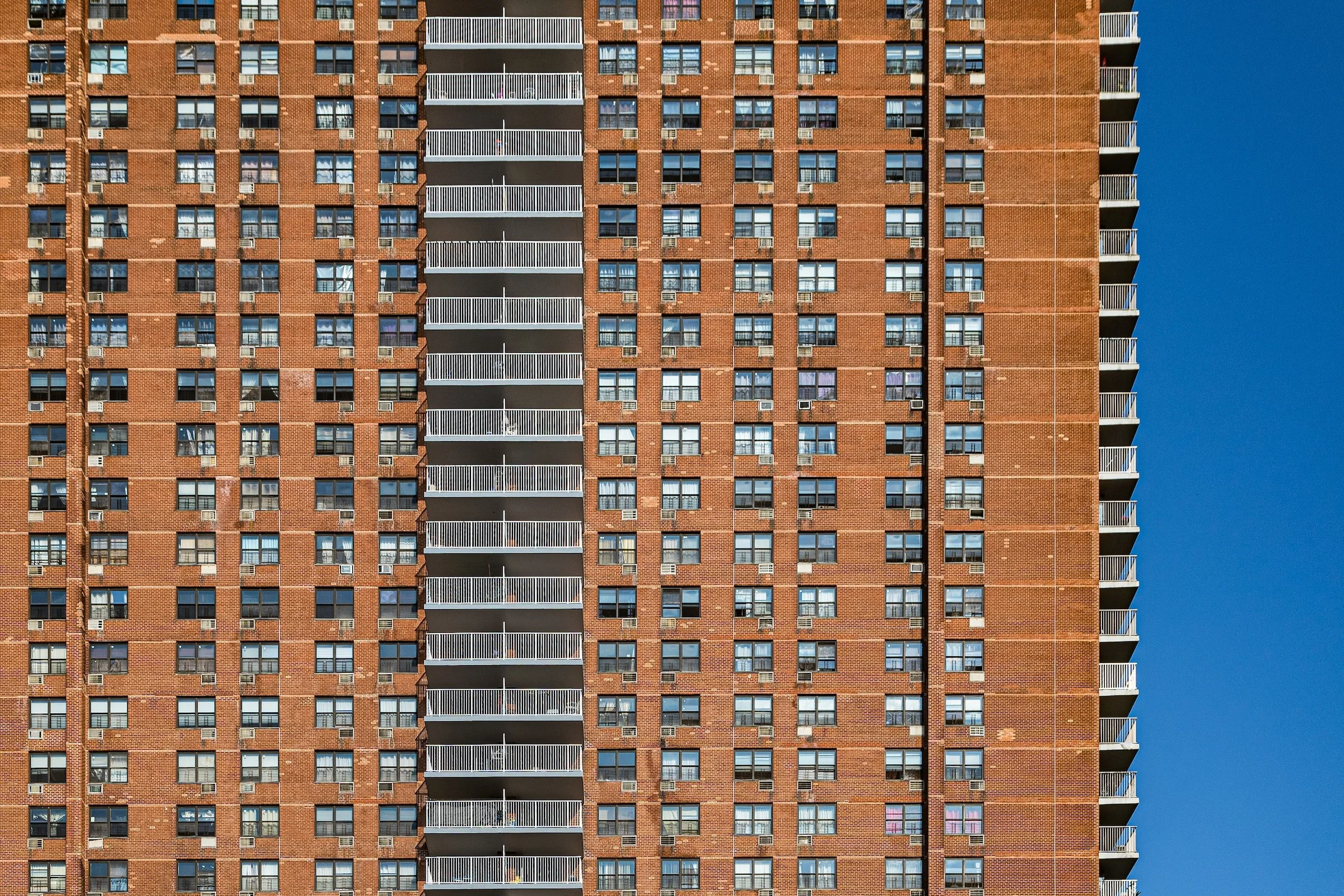
Williamsburg - Brooklyn - Lorimer Street Station
Definition:
Bigger Than The Frame is a composition strategy where the subject’s scale is communicated by refusing to contain it. The building (or structure) extends beyond the edges of the photograph—top, sides, or both—so the viewer feels the continuation. The frame becomes a window onto something larger, not a box that neatly holds it.
Usage:
Use Bigger Than The Frame to create awe, pressure, immersion, and city-scale drama—especially with high-rises, long façades, and repeating grids. The key is intent: you’re not “cutting things off,” you’re implying more. Done well, the crop becomes a storytelling tool: the city is too big, too dense, too endless to fit.
In Depth:
Most people treat cropping like an error (“Oops, I clipped the building”). This strategy flips the logic: cropping becomes proof of scale. When you deliberately let the subject spill past the edges, you tell the viewer, This continues. This overwhelms. This is not a contained object—it’s an environment.
There are two big ways this works:
Overwhelm through extension — vertical towers or long walls that exceed the frame and make the viewer feel small.
Infinity through repetition — grids, windows, balconies, and stacked floors that look like they could continue forever.
A few quick ways to use it in the field:
Commit to the crop. If you’re going to cut it off, cut it off boldly—tiny accidental clipping feels nervous; strong cropping feels intentional.
Keep your lines disciplined. Watch verticals and horizontals; if the subject is “too big,” your geometry has to be calm.
Find a “measure.” A tree, a water tower, a fire escape—something human-scaled that proves the scale without explaining it.
Use repetition as pressure. Grids and stacked balconies create the feeling of more than you can count.
Choose the edge that carries meaning. Cutting off the top says “endless height.” Cutting the sides says “endless breadth.” Cutting both says “you’re inside the machine.”
Below are ten launch examples showing different versions of Bigger Than The Frame—from balcony-stacked towers to brick walls that read like infrastructure, not a building. Each image includes a brief note on what the crop is doing, and why it strengthens the sense of scale.
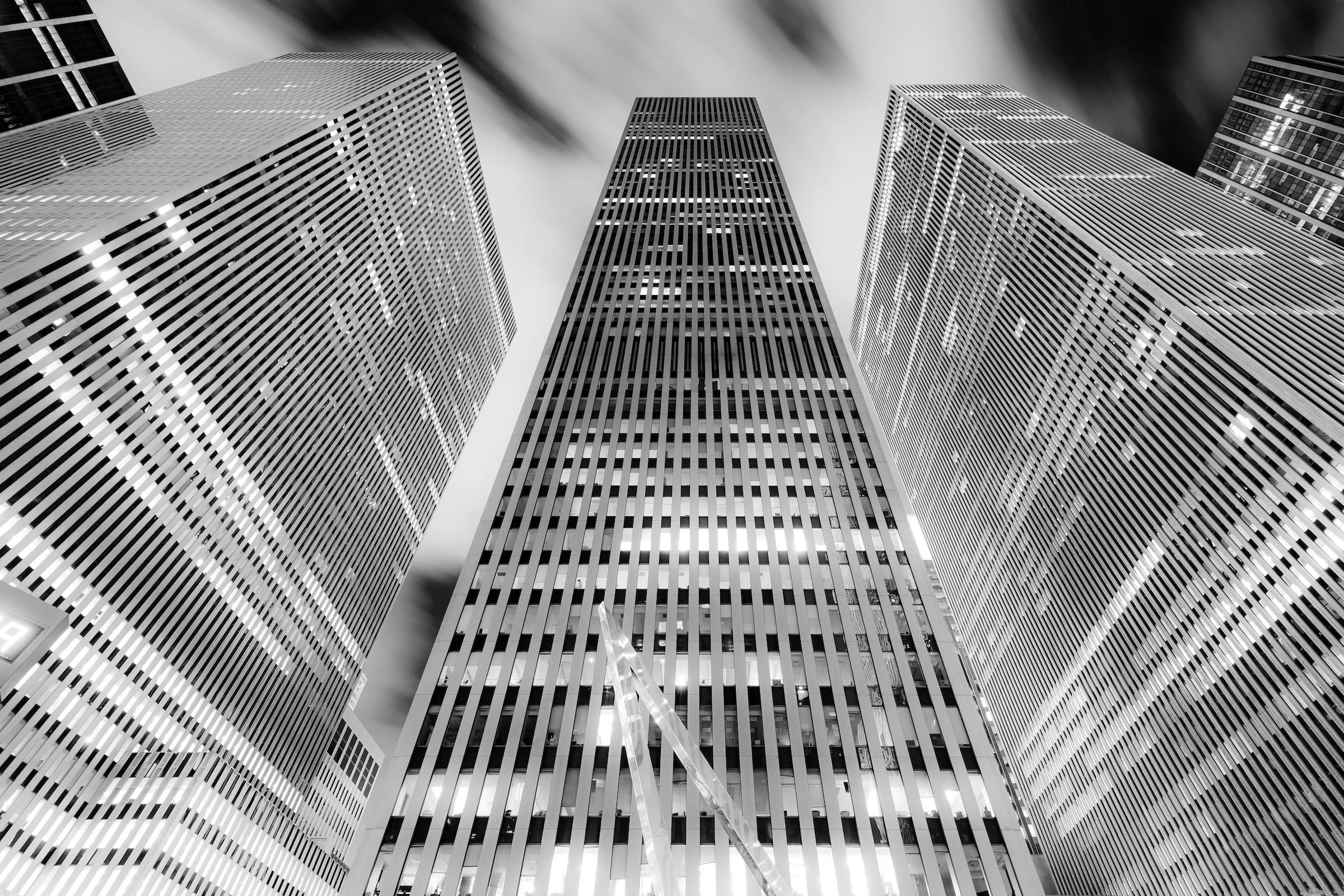
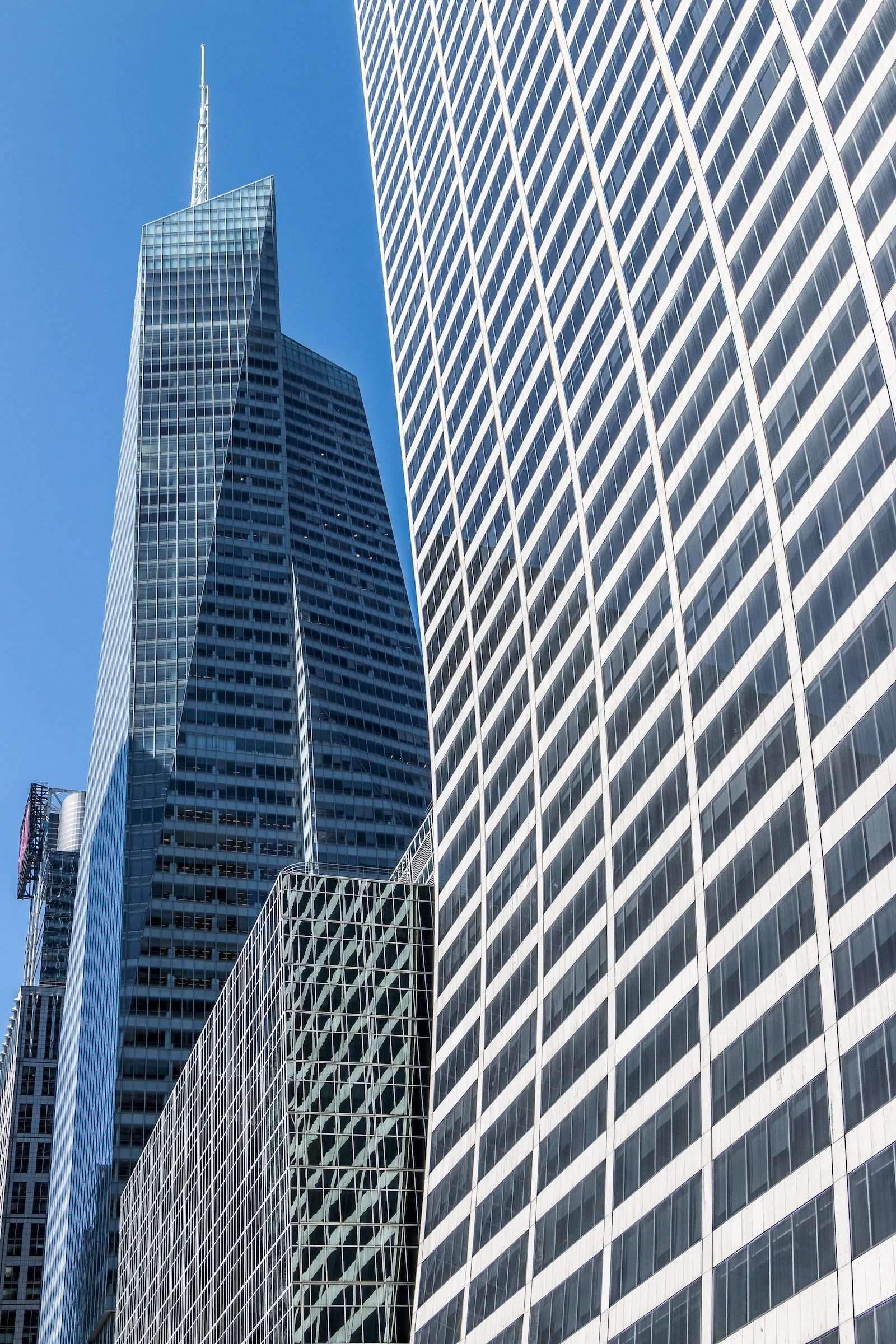
Vertical Overwhelm:
These frames lean into height—towers that feel like they continue upward past visibility, turning the viewer into a pedestrian looking up from the canyon floor.
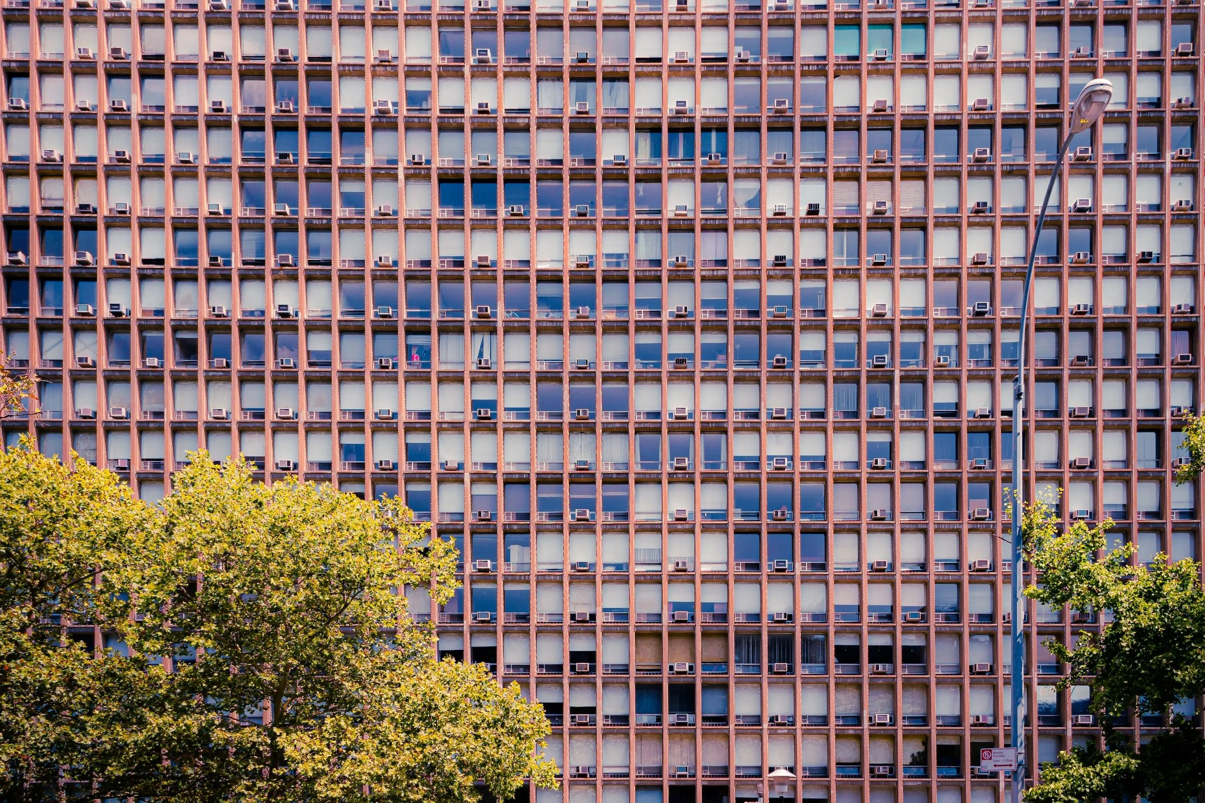
Marble Hill - Manhattan - Condos
This is pure scale-as-pressure: a sheer wall of windows and brick that dominates the composition. Keep verticals clean here—small tilts make big buildings feel sloppy instead of monumental.
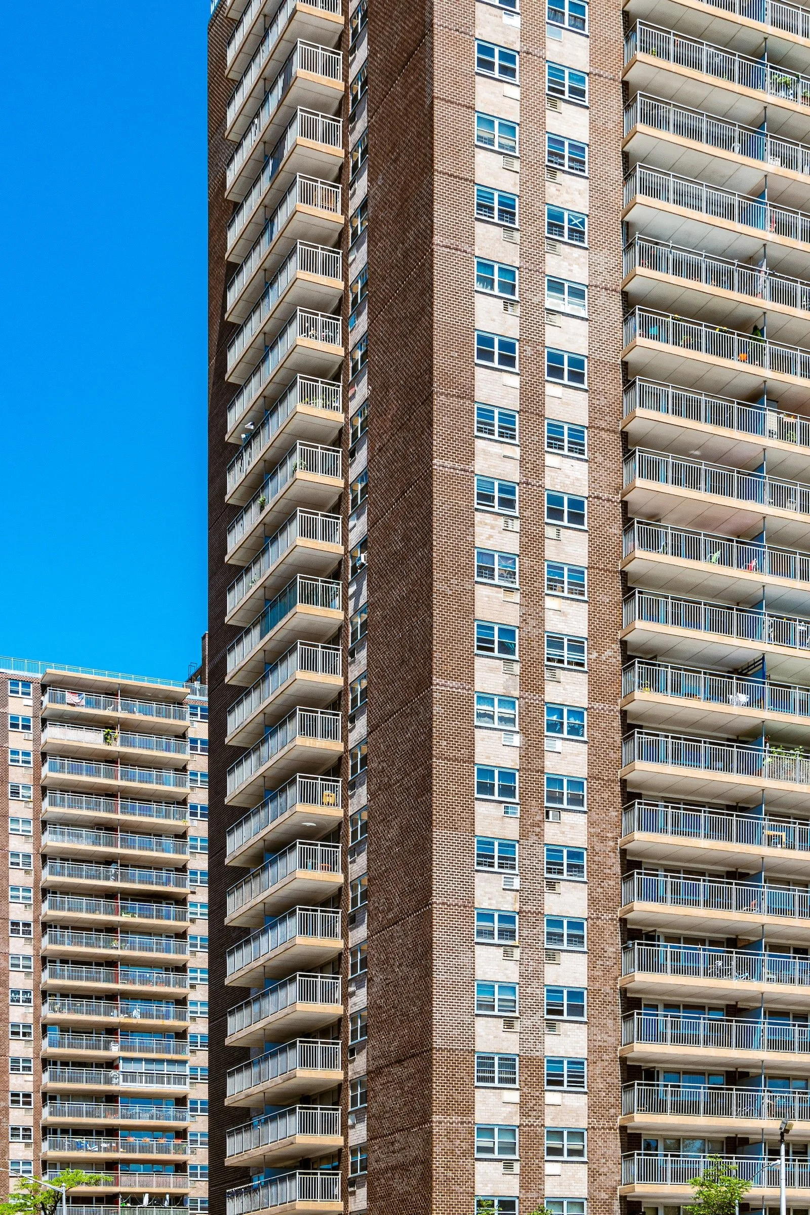
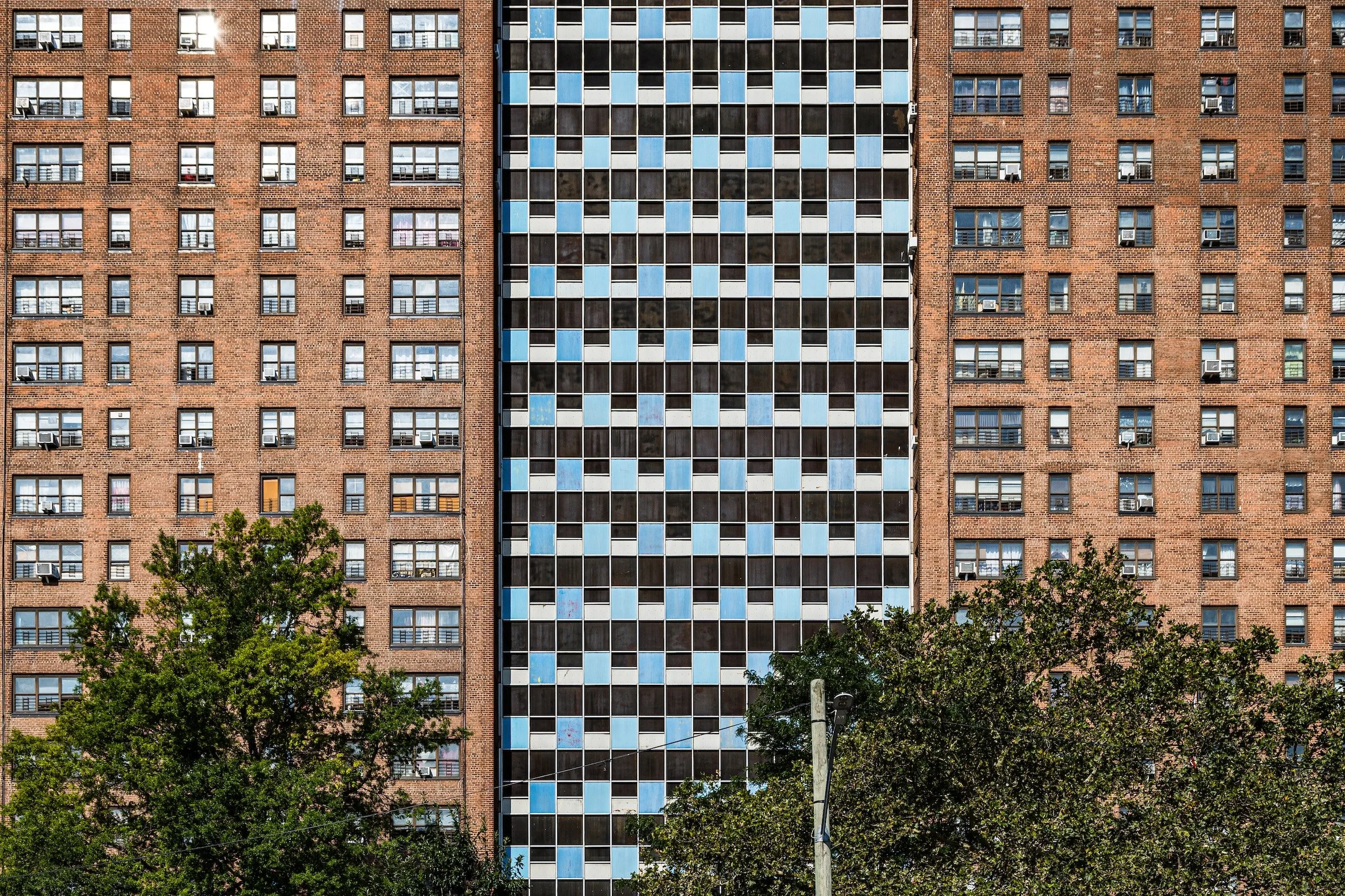
Alphabet Village - Manhattan - ABC High-Rises
The stacked balconies and repeating windows create a vertical rhythm that implies “more above.” The crop isn’t hiding the top—it’s declaring the height as unknowable.
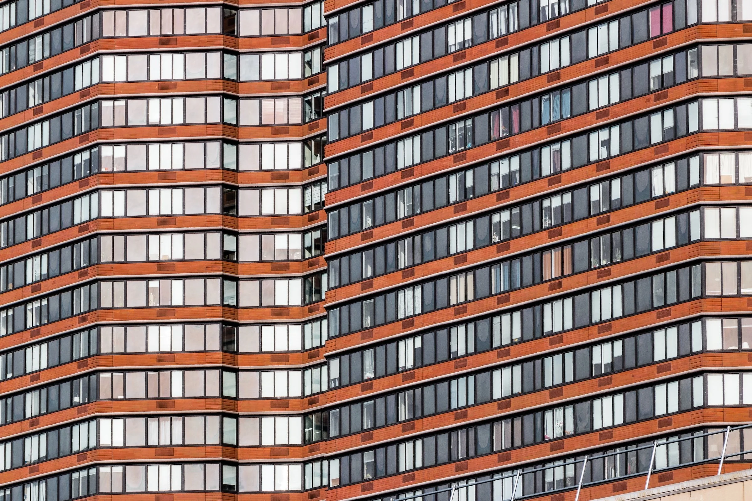
Hudson Yards - Manhattan - Riverplace
The façade becomes a pattern-field, and the frame feels like a sample of a larger structure. When the repetition is this strong, you can let the building become almost abstract without losing the sense of mass.
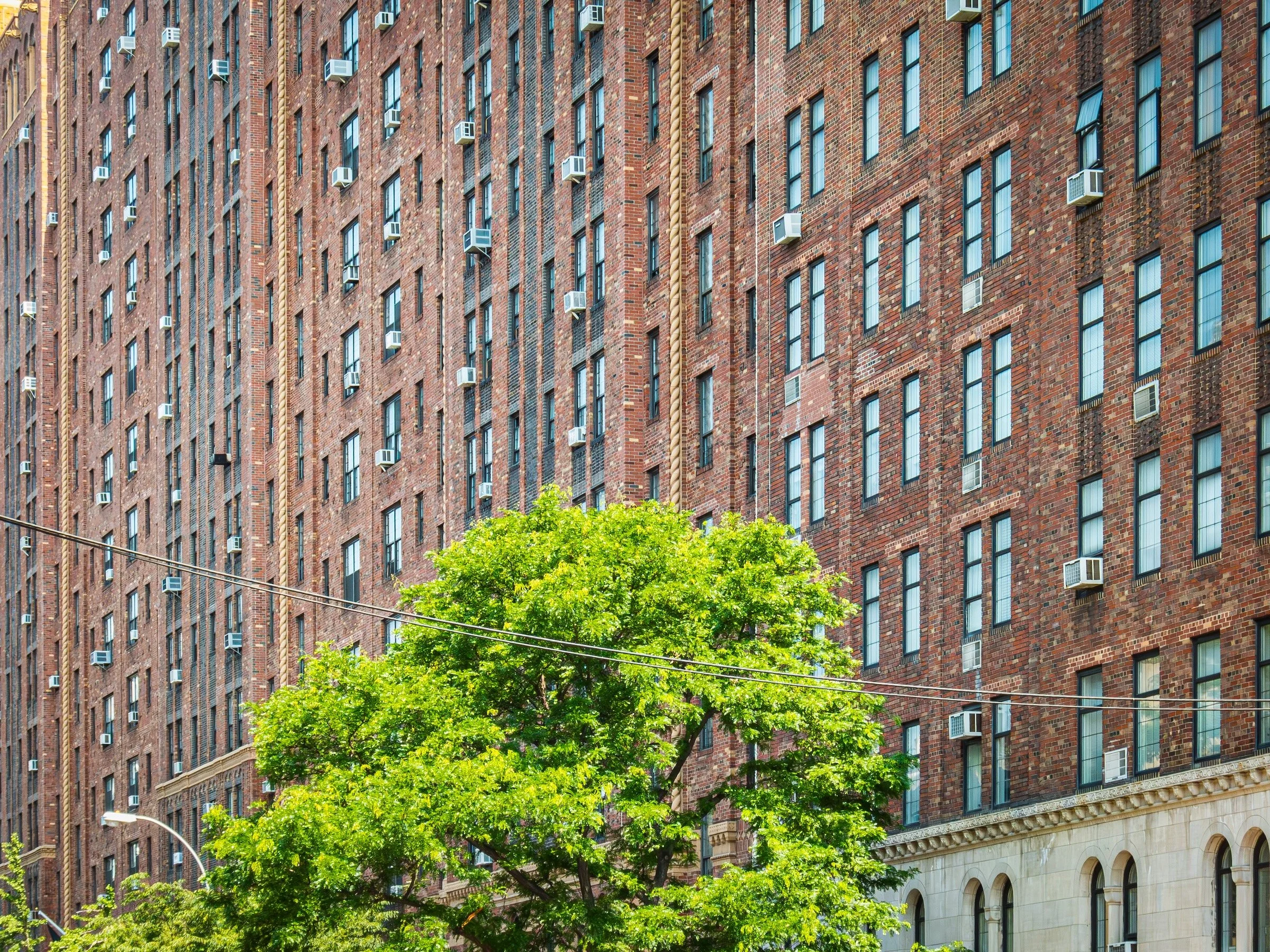
Endless Grids and Repetition Fields:
Here, the “bigness” comes less from height and more from countability—the feeling that the building extends beyond the frame because the pattern could continue indefinitely.
Hudson Yards - Manhattan - Hunter College Emeritus
The repetition is calmer, more architectural, but still relentless—like a visual metronome. This works best when you simplify everything else and let the grid do the talking.
Castle Hill - The Bronx - Castle Hill Castle
Balconies repeat like musical measures, and the building reads as a system rather than a single object. The crop strengthens that feeling: you’re seeing part of something bigger than one glance.
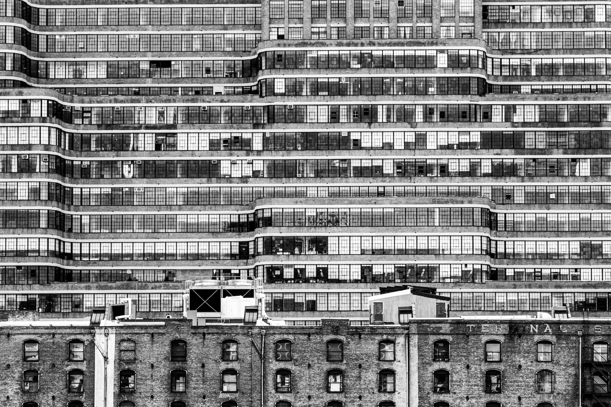
Hudson Yards - Manhattan - Starrett-Lehigh Building
A classic “too long for the frame” structure: horizontal scale as inevitability. The building becomes a shoreline—wide, steady, and seemingly continuous.
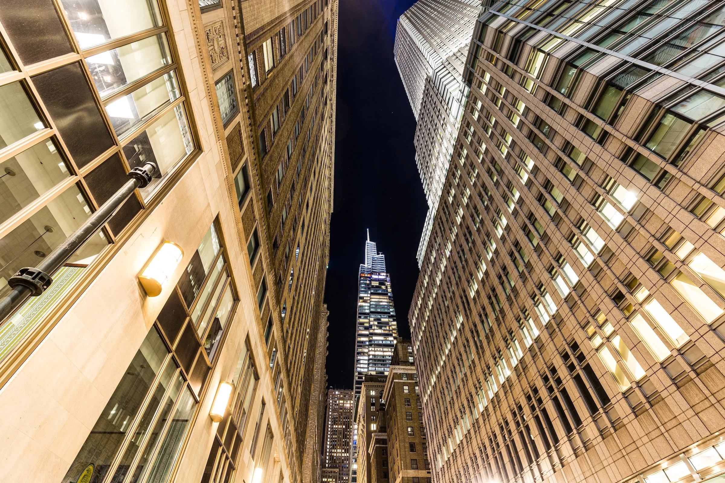
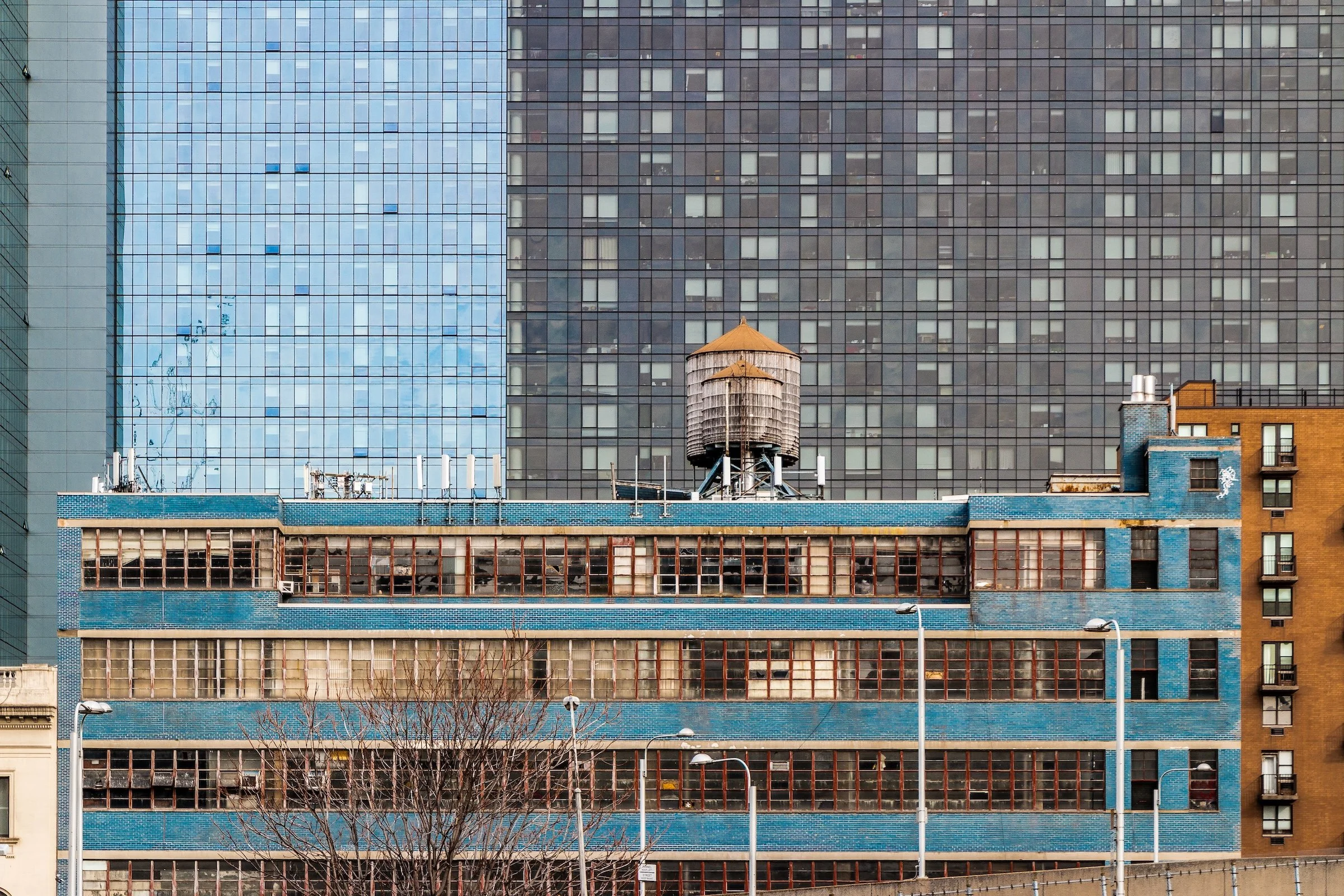
Scale Anchors and Structural Contrasts:
These examples use contrast—old vs. new, short vs. tall, brick vs. glass—to make the “bigger-than-frame” subject feel even larger. The smaller element becomes the measuring stick.
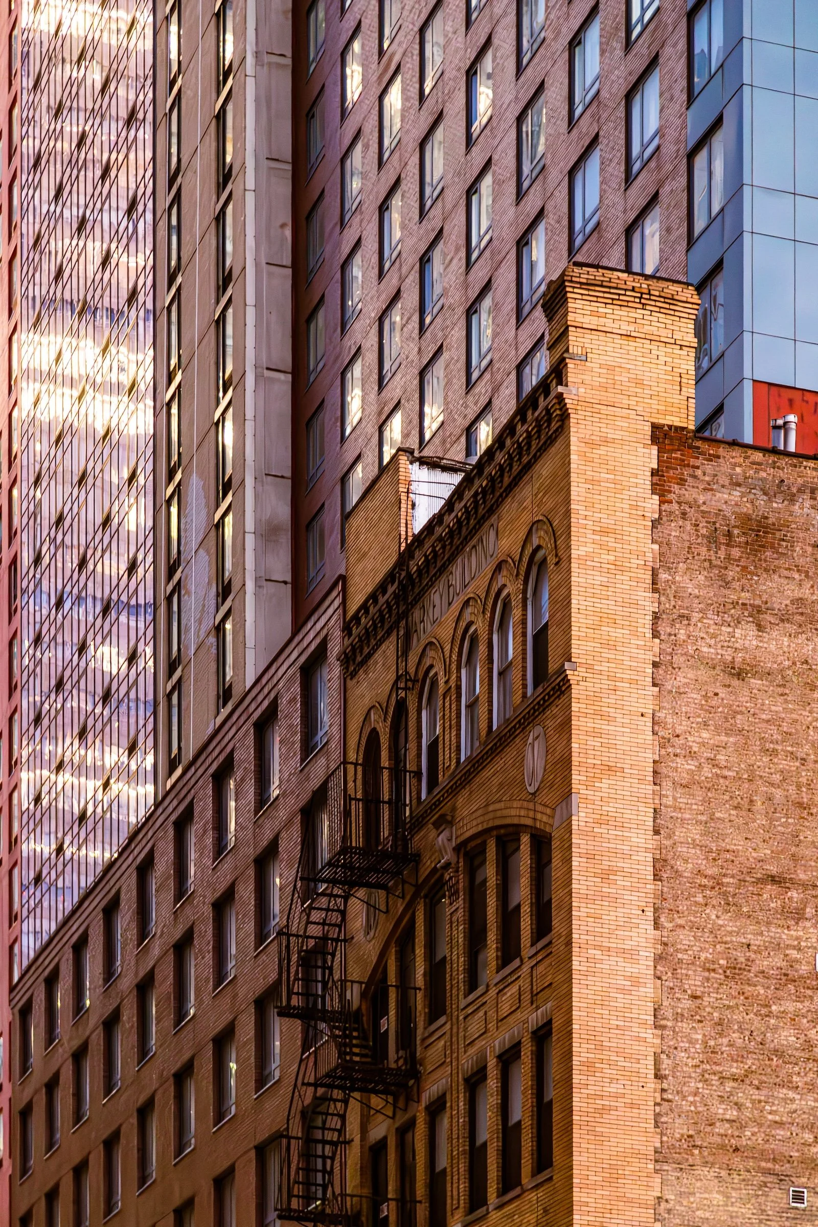
Garment / Fashion District - Manhattan - West 40th Street
The older structure becomes the human-scale reference point, while the surrounding walls press inward. This is scale through compression—the city as layered thickness.
Explore Further